Nature Photographers Network
This is the preserved archive of the original Nature Photographers Network. The community continues at naturephotographers.network.
Return :::::::: REPOST
‹ PreviousLandscape GalleryNext ›

Return :::::::: REPOST

by Pedro Bento

Gallery: LandscapePosted June 21, 2011399 views20 comments
I've been a member since 2007 and have learned a lot of you guys. Unfortunately in the last 2 years, I have not produced so much work as I like: I've got married :biggrin:, father of a lovely girl :jump: and finally try to run my photography business in the last year :confused:

So much work in social photography, but Nature and Landscape voice speak louder.

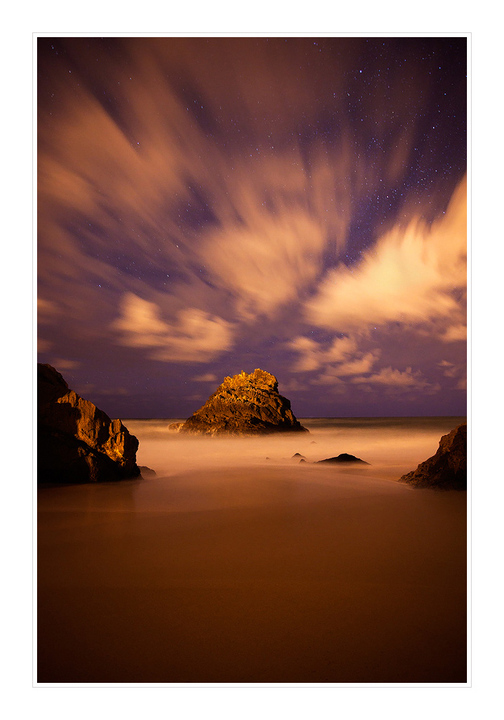
This Summer I'll be running a big Expo around Portugal with some of the most new talented photographers in Portugal and this will be one of the prints, so you feedback will be much appreciated.

Thanks and see you soon!

5D MKII + 17-40

Comments

20 comments
Comment posted by Mitch Erwin on June 21, 2011 at 9:31 AM
Pedro, this is a lovely image and obviously taken with a full moon behind you! I might try and crop some of the negative space from the bottom and work on the color cast a little brought on by the moonshine. I love the hint of stars behind the clouds! Great image! :toast:
Registered on April 24, 2006, 98 Posts, 656 Comments
Comment posted by Yiming Hu on June 21, 2011 at 9:34 AM
Pedro, this is excellent. I especially like the stars-behind-cloud look. The slow-shuttle speed also worked well for water.

I might crop the bottom slightly, although your current version works well.

Registered on April 28, 2011, 38 Posts, 733 Comments
Comment posted by Koveh Tavakkol on June 21, 2011 at 10:02 AM
A beautiful night shot!
Registered on September 1, 2009, 41 Posts, 608 Comments
Comment posted by Balan Vinod on June 21, 2011 at 11:02 AM
Pedro ..what a cracker of an image...love the "wipe" of the clouds here and the placement of the mountains / rocks. Really looks like some other planet. I would have kept the rocks to the bottom third of the frame ...but then this is effective as well...

Balan Vinod
Registered on March 20, 2006, 889 Posts, 2312 Comments
Comment posted by Darren Colello on June 21, 2011 at 11:37 AM
WOW, gorgeous composition. I love everything about this one. Exceptionally well done! :toast: :toast:
Registered on July 27, 2009, 175 Posts, 1100 Comments
Comment posted by Kartik Venkatarama on June 21, 2011 at 1:10 PM
Brilliant surreal image :toast:
Registered on July 27, 2007, 197 Posts, 830 Comments
Comment posted by Preston Birdwell on June 21, 2011 at 2:04 PM
Welcome back, Pedro! Congratulations on your marriage and daughter.

This is alovely image and quite dramatic. The print must be wonderful.

Good luck in your upcoming endeavors!

--P
Registered on November 1, 2003, 471 Posts, 5188 Comments
Comment posted by Marc Adamus on June 21, 2011 at 2:20 PM
Looks really cool, Pedro. Striking effects on display here. I'd drop the color temperature a lot if it were mine. It feels really warm to me.
Registered on September 17, 2005, 780 Posts, 8091 Comments
Comment posted by Scott Miller on June 21, 2011 at 3:53 PM
Love it, the clouds with the stars shining through are great. It is a bit warm though.
Registered on May 9, 2011, 23 Posts, 322 Comments
Comment posted by Hamed Musharbak on June 21, 2011 at 4:19 PM
love it :toast: , im agree with Marc

Hamed
Registered on June 1, 2009, 372 Posts, 2282 Comments
Comment posted by Rob Graham on June 21, 2011 at 5:58 PM
I like the stars through the clouds look, but agree that the image is too warm.
Registered on August 22, 2006, 842 Posts, 2824 Comments
Comment posted by Kah Kit Yoong on June 21, 2011 at 8:02 PM
Wonderful image. I don't think it needs a crop; the bottom part gives the image an overall feel of spaciousness. I agree that a cooler colour balance might be better.
Registered on September 27, 2006, 636 Posts, 10682 Comments
Comment posted by Tony Kuyper on June 22, 2011 at 12:01 AM
Whoa! That is truly and amazing image. Feels hyper-real, if you can gather what I mean.
Registered on November 1, 2003, 364 Posts, 22328 Comments
Comment posted by Lon Overacker on June 22, 2011 at 1:17 AM
Pedro,

First of all, congrats on all those life-changing events! And they are life changing.... (all for the good of course.)

This print will be a big hit I think in your upcoming show. A well executed and beautiful moon-lit seascape. I think the light balance with the night sky is quite good here. The only suggestion I have and perhaps it's too late for a print..... would be to consider shortening up the bottom a little bit? I'm undecided myself if that would help or hurt the overall presentation, but I think there's a lot of blank real estate at the bottom. A minor thought though. No other nits or suggestions from me. I'll bet this looks great.

Hope to see more from you. Best of luck with the show.

Lon
Registered on November 24, 2006, 521 Posts, 19147 Comments
Comment posted by Harry Lichtman on June 22, 2011 at 8:03 AM
Pedro - Interesting cloud action and the lighting looks surreal. I might take a little off the bottom, but otherwise an engaging image. Almost looks like a desert in the FG. :toast:
Registered on September 17, 2010, 304 Posts, 3507 Comments
Comment posted by Danny Laureys on June 22, 2011 at 5:06 PM
Excellent!!!!!
Registered on January 5, 2008, 590 Posts, 1261 Comments
Comment posted by Pedro Bento on June 23, 2011 at 5:27 AM
Here's my 2nd version, I didn't crop the bottom because I like that empty space of sand, but I rework the sky for a cold white balance.
Is it better, this way?
Registered on September 2, 2007, 45 Posts, 761 Comments
Comment posted by Ian Plant on June 23, 2011 at 6:34 PM
sweet night landscape, great motion blur
Registered on July 7, 2008, 271 Posts, 1657 Comments
Comment posted by Mark Metternich on June 25, 2011 at 3:02 PM
This is fantastic. :toast:
Registered on June 19, 2009, 276 Posts, 6240 Comments
Comment posted by Randy Wilson on June 28, 2011 at 11:21 AM
Beautiful composition and beautiful scene. Love the blurred clouds and the stars peeking through. The only thing I might change would be to crop a bit off the bottom, not because it's dark but because the proportions work out better.
Registered on June 25, 2009, 7 Posts, 85 Comments