Nature Photographers Network
This is the preserved archive of the original Nature Photographers Network. The community continues at naturephotographers.network.
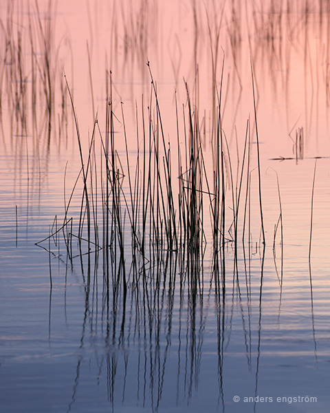
Reed straws
‹ PreviousLandscape GalleryNext ›

Reed straws

by Anders Engström

Gallery: LandscapePosted June 21, 2011103 views7 comments
This is an image from the other night, a beautiful evening with some really great colors in the sky. I was at a location where it was hard to good a landscape-composition so I deciced to get a closeup instead.

Canon EOS5d MII, EF 100-300 5.6L, 1/10s f8.

//Anders

Comments

7 comments
Comment posted by Marc Adamus on June 21, 2011 at 2:32 PM
I think these abstracts often work best when the focus is sharp throughout, Anders. That way the eye gets lost in the fluidity of lines. Here I'm not as sure about the OOF background, as it almost makes me want to see complete isolation of the foreground instead, without any distractions. Still, you might say it adds depth or context to the scene which is not a bad thing. What I really like is the gentle tonal transitions and textures around the foreground grasses.
Registered on September 17, 2005, 780 Posts, 8091 Comments
Comment posted by Tony Kuyper on June 22, 2011 at 12:05 AM
Sweet. Even with the OOF background, it's a nice graphic with the two-tone water.
Registered on November 1, 2003, 364 Posts, 22328 Comments
Comment posted by Lon Overacker on June 22, 2011 at 1:38 AM
Anders,

I think this is beautiful and very surprised it hasn't received more comments. I too love the color and the simply gradation between the two primary colors. The reeds and the ripples make for nice contrasting graphics and I just think the simplicity here really makes this one stand out. I can't disagree with Marc's thoughts on the depth, but IMO, the shallow depth does at least help provide some separation between the main cluster of reeds and the rest of the image. I like this quite a lot.

Lon
Registered on November 24, 2006, 521 Posts, 19147 Comments
Comment posted by Stuart Williams on June 22, 2011 at 2:31 AM
i like the colours here but would have preferred a much greater DOF.
Registered on December 7, 2007, 247 Posts, 4792 Comments
Comment posted by Harley Goldman on June 22, 2011 at 10:12 AM
This works beautifully. I will dissent from the above opinions and say the shallow DOF works very well. It gives the image a more dreamy quality and narrows the attention to the front reeds. Excellent.
Registered on November 19, 2003, 586 Posts, 11271 Comments
Comment posted by Lucy Aron on June 22, 2011 at 9:33 PM
The colors are beautiful and I agree that the DOF works and accentuates the definition of the foreground reeds. Very nice.

lucy
Registered on February 25, 2011, 189 Posts, 1160 Comments
Comment posted by Nick Bristol on June 22, 2011 at 10:02 PM
I really like the feel of this image, Anders. Wonderful color and comp. Your choice of DOF works quite well for me here. Very nice!

Nick Bristol
Lone Rock, WI
Registered on February 1, 2004, 752 Posts, 14140 Comments