Nature Photographers Network
This is the preserved archive of the original Nature Photographers Network. The community continues at naturephotographers.network.
Sunwapta Falls + Repost
‹ PreviousLandscape GalleryNext ›

Sunwapta Falls + Repost

by Sarah Marino

Gallery: LandscapePosted June 22, 2011579 views38 comments
I spent about three weeks in the Canadian Rockies last fall and found the trip to be overwhelming, mostly because I think we tried to see too much. I processed a few images when I got back but just wasn't feeling it. I opened up the folder this week and found that I could finally enjoy looking through the photos.

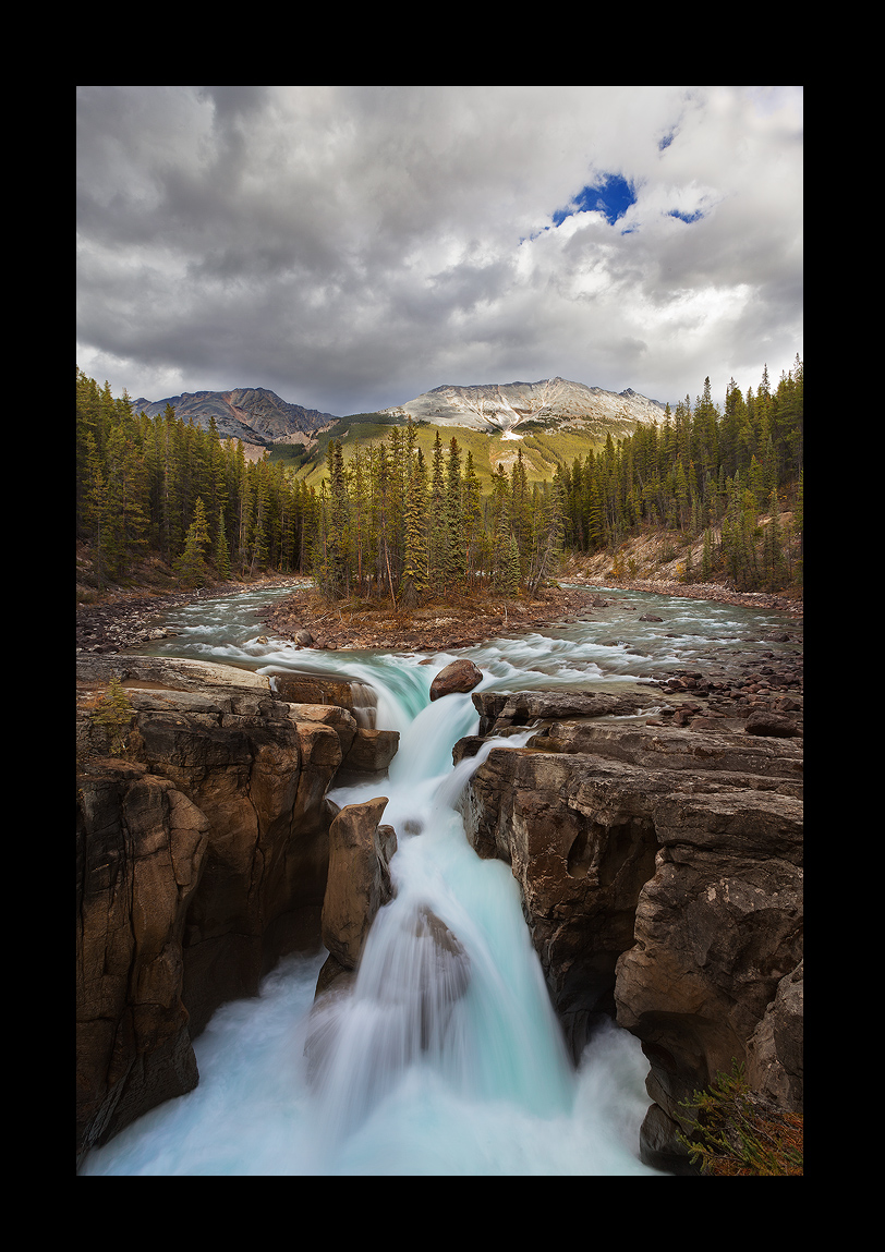
This is Sunwapta Falls in Jasper National Park. I was hoping that colorful clouds would appear, but the storm clouds just continued to hang around.

I tried a 4x5 crop to eliminate the bit of blue sky, but ended up preferring the full view. Any comments on the cropping, or anything else, are very much appreciated.

5D2, 17-40mm @ 19mm. f/16. 2 exposures - 0.4 sec and 1/10 sec. LARGER photo included.

Comments

38 comments
Comment posted by Koveh Tavakkol on June 22, 2011 at 11:58 PM
The composition and scene are beautiful here Sarah. The water does a great job to pull my eye back into the rest of the image. The only nit for me here is the patch of blue skies. I would consider cloning this out to make your sky more even throughout. I found the blue just drew my eye away and distracted from the background peaks. I almost think you should take a look at this one for a B&W candidate. :biggrin:
Registered on September 1, 2009, 41 Posts, 608 Comments
Comment posted by Yiming Hu on June 23, 2011 at 12:05 AM
I know you have tried. However I still think that cropping out the blue sky and above will make the picture a winner. The waterfall and its colors are fantastic.
Registered on April 28, 2011, 38 Posts, 733 Comments
Comment posted by Bruce King on June 23, 2011 at 12:06 AM
Beautiful scene and an expertly crafted image. I agree the patch of blue sky is a slight distraction but cropping from the top reduces the excellent sense of depth you've captured IMO. I like Koveh's suggestion, however it's very nice as is. Well done.
Registered on January 14, 2010, 276 Posts, 2212 Comments
Comment posted by SandyRichardsBrown on June 23, 2011 at 12:07 AM
Excellent - love the detail and even light throughout. Beautiful water and flow too.The centered 'falls work well here.
I agree about the blue bit of sky - adds interest for sure, but definitely draws my eye. The stormy clouds are enough, and the sky doesn't need the bit of blue.

Lovely!
Sandy
Registered on November 24, 2003, 3937 Posts, 12909 Comments
Comment posted by Preston Birdwell on June 23, 2011 at 12:13 AM
Lovely scene, here, Sarah. It is nicely composed. The blue sky spot does grab my eye. I'd certainly consideer a careful job because acropping it out changes the expansive feel of the image. I also see a tad bit too much cyan in the water. You could try using a Selective Color adjustment layer, select the Whites and then pull back on the cyan a bit.

It's a very nice image. Good work!

--P
Registered on November 1, 2003, 471 Posts, 5188 Comments
Comment posted by Jack Garrett on June 23, 2011 at 12:19 AM
Great capture Sarah! I'm with the group that says crop the blue out and you've got a real winner here! I don't think the water needs an adjustment..Canadian Rockies water seems to have that color to it.
Registered on November 7, 2007, 41 Posts, 251 Comments
Comment posted by Danny Laureys on June 23, 2011 at 12:20 AM
Excellent shot!!! I do agree with Koveh abouth the the blue patch of sky, it does distract a bit, you could try cropping the sky just above the larger blue patch and clone the rest out, just a suggestion, the color of the water is excellent so is the shutter speed. Also the larger version really does it for me.
Registered on January 5, 2008, 590 Posts, 1261 Comments
Comment posted by Sarah Marino on June 23, 2011 at 12:27 AM
Thanks for all of the comments in general and specifically about the sky. I appreciate the feedback! For a quick comparison, I cloned out the bit of blue and overall agree that it makes the image stronger.

Koveh - I have a black and white worked up but shared the color version since I thought I would get more feedback. I think I like B+W better (not surprising...).

Preston - Because of the glacial runoff, the water is naturally colorful, but it may be too colorful to be believable. I am interested to hear if others think the water needs to be toned down.

Thanks again for the feedback!
Registered on November 10, 2008, 23 Posts, 393 Comments
Comment posted by Jim Goldstein on June 23, 2011 at 12:40 AM
Personally I like this as a square photo. The top border being just at the treetops and the bottom cutoff being a smidge up from the bottom. The focus is the water and while the mountains provide a sense of environment I think they're optional. The square format would make for a great fine art presentation.
Registered on March 18, 2006, 119 Posts, 878 Comments
Comment posted by Jared Atencio on June 23, 2011 at 1:18 AM
I really like the centered comp here Sarah, and the circle around the trees converging at the falls is just great-you have a lot of options here. I prefer a crop down from the top even more than your second version, leaving just a bit of breathing room for the peaks and making this more of a 4X5 vert, although now I'm a little intrigued by Jim's crop suggestion, esp. in a B&W presentation. The cyan in the river itself does not appear too strong for me, but I wouldn't mind seeing less of it in the bottom half of the falls. Glad to see the images from this trip slowly starting to emerge!
Registered on June 23, 2009, 21 Posts, 422 Comments
Comment posted by Bruce Omori on June 23, 2011 at 5:29 AM
Gorgeous, Sarah! Great composition of a beautiful scene. Colorful clouds would've been nice, but stormy ones add a dramatic feel to it! Well executed. :toast:
Registered on December 6, 2010, 6 Posts, 175 Comments
Comment posted by Kah Kit Yoong on June 23, 2011 at 7:34 AM
The second version is perfect. I love the colour of that glacial water; it doesn't look like it needs toning down.
Registered on September 27, 2006, 636 Posts, 10682 Comments
Comment posted by Joseph Balcken on June 23, 2011 at 8:42 AM
The second version is awesome! I went back and forth on a crop off the top, but that is personal preference.
Beautiful! :toast:
Registered on November 29, 2009, 48 Posts, 249 Comments
Comment posted by Nick Bristol on June 23, 2011 at 9:00 AM
Sarah, I really like the second version. Looks wonderful! I like this comp very much, and that water looks awesome! Nice work.

Nick Bristol
Lone Rock, WI
Registered on February 1, 2004, 752 Posts, 14140 Comments
Comment posted by Bruce King on June 23, 2011 at 9:43 AM
Oh yeah..........send me a large print of v2. I like the water; glacial runoff can change color almost daily so this seems very realistic to me and the vibrancy makes it pure eye candy.
Registered on January 14, 2010, 276 Posts, 2212 Comments
Comment posted by Joshua Hardin on June 23, 2011 at 10:38 AM
Personally, I prefer the blue sky in the first version. The island of blue in the sky nicely mimicked the island surrounded by the river. I don't think cloning more grey sky added a lot to the image. I would stick with version 1 or just crop as much sky as possible above the mountains as previously suggested.
Registered on July 29, 2006, 40 Posts, 414 Comments
Comment posted by R.Bill Moser on June 23, 2011 at 10:50 AM
The repost is perfect. Well done
Registered on January 29, 2010, 285 Posts, 4281 Comments
Comment posted by Mark Seaver on June 23, 2011 at 11:14 AM
Beautiful shot. I like the symmetry of the flow around the island and how you've centered it. I also like the blue spot in the sky, but wish it were slightly less saturated. Having seen glacial runoff in several locations, the water color looks good (maybe a tiny bit strong).
Registered on January 23, 2011, 1103 Posts, 17270 Comments
Comment posted by Jack Garrett on June 23, 2011 at 11:20 AM
Jumping up and down :jump: doing a dance over the repost...you nailed this one!! Please DO NOT change the water..that's the way water in that part of the country looks.
Registered on November 7, 2007, 41 Posts, 251 Comments
Comment posted by Michael J Greene, on June 23, 2011 at 12:00 PM
Sarah,

A very unique scene indeed. Wonderfully captured. I like the re-post better. I think you could add some vignetting to the top corners. Very well done. I like it a lot!

Michael :toast:
Registered on June 18, 2009, 86 Posts, 2317 Comments
Comment posted by Stuart Williams on June 23, 2011 at 12:16 PM
sarah - i like this - but particularly the lower half. the sky does nothing for me. i'd explore a square crop - chopping just above the tops of the trees in the centre of the image. that way it becomes, for me, a wonderfully compelling image.
Registered on December 7, 2007, 247 Posts, 4792 Comments
Comment posted by Eva McDermott on June 23, 2011 at 12:29 PM
Your repost works best for me Sarah. I especially like the turquoise in the falls and the moodiness in the sky.
Registered on January 4, 2009, 1015 Posts, 13229 Comments
Comment posted by James Fougère on June 23, 2011 at 1:11 PM
Awesome comp Sarah :biggrin: The repost works better. I am curious as to what a B&W conversion would look like with more contrast in the clouds?
Registered on October 25, 2010, 41 Posts, 831 Comments
Comment posted by Manoj Vallati on June 23, 2011 at 1:43 PM
Beautiful Wow photo.. I prefer second post but the pinch of blue made me explore every part of the scene
Thanks for sharing :)
Registered on February 24, 2011, 49 Posts, 148 Comments
Comment posted by Shaun Mazurek on June 23, 2011 at 3:14 PM
Wow, what an amazing composition! I love the moddy sky as well. Great Job Sarah!
Registered on June 12, 2010, 21 Posts, 162 Comments
Comment posted by Bill Chambers on June 23, 2011 at 3:19 PM
Wow, it's a tough call between v1 and v2 but, at the moment I'm leaning toward v1. Real close though. Excellent composition and perfect shutter speed. A very enjoyable image Sarah. Water color looks good to me, but I'm on an uncalibrated work monitor.
Registered on April 10, 2005, 753 Posts, 21216 Comments
Comment posted by Aaron Feinberg on June 23, 2011 at 5:01 PM
Think i like the fuller view of 1 but yea, what an awesome spot. And you were able to stay dry? And now for the b/w :)

aF
Registered on October 26, 2009, 399 Posts, 2789 Comments
Comment posted by Phil Pogledich on June 23, 2011 at 6:42 PM
Impressive shot Sarah. Processing feels perfect to me. I really liked the original and don't have a strong preference between it and the repost . . . the bit of blue sky was not a problem for me, but I don't particularly miss it in the repost either.
Registered on August 24, 2009, 123 Posts, 3099 Comments
Comment posted by dean hebert on June 23, 2011 at 6:46 PM
Great shot Sarah! I thinking cropping most of the sky helps keep your eyes on the prize(waterfall). :toast:
Registered on August 4, 2010, 70 Posts, 1132 Comments
Comment posted by Steve Sieren on June 23, 2011 at 7:34 PM
Sarah, circles in nature aren't too common so congrats on finding one! I think the top third of the scene is the least attractive part of the photograph so I'd crop the sky to a cramped slither above the tree tops and strongly burn the whats left of the clouds. That would make the most attractive parts of this photograph bolder. I think the 4x5 or 2x3 boxes are limiting how you see.
Registered on January 2, 2008, 360 Posts, 5321 Comments
Comment posted by Brian Schrayer on June 23, 2011 at 8:30 PM
You have a very compelling photo here, Sarah. I like the way that the river forks around the island and converges in the foreground waterfall. I also like the dappled light on the distant peaks. The overcast diffused light helped bring the contrast to manageable levels. Personally, I like the color of the water and I wouldn't change it. It doesn't look overdone to me. I can also see how this would also be a nice addition to your already strong portfolio of B&W images.
Registered on May 28, 2004, 114 Posts, 2890 Comments
Comment posted by Sarah Marino on June 23, 2011 at 9:08 PM
Hi everyone - again, thank you for the input and comments. I appreciate the feedback!

It is interesting to hear all of your different views on the sky. For the version that goes on my website, I think I am going to keep the second version with the moody sky, even if it is not "pretty." Generally, I would prefer a moody sky over a playa compared to a field of wildflowers and cotton candy clouds, so I am predisposed to like darker, less cheery images I guess. It is still quite helpful to hear others' thoughts, so thank you for taking the time to leave a comment.

Steve - your reminder about not staying trapped in an aspect ratio is a good one, especially as demonstrated by your most recent post.

I am going to fine tune the b+w image and will share that next.

Thanks!
Registered on November 10, 2008, 23 Posts, 393 Comments
Comment posted by Tony Kuyper on June 23, 2011 at 9:28 PM
You are so, so good with the light, Sarah. This is perfect in every sense.
Registered on November 1, 2003, 364 Posts, 22328 Comments
Comment posted by Youssef Ismail on June 23, 2011 at 10:19 PM
Sarah,

Wonderful photo. I love the sense of symmetry right to left. However I too agree with Jim on an almost square photo with the top being just above the trees.
Registered on November 1, 2003, 474 Posts, 5555 Comments
Comment posted by Lon Overacker on June 24, 2011 at 1:34 AM
Sarah,

I'll put my vote in for the original post, although I certainly respect and understand your preferences - after all, it is YOUR image! :smile: But simply from a broad, grand landscape point of view, the first version with the patch of blue just has it all in terms of the comp and all things in balance from the sky/clouds to the mountains, the symmetry of the river and the grand finale of the falls. I just think it's a beautiful summary image, if that makes sense. Certainly a more intimate or moody images work too with a different sky or a square crop. the good news is that you have it all contained in this capture and there are many options available to you.

One thing I will say about the sky, and I'm assuming the original post is the original sky? And that is the light on the mountains. The hole in the sky as it relates to the light onthe mountain is somewhat relevant I think. While in the repost, there could be holes in the sky outside the frame and so it too is believable. But to me, the first post just seems right all the way around. But in the end, your choice.

As far as the color in the water, I love it. Although I've only been to Glacier NP twice (once at 12, and then in my early twenties) I remember enough to know of glacial water that the color is true.

Beautiful mountain landscape.

Lon
Registered on November 24, 2006, 521 Posts, 19147 Comments
Comment posted by Joe Abounader on June 24, 2011 at 2:32 PM
I love your photo Sarah. I didn't notice the patch of blue sky before it was mentioned, so to me it was no problem, it blended in well. I don't think you could have cropped it as that leaves very little of the sky. As others said, it's surely your decision if you want to clone it out though. I like the nice symmetrical flow of water around the island, and your angle showcases that perfectly and makes the photo quite original to me. The exposure is perfect for both the water and the overall scene. Great shot.
Registered on June 15, 2011, 14 Posts, 58 Comments
Comment posted by Vlad Sadovsky on June 24, 2011 at 10:52 PM
Well done, like the composition and the scene. Water rushing down with greenish waves playes well with layer of trees. Not too much cyan i think, just right .

But (as said below) dark blue patch breaks the harmony somewhat.
Registered on November 12, 2010, 48 Posts, 358 Comments
Comment posted by Mark Metternich on June 25, 2011 at 2:52 PM
What an excellent location!!! What a nice shot. I'd like to see it in a variety of conditions. How about a dusting of snow and blazing pink sunrise? Nice job Sarah. :biggrin: :toast:
Registered on June 19, 2009, 276 Posts, 6240 Comments