Nature Photographers Network
This is the preserved archive of the original Nature Photographers Network. The community continues at naturephotographers.network.
Paradise III
‹ PreviousLandscape GalleryNext ›

Paradise III

by Chris Chamberlain

Gallery: LandscapePosted June 24, 2011268 views14 comments
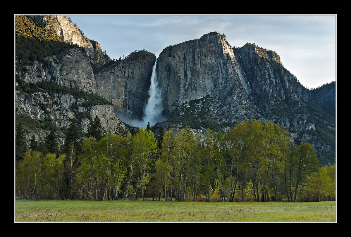
Since I didn't make it to the valley this spring, one from last year will have to do. I have a similar comp with no sky in my gallery. I kept thinking that this needed more contrast while processing it. I made a couple of adjustments while working it up. now, I'm wondering if the contrast isn't a tad too heavy??? Large version included, I'd love to hear your thoughts.

D200,
18-70mm,
Soft GND,
1/6sec, F/13,

Chris

Comments

14 comments
Comment posted by Jared Atencio on June 24, 2011 at 1:56 AM
I think I'd prefer less contrast here Chris, as it does feel rigid and heavy to me. Love this classic Yosemite view.
Registered on June 23, 2009, 21 Posts, 422 Comments
Comment posted by Lon Overacker on June 24, 2011 at 2:50 AM
Chris,

Yet another fine Yosemite image from you. A classic, but a beautifully captured and processed rendition. I like the contrast and I think it works better in the larger version. It does seem somewhat heavy in the smaller version. Honestly though, if no one mentions contrast, I probably don't comment on it. Also in the small version, I'm more distracted by the light on the granite wall, upper left. Much less so in the larger version. Weird. Oh, I like the meadow grasses in the larger version too. Another wonderful Yosemite image.

Lon
Registered on November 24, 2006, 521 Posts, 19147 Comments
Comment posted by Paul Duval on June 24, 2011 at 8:38 AM
Chris,

I see the world of Yosemite has returned to normal here :rolleyes: I'm not sure the contrast is too heavy it has good tonal separation, but the shadows seem to have just the slightest bluish cast. Other than that this is a great morning view of the falls, I not sure how you feel about minor cloning out of modern intrusions but there is a car just showing in the tree line. :jump:

Paul
Registered on June 30, 2009, 508 Posts, 1907 Comments
Comment posted by Mitch Erwin on June 24, 2011 at 9:07 AM
Chris, an aptly named title for this image. Contrast wise, it looks good, and I don't think I would have noticed had you not mentioned it. The larger version is great! :toast:
Registered on April 24, 2006, 98 Posts, 656 Comments
Comment posted by Nick Bristol on June 24, 2011 at 9:08 AM
What a wonderful view. I really enjoying looking at this Chris. The large version looks really nice to me, and I bet this would make a beautiful large print. I know I would enjoy it!

Nick Bristol
Lone Rock, WI
Registered on February 1, 2004, 752 Posts, 14140 Comments
Comment posted by Michael R Reynolds on June 24, 2011 at 10:19 AM
Chris,
Really love the viberance you've got in this early morning shot. Really captures the spirit of the Valley in spring. Good composition. Nicely done.
Registered on February 26, 2008, 54 Posts, 812 Comments
Comment posted by Bill Chambers on June 24, 2011 at 10:37 AM
Iconic, but sweet, My only nit (minor) is that I wish there was more grass visible at the bottom.
Registered on April 10, 2005, 753 Posts, 21216 Comments
Comment posted by Jorne de Bruin on June 24, 2011 at 11:55 AM
The contrast is just right in the larger version, sweet icon shot! :wavey:
Registered on June 26, 2008, 178 Posts, 2136 Comments
Comment posted by Harley Goldman on June 24, 2011 at 12:05 PM
I am seeing a lot of cyan on the back walls and in the waterfall. It is indeed a classic view, but doesn't rank up there with one of my favorites from your excellent collection.
Registered on November 19, 2003, 586 Posts, 11271 Comments
Comment posted by Sarah Marino on June 26, 2011 at 12:58 PM
Hi Chris - I like this image as presented. I think the contrast is just about right. I also like the blue in the shadows but agree that the water might have too much of a color cast. Beautiful image!
Registered on November 10, 2008, 23 Posts, 393 Comments
Comment posted by John Williams on June 26, 2011 at 8:58 PM
Classy classic Chris. Larger version looks great. I would also whiten the water a bit.
Registered on September 6, 2007, 221 Posts, 5985 Comments
Comment posted by Stan Rose on June 26, 2011 at 10:57 PM
Im surprised that no one has mentioned the fact that this is Yosemite Falls in shadows. I mean, the entire subject is in shadows! Apparently it works for some folks--just doesnt for me :wink: :wavey:
Registered on September 15, 2005, 836 Posts, 17099 Comments
Comment posted by Chris Chamberlain on June 27, 2011 at 7:28 PM
Hey Stan, thanks!!!! :smile: It's cool, I was kind of thinking the same thing, but the greens and overall aesthetics of the scene, not the light was what I was capturing here. In order to have light on the falls, it would have had to be around 9:30. By then, the light kind of sucks, cause' all of the foreground would be in bright light.

Cheers,
Chris
Registered on March 13, 2007, 500 Posts, 8365 Comments
Comment posted by Pedro Bento on June 28, 2011 at 8:40 AM
Your work from Yosemite it's always an inspiration.
I have a dream to visit this valley someday, and when It happens I'll remind your great shots
from here.
The contrast and procession is perfect as usual.

PB
Registered on September 2, 2007, 45 Posts, 761 Comments