Nature Photographers Network
This is the preserved archive of the original Nature Photographers Network. The community continues at naturephotographers.network.
Cape Breton Pebbles + Repost
‹ PreviousLandscape GalleryNext ›

Cape Breton Pebbles + Repost

by Eva McDermott

Gallery: LandscapePosted June 29, 2011646 views8 comments
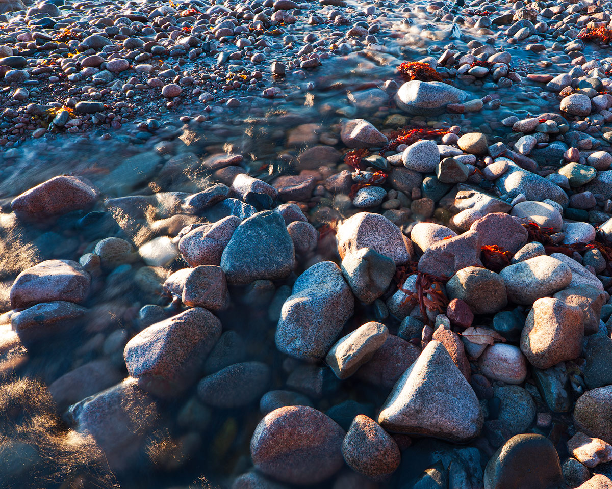
Pebbles on the beach at St. Ann's Bay, Cape Breton Island, Nova Scotia. The light swirling around the colored rocks on the beach caught my eye. No sure this will work for everyone but I liked the scene. The sun has been up for 20 minutes and the light was quite bright.

Thanks for having a looked and for any comments or critiques.

Canon 5DM2
Canon TS-E 24mm f/3.5L II
ISO 50 2sec f/16
SR Color Combo Polarizer

Comments

8 comments
Comment posted by Dorin Bofan on June 29, 2011 at 2:03 PM
I like how the red algae help creating a bit of diversity in the patterns. It's a very interesting study and something rather different from you, Eva. On the nit picking side, you could tame the highlights a bit.
Registered on April 30, 2007, 122 Posts, 3086 Comments
Comment posted by Bill Chambers on June 29, 2011 at 2:03 PM
Certainly works for me, although I might crop a bit off the top to emphasize the larger rocks more. Love the warm/cool contrast, and the texture of the rocks.
Registered on April 10, 2005, 753 Posts, 21216 Comments
Comment posted by Andreas Resch on June 29, 2011 at 2:49 PM
Love the place and the great amount of stones you've found here, Eva. I love what's going on on the right side but am a bit on the fence about the stuff going on in the corners on the left side - they don't fit into the overall abstract pattern of the shot too well for me. The high saturation and strong contrast is a matter of taste. Personally I would like them tuned down a little - it will still be a strong and powerful shot.
Registered on November 14, 2007, 322 Posts, 6101 Comments
Comment posted by Lon Overacker on June 29, 2011 at 3:51 PM
Eva,

I really like the perspective and viewpoint here. And while the light is hitting some of the rocks hard, I like most of the specular highlights being created - especially in the "swirls" you noted. I might be inclined to run Super Brights luminosity mask and/or a burn/dodge layer and tone down those bright highlights a little bit. But otherwise, I really like this somewhat intimate capture of these highlighted stones and water - even considering the hot spots on a few of the rocks.

And since I'm always harping on blue and cyan, I'll just say that I think these colors work well and add to the overall color scheme of the image. Well seen and captured Eva.

Lon
Registered on November 24, 2006, 521 Posts, 19147 Comments
Comment posted by Eva McDermott on June 29, 2011 at 11:14 PM
Here is a reworked image with highlights reduced and both red and cyan reduce -30. I never increase saturation BTW. The red seaweed is due to back light from the newly risen sun. I had further reduced the Super Brights with TK layers. In final processing after sharpening, I darkened the image a bit. Thanks all for your input. The swirling highlights on the left are what caught my eye so I decided to leave them more or less as is.
Registered on January 4, 2009, 1015 Posts, 13229 Comments
Comment posted by Lon Overacker on June 30, 2011 at 5:15 PM
Eva,

Thanks for taking the time for the rework. The reduction in the highlights looks much better. For me though, the contrast/saturation wasn't bothering me, so I'd be happy with something in between the two, with the highlights as you now have them. Of course, as with any image, we're in the personal choice end of things anyway, so in the end it's whatever you think works best.

Lon
Registered on November 24, 2006, 521 Posts, 19147 Comments
Comment posted by Nick Bristol on June 30, 2011 at 7:22 PM
Hi Eva, This might not be a favorite from you for me, but I do like it. I can sure see why you made this image because of that swirling light and all the nice shapes and textures you caught.. I kind of like the idea of cropping some of the top off, but that is just a feeling I have looking at this and you may not want to loose that part.
I think the repost looks pretty good, but I like the color saturation better in the first one. Sure hope to make it out that way one day and see some of these places for myself. Meanwhile, I'll keep enjoying these through your eyes.

Nick Bristol
Lone Rock, WI

Registered on February 1, 2004, 752 Posts, 14140 Comments
Comment posted by Rudy Ruberti on June 30, 2011 at 10:45 PM
I think I would prefer a combination of the two, reduce the highlights a bit but keep the saturation. I can also see a slight crop off the top, as I find the lower part of the scene more interesting.
Registered on October 28, 2008, 179 Posts, 1875 Comments