Nature Photographers Network
This is the preserved archive of the original Nature Photographers Network. The community continues at naturephotographers.network.
Comanche Point +REPOST
‹ PreviousLandscape GalleryNext ›

Comanche Point +REPOST

by Jake Case

Gallery: LandscapePosted July 4, 2011264 views5 comments
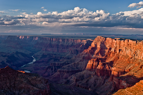
As monsoon season starts again here in Arizona, I've revisited some of my shots from last year. This is, of course, one of the "iconic" shots from the Grand Canyon's South Rim. I remember the evening as being absolutely gorgeous, and setting up at Navajo Point was an absolute pleasure as the crowds are null compared to Desert View a half mile away. I wandered a bit experimenting with different foreground subjects, but I found myself more pleased with this "simple" composition utilizing only the far cliffs. I made many exposures, but I liked this one the best because of the particular cleanness the clouds have, and the particular way the light is hitting Comanche Point down the canyon. In a previous version of this photo, I received a critique on a different website that he wished there was more frame to the left of the river, so I have been considering cropping the right hand side if that would possibly balance the composition better. Anyone agree or disagree with the crop idea? Any other comments and critiques are appreciated!

Canon T1i @ 30mm
ISO 100
f/9.0
1/20 sec

Comments

5 comments
Comment posted by Barry Vangrov on July 4, 2011 at 7:39 PM
I could see cropping the right side for a square comp that I think would work nicely but you'd be losing a great deal of the really nice light on the canyon walls on that side. So I think I'd stick with this. Maybe brighten up the lower left corner just a bit.
Registered on September 1, 2009, 148 Posts, 749 Comments
Comment posted by Tony Kuyper on July 4, 2011 at 8:37 PM
The clouds are definitely important here to add an element to the sky and which works well with the sunlit land. Processing-wise, this has a bit of an Ektrachrome feel to me, which I always felt was a bit to bluish on the color balance. So this sort of has a bit of a "retro" style to it, which is OK, especially with this subject matter.
Registered on November 1, 2003, 364 Posts, 22328 Comments
Comment posted by Ed Lowe on July 4, 2011 at 10:17 PM
I for one would hate to lose that warm light on the right side, Jake. This is just a suggestion, but what do you think of a small crop from the bottom and right side to get rid of the sunlit rock in the LRC? My eye keeps going down to that area instead of the rest of this beautiful scene.

Ed
Registered on February 7, 2004, 414 Posts, 7115 Comments
Comment posted by Jake Case on July 5, 2011 at 12:50 AM
The more I try to crop it, the more I don't want to. That little piece is distracting, but I think it's better to keep it than to lose 1/4 of the frame. I did discover a neat thing in Nik Color Efex Pro called "Tonal Contrast", so here is a repost using that effect. Let me know if it looks too fake or HDRish.
Registered on December 13, 2010, 38 Posts, 167 Comments
Comment posted by Nick Bristol on July 5, 2011 at 4:30 PM
What a beautiful view Jake. I like this very much. The color works really nice for me. I think I like the original better than the repost. Imo I would not crop the right side. I love the light there, but I can understand the thinking for that. I like it this way. :toast:

Nick Bristol
Lone Rock, WI
Registered on February 1, 2004, 752 Posts, 14140 Comments