Gallery: Regional: UKNPPosted July 7, 2011135 views12 comments
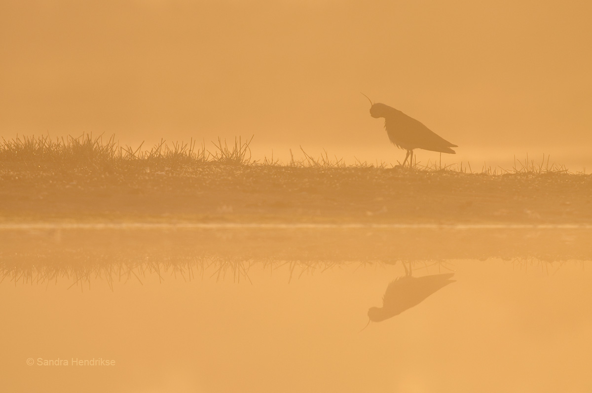
A preening Lapwing, taken at sunrise on a misty morning. Although I like the shot, I'm not quite sure about this one. Does it work?
Nikon D300s @ 500 mm, iso 200, 1/800 sec, F 6.3 on a groundpod.
Comments
12 comments
Comment posted by Andy Shepherd on July 7, 2011 at 4:42 PM
Hello Sandra,
The soft muted colours work well and make for a very atmospheric scene, composition is spot on too. The image works IMO.
I think you have scope to produce two very different images with this one, a lift in contrast would give this a little more punch and give a totally different feel, either way it looks good.
Andy...
Registered on September 24, 2006, 123 Posts, 1254 Comments
Comment posted by John Robinson on July 7, 2011 at 4:53 PM
That,s different !
I think I agree with Andy about giving it a bit more "oomph!"
Cheers
John
Registered on March 2, 2008, 535 Posts, 2453 Comments
Comment posted by Matt Cole on July 7, 2011 at 5:57 PM
That's nice Sandra, I like it. It's perhaps not entirely obvious that the Lapwing is preening so I wonder if a more standard pose would work better. It has a lovely atmosphere though.
Matt
Registered on February 18, 2008, 17 Posts, 267 Comments
Comment posted by Bob Johnson on July 7, 2011 at 6:54 PM
Hi Sandra I like the shot and the soft effect but agree with Matt regarding the pose. also a tighter crop could work
Bob
Registered on December 8, 2010, 17 Posts, 169 Comments
Comment posted by keith mitchell on July 8, 2011 at 2:55 AM
Sandra it works for me just as it is i love this type of image that you are posting.
Keith.
Registered on July 12, 2008, 127 Posts, 1735 Comments
Comment posted by David Sewell on July 8, 2011 at 10:03 AM
It works for me as it is. It would be great, however, if you could post a version with higher contrast as well, as Andy and John suggest, for comparison.
David
Registered on September 10, 2008, 63 Posts, 801 Comments
Comment posted by Phil Ellard on July 8, 2011 at 1:32 PM
The soft colours and muted feel work wonderfully, I am a fan of subtle. But the bird pose lets it down as you cannot see the beak the crest takes on the beak but at a funny angle, if that makes sense . As already said a more normal pose would make this a cracker. Do you have one?
Registered on December 17, 2010, 60 Posts, 634 Comments
Comment posted by Robert Lawrence on July 8, 2011 at 2:02 PM
I like the overall effect of this Sandra and you may well have another which will really float my boat but in the end this one doesn't quite work for me. As has been mentioned, the pose is the biggest drawback for this. I have always believed that for a silhouette to work it has to be a distinct shape that can be readily identified and unfortunately this one isn't. It is possible to imagine what the bird is doing but visually it doesn't stand up unless you can see the beak.
Compositionally, I think I would have had the horizontal line less central. I can appreciate that you are probably trying to create a 'mirror' image as it were but I feel it would be stronger with a bit less at the bottom and more above.
I agree that more contrast would create a 'different' image but that would not be how this type of image would appear in my minds eye. As you have presented it is exactly how I imagine this type of lighting to be and I like it.
Registered on February 13, 2008, 3 Posts, 163 Comments
Comment posted by Sandra Hendrikse on July 10, 2011 at 6:43 AM
Thank you all very much for taking the time to comment on this image. Nice to read the different viewpoints. Although I have a more standard pose, I've posted this shot to find out what your thoughts were, as I also had my doubts about the pose. The suggestion to lift the contrast never crossed my mind, but it certainly was an eye-opener. I just gave it a try and I've posted the result for comparison. Besides that I've also adjusted the composition a little bit.
Registered on January 23, 2008, 48 Posts, 769 Comments
Comment posted by Simon Litten on July 10, 2011 at 12:56 PM
Works for me all day long! Great shot
Simon
Registered on June 22, 2006, 24 Posts, 275 Comments
Comment posted by Ian Haskell on July 12, 2011 at 7:10 PM
I don't mind how the shot is processed. Both have their own individual merits...overall though the mood in the first is best imho, but I like misty shots (so subjective choice really).
Ian
Registered on October 30, 2008, 24 Posts, 673 Comments
Comment posted by Craig Jones on July 14, 2011 at 5:51 PM
A lovely image with bags of atmosphere, beautiful lighting and the reflection is the icing on the cake
Registered on January 31, 2009, 67 Posts, 316 Comments

Comments
12 commentsHello Sandra,
The soft muted colours work well and make for a very atmospheric scene, composition is spot on too. The image works IMO.
I think you have scope to produce two very different images with this one, a lift in contrast would give this a little more punch and give a totally different feel, either way it looks good.
Andy...
I think I agree with Andy about giving it a bit more "oomph!"
Cheers
John
Matt
Bob
Keith.
David
Compositionally, I think I would have had the horizontal line less central. I can appreciate that you are probably trying to create a 'mirror' image as it were but I feel it would be stronger with a bit less at the bottom and more above.
I agree that more contrast would create a 'different' image but that would not be how this type of image would appear in my minds eye. As you have presented it is exactly how I imagine this type of lighting to be and I like it.
Simon
Ian