Gallery: LandscapePosted July 12, 2011597 views32 comments
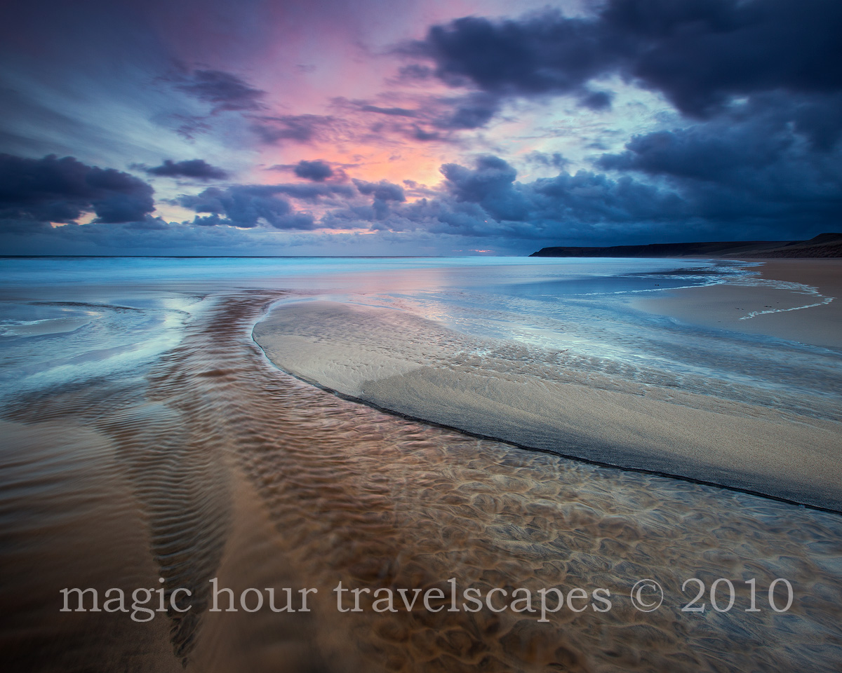
Isle of Harris, Scotland
Sand patterns and a wonderful sunrise.
Canon 5DMkII, 16-35mm
Comments
32 comments
Comment posted by Joel Hazelton on July 12, 2011 at 1:14 AM
Yes!!!
Registered on August 6, 2008, 194 Posts, 1315 Comments
Comment posted by Mark Metternich on July 12, 2011 at 3:45 AM
Geeze this is nice! Way to go on the Shot Kah.
Registered on June 19, 2009, 276 Posts, 6240 Comments
Comment posted by Eva McDermott on July 12, 2011 at 6:53 AM
Absolutely gorgeous Kah Kit! Love how the ripples acts as pathway into the scene of color and simple beauty. The lines of texture and light are nothing short of amazing! I keep coming back to this.
Registered on January 4, 2009, 1015 Posts, 13229 Comments
Comment posted by Gorka Lopez on July 12, 2011 at 7:22 AM
Great guiding lines, textures and tones. I find the sky a little bit dark, but I understand that it adds great drama to the scene.
Congratulations.
Registered on July 4, 2011, 8 Posts, 31 Comments
Comment posted by Anthony Gibson on July 12, 2011 at 7:48 AM
This is really nice, the cool blue tones throughout really puts this scene over the top. Great find and capture.
Registered on June 11, 2008, 19 Posts, 130 Comments
Comment posted by Nancy Lea Sandy on July 12, 2011 at 9:29 AM
I love all the textures in this image. The colors are pretty sweet, too! Compositional elements are perfect (as usual) Very nice image.
Registered on January 24, 2011, 576 Posts, 6942 Comments
Comment posted by Nick Bristol on July 12, 2011 at 9:35 AM
This is Beautiful!! I love the colors in this and the fantastic mood. Great shot Kah!
Nick Bristol
Lone Rock, WI
Registered on February 1, 2004, 752 Posts, 14140 Comments
Comment posted by Koveh Tavakkol on July 12, 2011 at 9:41 AM
The sand patterns look incredible, and the light is very nice as well. The vignetting on the upper right does seem a little strong.
Registered on September 1, 2009, 41 Posts, 608 Comments
Comment posted by Kah Kit Yoong on July 12, 2011 at 10:03 AM
@ Koveh. I removed the natural vignette at first, then applied one at the last minute. Might be a bit heavy top right as you say, perhaps also bottom left.
Registered on September 27, 2006, 636 Posts, 10682 Comments
Comment posted by Hamed Musharbak on July 12, 2011 at 10:15 AM
this is nice kah, lovely colors in the sky
Hamed
Registered on June 1, 2009, 372 Posts, 2282 Comments
Comment posted by Marc Adamus on July 12, 2011 at 10:25 AM
The water seems to have something of a shimmer to it, giving this more of a tropical feel than Scotland! I love the refreshing blues and pastels here working to accentuate the mood as well.
Registered on September 17, 2005, 780 Posts, 8091 Comments
Comment posted by Jorne de Bruin on July 12, 2011 at 12:37 PM
Superb! Love the colour combination here and all the lovely texture!
Registered on June 26, 2008, 178 Posts, 2136 Comments
Comment posted by Rafael Rojas on July 12, 2011 at 12:38 PM
Quite a flow here...The textures are really lovely. Well done Kah
Registered on March 1, 2009, 56 Posts, 623 Comments
Comment posted by Preston Birdwell on July 12, 2011 at 2:06 PM
Very moody, Kah Kit. I think it could be a bit brighter, and the cyan appears to be a little strong. I like the composition and there is a lot of nice detail to explore.
--P
Registered on November 1, 2003, 471 Posts, 5188 Comments
Comment posted by R.Bill Moser on July 12, 2011 at 2:56 PM
Amazing.
Registered on January 29, 2010, 285 Posts, 4281 Comments
Comment posted by Tony Kuyper on July 12, 2011 at 3:03 PM
What a fantastic comp, Kah-Kit, and the light too. You brought it all together perfectly, as usual.
Registered on November 1, 2003, 364 Posts, 22328 Comments
Comment posted by Harley Goldman on July 12, 2011 at 6:18 PM
Real sweet! Wild colors.
Registered on November 19, 2003, 586 Posts, 11271 Comments
Comment posted by Paul Marcellini on July 12, 2011 at 8:00 PM
I've known you as someone who keeps colors natural. So I believe those blues but man they are more cyan than I would expect. It defintely catches the eye nicely though. Love the depth and patterns.
Registered on November 27, 2007, 250 Posts, 2468 Comments
Comment posted by Kah Kit Yoong on July 12, 2011 at 9:27 PM
Thanks for your suggestions. I've re-worked this from scratch with a warmer colour balance. The cyan was present on the RAW but became stronger with the contrast work. I've reduced the saturation in areas where it may have been too strong.
Registered on September 27, 2006, 636 Posts, 10682 Comments
Comment posted by Michael J Greene, on July 12, 2011 at 11:17 PM
Kah,
I like the complex composition and the foreground is especially interesting. The colors and lines are fantastic. Have you considered processing with two different white balances for the sky and foreground? I don't take many ocean shots and have never visited your neck of the woods, but personally I've noticed what I thought to be too much cyan in almost all of your most recent seascapes. In your re-post, I notice the vignetting is gone (improvement), but you didn't pull any cyan out of the sky. Other than that, this shot is money.
Michael
Registered on June 18, 2009, 86 Posts, 2317 Comments
Comment posted by Jean Day on July 13, 2011 at 12:37 AM
The curves and textures of the fg really pull me in to the image and up to those gorgeous tones in sea and sky. I also prefer the original image color especially with the vignette as it seems to help keep the focus on that great curve of sand leading to the light. Beautiful.
Registered on April 10, 2011, 36 Posts, 306 Comments
Comment posted by Rudy Ruberti on July 13, 2011 at 1:49 AM
Beautiful scene. I think the repost is even better, as the corners of the sky seem a little dark in the original. Great foreground, too.
Registered on October 28, 2008, 179 Posts, 1875 Comments
Comment posted by Jack Graham on July 13, 2011 at 2:29 AM
Kah---love the rework----the FG is very much the line into this wonderful image.
JG
Registered on November 26, 2003, 158 Posts, 574 Comments
Comment posted by Gary McGhee on July 13, 2011 at 7:53 AM
Very nice indeed Kah, I too prefer the repost. There is so much to look at in this. The curving sand bar and the textures and patterns in the water are wonderful. Gorgeous colours throughout.
Gary.
Registered on April 15, 2010, 142 Posts, 2416 Comments
Comment posted by Mark Seaver on July 13, 2011 at 11:49 AM
This is beautiful! The foreground stream with the ripples and waves really grabs my eyes and leads them to that lovely wash of pink sky. I like how the repost has opened up the foreground even more.
Registered on January 23, 2011, 1103 Posts, 17270 Comments
Comment posted by Chikku Baiju on July 13, 2011 at 12:43 PM
very nice indeed! never would have thought this was Scotland. Love the repost as well. Everything just looks perfect here.
Registered on January 9, 2010, 31 Posts, 246 Comments
Comment posted by David Edwards on July 14, 2011 at 4:28 AM
A fabulous and unusual image, Kah Kit. I love the fg sand patterns and lines... a great comp. The coloration of the water seems quite cyan and vivid, but I like the glow of the light on this colour and how it really lifts the image. The reworked repost has better overall colour balance, but it seems to have lost a bit of that glow and contrast on the water that I liked in the original. Can't please everyone I suppose
Registered on December 6, 2008, 142 Posts, 2623 Comments
Comment posted by Vance Gese on July 14, 2011 at 1:34 PM
The large scale abstract design of the beach and water is incredible and complemented nicely by the amazing sky.
Registered on November 13, 2008, 298 Posts, 6629 Comments
Comment posted by Malcolm Muir on July 14, 2011 at 2:09 PM
Fantastic - few better places for sky and seascapes than the Hebrides IMHO. This one really has punch, well done.
Registered on August 14, 2005, 12 Posts, 66 Comments
Comment posted by Morris McClung on July 14, 2011 at 9:34 PM
Well, this is a little bit of glorious! Magnificent color and light and the comp is exquisite.
Registered on May 7, 2007, 670 Posts, 19650 Comments
Comment posted by dean hebert on July 16, 2011 at 1:49 PM
I love the colour and ripples in the sand.
Registered on August 4, 2010, 70 Posts, 1132 Comments
Comment posted by John Williams on July 17, 2011 at 4:10 PM
The two go together perfect! The repost looks great.
Registered on September 6, 2007, 221 Posts, 5985 Comments

Comments
32 commentsCongratulations.
Nick Bristol
Lone Rock, WI
Hamed
--P
I like the complex composition and the foreground is especially interesting. The colors and lines are fantastic. Have you considered processing with two different white balances for the sky and foreground? I don't take many ocean shots and have never visited your neck of the woods, but personally I've noticed what I thought to be too much cyan in almost all of your most recent seascapes. In your re-post, I notice the vignetting is gone (improvement), but you didn't pull any cyan out of the sky. Other than that, this shot is money.
Michael
JG
Gary.