Nature Photographers Network
This is the preserved archive of the original Nature Photographers Network. The community continues at naturephotographers.network.
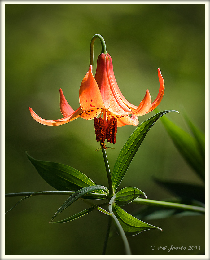
Canada Lily -- BETTER?
‹ PreviousFlora GalleryNext ›

Canada Lily -- BETTER?

by Wayne Jones

Gallery: FloraPosted July 13, 2011813 views29 comments
This is ALMOST identical to the image I posted Monday night but shot a few minutes earlier at 1/160 sec. instead of 1/100 sec. After I shot this, I looked at the histogram and decided to up the exposure to push the curve to the right, as I have heard is the correct way to shoot. After posting that brighter image, I compared it to a couple of beautiful images in the Landscape Gallery (posted by Marc Adamus and Stan Rose) and realized that for months I have been posting images brighter than I like. (Complicated reasons, partly related to a problem with dark prints I have been struggling with.)

So... I went back to the darker image, (partly because the background light was a little different then) and reprocessed it to match the memory and feeling I got when the sun hit the flowers as I crouched with my feet in the water of that shady swamp.

QUESTION: I got all positive comments on the brighter version, but it looks a bit harsh to me. Can you do me a favor and please click HERE to see the brighter one side-by-side with this one? (by re-sizing the two windows).
I like this darker one better, DO YOU?

THANKS in advance for you honest opinions!

Larger image provided

Canon 50D
Sigma 150 mm. Macro; Circ.Polarizer
f/4 @ 1/160 sec.: ISO 100
Four images stacked in CS5 for depth-of-field
Double-processed in ACR to reduce a couple of highlights

Comments

29 comments
Comment posted by Pat Sampson on July 13, 2011 at 9:50 PM
Wayne,

As much as I liked the first image, I prefer this one. Of course I like the dark side. For me, there's a stronger mood in this one, maybe a little more mystery.

I've discovered that on about anything I do, I need to bring the image up about 3/4 to 5/4 of an F/stop to print it and proofs are the only way I can tell for sure. That means I typically have to reduce the dynamic range in the image or have the highlights blown out when I print. I hate it. (smile)

pat
Registered on May 19, 2007, 953 Posts, 15989 Comments
Comment posted by scott lanz on July 13, 2011 at 9:57 PM
Tough call, Wayne. I am going to straddle the fence on this one. My initial reaction was that I preferred the original, but on further review, I like them both equally.
Registered on November 14, 2003, 840 Posts, 12902 Comments
Comment posted by Wayne Jones on July 13, 2011 at 10:04 PM
Thnks guys.
PAT -- Sorry to hear you have the same printing agony that I have, but it's comforting to know I am not alone! :wink:
Registered on April 18, 2007, 953 Posts, 6435 Comments
Comment posted by Barbara Graham on July 13, 2011 at 10:52 PM
Wayne, I love this version of the image. It is so elegant, with wonderful colors and sharpness and composition.
Registered on July 27, 2010, 1310 Posts, 5035 Comments
Comment posted by Mark Windom on July 13, 2011 at 11:56 PM
Easy call for me, I much prefer this second version. The darker BG helps place emphasis on the main subject and the colors stand out much better. :toast:
Registered on November 1, 2003, 176 Posts, 2302 Comments
Comment posted by Charlie Baugh on July 14, 2011 at 1:39 AM
This one definitely for my taste. I absolutely love the included foliage, all of it. And yet an insect to really please me. Thumbs and toes up, Wayne.

Charlie :smile:
Registered on April 18, 2011, 329 Posts, 1985 Comments
Comment posted by Gary Yeoh on July 14, 2011 at 3:34 AM
Wayne:
Definitely this one for sure. The mood is stronger in this one and the color saturation is better too. :toast:

I am also finding that my prints are darker than I expect.
Registered on September 1, 2009, 588 Posts, 8184 Comments
Comment posted by Bob&Charly Nelson on July 14, 2011 at 7:02 AM
Wayne, while I like them both, this has a way of making the subject look stunning. My vote goes here.
Bob
Registered on October 27, 2005, 289 Posts, 4202 Comments
Comment posted by Derek Yow on July 14, 2011 at 1:27 PM
+1 for this version Wayne! This one I think captures the beauty of this subject with more impact.
Registered on May 18, 2010, 26 Posts, 655 Comments
Comment posted by Krunal Janani on July 15, 2011 at 1:51 AM
Well this has an obvious mood attached to it & if i were to chose i wud chose this Wayne
on the print issue (i m no expert on it) but here's my view on it
as monitors are backlight viewing media u need a bit of less brightness then the print media just to get that ahh that's perfect feeling
so when i print something i just add a bit of brightness to my images (very little) to get as close to as it looks on my monitor
just my 2 cents :wavey:
Registered on September 16, 2010, 60 Posts, 1370 Comments
Comment posted by Sarah Clarehart on July 15, 2011 at 2:12 AM
Beautiful.. I like this one also. The orange really pops! I love the pose of the flower.
Registered on April 22, 2011, 5 Posts, 30 Comments
Comment posted by Morris McClung on July 15, 2011 at 8:16 PM
Perfect!
Registered on May 7, 2007, 670 Posts, 19650 Comments
Comment posted by Albert Darmo on July 16, 2011 at 10:59 AM
Hi Wayne :wavey: I could go on all day about this subject :eek: I to like my images on the dark side, when i keep my shots to the Rt side of the histogram, thiey look to light, before being corrected in photoshop what to do? for prints. done at the photostore, to the left,....... for photoshop to the rt of center.of the histogram ..... Yes!1 i prefer the darker version :smile:.Marvelous work :cool: !!
Albert Darmo
Registered on November 25, 2008, 1386 Posts, 11978 Comments
Comment posted by Bill Fach on July 16, 2011 at 2:35 PM
Wayne: I'll have one of each in 16x20 so I can make a proper comparison. I thought the original was fine but this is even better. Plus you get major props for catching this in the wild and for the party crasher. Superb image.>=))>
Registered on November 1, 2003, 1805 Posts, 26981 Comments
Comment posted by John Robinson on July 16, 2011 at 7:47 PM
Love it !
I certainly prefer the darker one. Interesting discussion too.
JohnR
Registered on March 2, 2008, 535 Posts, 2453 Comments
Comment posted by Bob&Charly Nelson on July 21, 2011 at 4:46 PM
Congrats on the WP Wayne..... Well done.
Bob
Registered on October 27, 2005, 289 Posts, 4202 Comments
Comment posted by Giuseppe Guadagno on July 21, 2011 at 5:27 PM
I am glad for your WP, Wayne. In the previous post I sad that I liked everything; Here I like more than everything. Yes, this is is better for me too.
Cheers.
Registered on February 3, 2007, 827 Posts, 5052 Comments
Comment posted by Albert Darmo on July 21, 2011 at 7:02 PM
Hi wayne :wavey: Congrats on a well deserved WP :toast:
Albert Darmo
Registered on November 25, 2008, 1386 Posts, 11978 Comments
Comment posted by SandyRichardsBrown on July 21, 2011 at 7:20 PM
Gorgeous - congrats on the WP!
Sandy
Registered on November 24, 2003, 3937 Posts, 12909 Comments
Comment posted by Mark Seaver on July 22, 2011 at 11:21 AM
This is fabulous. I really like how the bloom glows as if lit from within. Sorry I missed this in the forum. Congrats on the WP!
Registered on January 23, 2011, 1103 Posts, 17270 Comments
Comment posted by Ian Wolfenden on July 22, 2011 at 11:51 AM
Sorry I missed this very beautiful image, Wayne - many congratulations on a well deserved EP !!
Registered on May 18, 2007, 1108 Posts, 7647 Comments
Comment posted by Ramamohan Pai on July 22, 2011 at 12:42 PM
Congrats Wayne on a richly deserved EP :toast:
Registered on November 1, 2003, 550 Posts, 9037 Comments
Comment posted by Jeremy Week on July 22, 2011 at 8:34 PM
Love the comp you did here! Light and colors are wonderful! The dragonfly is the icing.
Registered on February 19, 2007, 62 Posts, 394 Comments
Comment posted by Nate Chappell on July 24, 2011 at 12:15 AM
Congrats Wayne :toast: :toast:
Registered on February 1, 2006, 1158 Posts, 19528 Comments
Comment posted by Morris McClung on July 24, 2011 at 10:40 PM
Congratulations on the EP! :toast:
Registered on May 7, 2007, 670 Posts, 19650 Comments
Comment posted by John Launstein on July 26, 2011 at 5:35 PM
Wayne, this is an absolutely stunning image. The lighting is incredible...exquisite really. The sharpness outstanding, the bokeh beautiful, the colours and textures...captivating. The tonal range of the OOF background, and the particular patterns it gives (working flawlessly with the comp you chose), is a key element to taking a great image and making it exceptional. Congrats on the WP...this one is top shelf.
Registered on April 5, 2011, 223 Posts, 1193 Comments
Comment posted by Kah Kit Yoong on July 27, 2011 at 10:32 AM
Congrats. This is exquisite.
Registered on September 27, 2006, 636 Posts, 10682 Comments
Comment posted by Christine Adams on July 29, 2011 at 12:50 PM
Hi Wayne! I don't get on here as much as I used to but I'm REALLY glad I didn't miss this one. It's gorgeous!! I, too, prefer this one but wouldn't mind a version that's in the middle of both. Congrats on you EP!!!

Glad that you're posting and I hope your health is continuing on the right course!! :jump:
Registered on January 24, 2006, 119 Posts, 1871 Comments
Comment posted by Mohammad Hosseini on August 1, 2011 at 9:16 AM
Wayne, Both of them are perfect. But, when I compare them, I prefer this one better. I like the darker BG.
I am so surprised that you have captured the insect exactly in the same position in both images. Congrats on WP well deserved.
Registered on May 16, 2011, 15 Posts, 301 Comments