Nature Photographers Network
This is the preserved archive of the original Nature Photographers Network. The community continues at naturephotographers.network.
Arctic skuas + UPDATE
‹ PreviousRegional: UKNP GalleryNext ›

Arctic skuas + UPDATE

by Edwin kats

Gallery: Regional: UKNPPosted July 14, 2011272 views14 comments
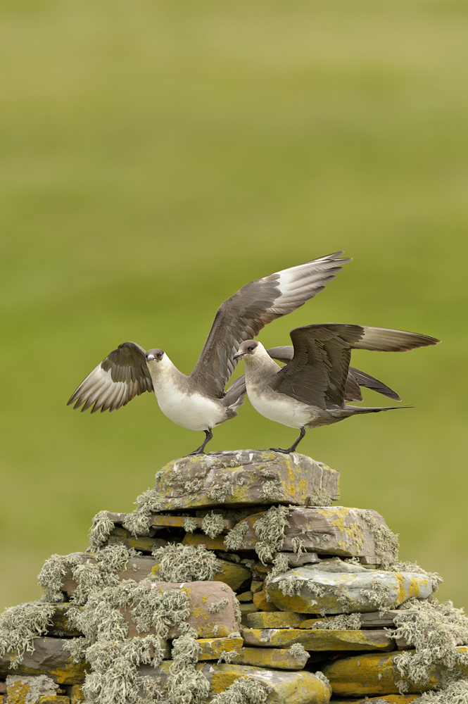
We were really happy when we found an arctic skua on a beautiful lichen covered wall. After an hour or so the male returned to his mate and capturing both male and female in the same shot was a real treat.

iso 400 1/1000 sec. f/4 full frame

Edwin

Comments

14 comments
Comment posted by Malcolm Muir on July 14, 2011 at 3:09 PM
They really are beautiful birds, arctic skuas - pity about their habits! Lovely shot: love the shape of the wall and texture of the lichen.

:toast: :toast:
Registered on August 14, 2005, 12 Posts, 66 Comments
Comment posted by Philip Hodgkins on July 14, 2011 at 3:24 PM
I would echo Malcolm's observations. To me, the photo seems flat. I am sure this is due to the lighting, but I think a bit more contrast might get a little more pop out of it. Or possibly darken the mid tones. Also, a crop from the top would give a less centered focus to the subjects.
Registered on July 24, 2006, 2741 Posts, 12349 Comments
Comment posted by Daniel & Loana on July 14, 2011 at 4:12 PM
Great capture, Edwin.
Registered on October 7, 2008, 166 Posts, 3044 Comments
Comment posted by Verdon on July 14, 2011 at 4:45 PM
great shot and quality is stunning, the top of the frame is for me pretty boring , Probably I would cut it out, thank you for sharing :toast:
Registered on June 10, 2011, 147 Posts, 1444 Comments
Comment posted by John Robinson on July 14, 2011 at 6:36 PM
I can see why you have gone for full frame portrait ( to make use of the wall , I presume ) but to me the birds cry out for landscape. maybe the space at the top is with a view to publication.
Nice shot though.
JohnR
Registered on March 2, 2008, 535 Posts, 2453 Comments
Comment posted by Neil Burton on July 15, 2011 at 3:35 AM
OK, I can see they are trying to take off but cannot, it is not litchen it's glue? :biggrin: It is a great shot but like the others am not sure about the comp.
Registered on September 16, 2010, 26 Posts, 461 Comments
Comment posted by Edwin kats on July 15, 2011 at 7:18 AM
Thanks all. I was really curious about your ideas concerning the comp and I agree with you. If I can I always take both horizontal and verticals of the same subject. Shame I can't show the update on a 1000 px size.

cheers,

Edwin
Registered on April 24, 2006, 177 Posts, 399 Comments
Comment posted by Edwin kats on July 15, 2011 at 7:19 AM
Thanks all. I was really curious about your ideas concerning the comp and I agree with you. If I can, I always take both horizontal and verticals of the same subject. Shame I can't show the update on a 1000 px size. Update is slight crop to get the births bigger in the frame.

cheers,

Edwin
Registered on April 24, 2006, 177 Posts, 399 Comments
Comment posted by Phillip Tomkinson on July 15, 2011 at 8:04 AM
Very nice Edwin.

Phil.

:toast: :toast: :toast: :toast: :toast: :toast: :toast: :toast: :toast: :wavey:
Registered on July 14, 2005, 194 Posts, 427 Comments
Comment posted by Mike Smith on July 15, 2011 at 9:38 AM
Horse for courses, all great shots, intial one perfect for editorial style and second one is really nice in its own right. A classic Shetland rock vantage point image

:toast:
Registered on September 16, 2005, 12 Posts, 46 Comments
Comment posted by Neil Burton on July 15, 2011 at 10:26 AM
:toast:
Registered on September 16, 2010, 26 Posts, 461 Comments
Comment posted by David Sewell on July 15, 2011 at 10:29 AM
Very marginal, but I think I prefer the landscape format version. Great shot either way though.

David
Registered on September 10, 2008, 63 Posts, 801 Comments
Comment posted by Des Ong on July 15, 2011 at 11:53 AM
The landscape version is a classic presentation so should appeal to most viewers but I see the application of the original portrait version as the surrounding space screams cover shot to me. Personally I prefer the 2nd one, not because it's bigger in the frame, but rather I get a look'in from the bird on the left and also the contrasting wings position between the two birds. Both lovely to be honest...
Registered on July 12, 2007, 23 Posts, 234 Comments
Comment posted by John Robinson on July 15, 2011 at 7:59 PM
Second for me. Des has summed it up better than I can. I did think about the publication aspect though.
JohnR
Registered on March 2, 2008, 535 Posts, 2453 Comments