Nature Photographers Network
This is the preserved archive of the original Nature Photographers Network. The community continues at naturephotographers.network.
Pemaquid Point Sunrise
‹ PreviousPhoto Art GalleryNext ›

Pemaquid Point Sunrise

by Scott Snyder

Gallery: Photo ArtPosted July 15, 2011139 views9 comments
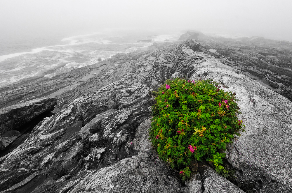
Another great Maine sunrise!

July 4 a couple years ago. By the time the fog burned off all color was gone. That did not bother me a bit. Had a couple hours to wander alone in this usually crowded summer tourist spot.

I usually do not like combo bw/color conversions, but there was so little color in this that it seemed an obvious choice. The area around the Pemaquid Point lighthouse is one of my favorites. Great layered rock tumbling down into the Atlantic. Enjoy

Cheers,

Scott

Comments

9 comments
Comment posted by Richard Siggins on July 15, 2011 at 12:10 PM
Not what I was expecting for "Pemaquid Point Sunrise". It's nice to see a different look to this "usually crowded summer tourist spot". Only suggestion would be to crop a little more off the top.

I'm not a big fan of desaturating part of a photo, but in this case it works well. I bet this is a good photo even without that treatment.
Registered on October 11, 2007, 115 Posts, 223 Comments
Comment posted by Phil Pogledich on July 15, 2011 at 12:15 PM
I'd be curious to see this with a bit of color returned to the desaturated area. Even before reading your description, I felt that you must have selectively desaturated everything but the plant. Sometimes that's a neat effect but I don't generally care for it in nature photos. I think even a hint of color in the rest of the scene might do the trick . . . it's certainly a nice composition and the foreground plant anchors the scene nicely.
Registered on August 24, 2009, 123 Posts, 3099 Comments
Comment posted by Yiming Hu on July 15, 2011 at 1:24 PM
Not sure if I like the treatment. The comp looks nice to me.

Plan to visit there next week. Hope I can see some colors :smile:
Registered on April 28, 2011, 38 Posts, 733 Comments
Comment posted by Floris van Breugel on July 15, 2011 at 1:57 PM
Very interesting take, Scott. I like how the pinks stand out so well. The misty atmosphere adds a lot too.

I am going to go ahead and move this to photo art, hope you understand.
Registered on December 19, 2008, 306 Posts, 4840 Comments
Comment posted by Scott Snyder on July 15, 2011 at 3:12 PM
Thanks for the comments ya'll. Floris, no problem. I think I'll take another look at a straight color version too.
Registered on November 11, 2009, 45 Posts, 161 Comments
Comment posted by Scott Snyder on July 15, 2011 at 4:04 PM
Here's a full color version too. Which do you prefer? After reworking I may prefer the color version.
Registered on November 11, 2009, 45 Posts, 161 Comments
Comment posted by David W. Kelly on July 16, 2011 at 1:55 PM
I do like the original but I prefer the color version. Nice image.
Registered on October 7, 2005, 883 Posts, 6590 Comments
Comment posted by Carol Hyman on July 17, 2011 at 12:03 PM
Scott, I think this is beautifully done. What I like second best (after the color combined with black and white) are the rocks. They pull the eye into the image and out again to the flowers. Well seen.

Regards,

Carol

My preference is the original posted image.
Registered on January 18, 2007, 597 Posts, 8062 Comments
Comment posted by Mark Pelton on July 19, 2011 at 10:13 PM
They are both very nice, but I might have to go with the original post. Nice concept.
Registered on November 25, 2003, 380 Posts, 4647 Comments