Nature Photographers Network
This is the preserved archive of the original Nature Photographers Network. The community continues at naturephotographers.network.
BlueJay + Repost
‹ PreviousAvian GalleryNext ›

BlueJay + Repost

by Ray Whitt

Gallery: AvianPosted July 22, 2011202 views17 comments
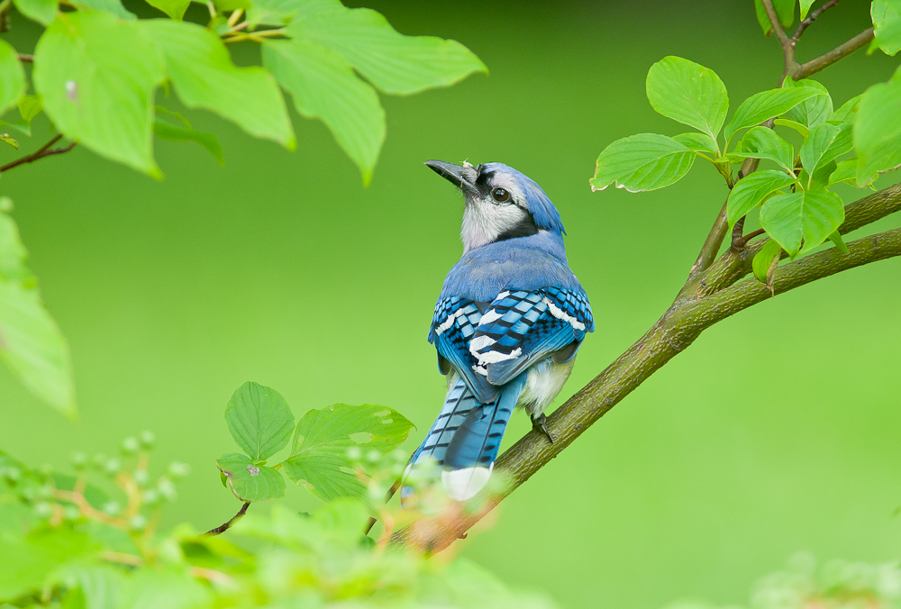
Took this shot at the New York Botanical Gardens a couple of springs ago. A wonderful place for viewing plants and birds. Nikon D300 with 300mm f2.8 with 1.7tc. ISO 640. f5, Shutter !/320. Comments and critique welcomed. Thanks, Ray

Comments

17 comments
Comment posted by Dennis Plank on July 22, 2011 at 10:45 PM
Excellent detail and exposure, Ray. I like the head turn and the way the leaves frame the Blue Jay.
:toast:
Registered on January 28, 2008, 1767 Posts, 23192 Comments
Comment posted by SandyRichardsBrown on July 22, 2011 at 10:54 PM
I miss these "real" Blue Jays of my Ohio childhood. the Stellar ones here are not as beautiful, imo.

Great pose and head-turn, bright eye, lovely greens. Too bad the tail is partially obscured - but still a very nice image.
Sandy
Registered on November 24, 2003, 3937 Posts, 12909 Comments
Comment posted by Carol Nichols on July 22, 2011 at 11:07 PM
Beautiful blue jay Ray. Very nice turn of the head. All the shades of blue and details in the feathers are just wonderful. Although the green is a very beautiful color, I almost wonder if toning down the green would bring more attention to the bird and less to the greenery.
Registered on November 7, 2007, 161 Posts, 1420 Comments
Comment posted by Brian Gatlin on July 22, 2011 at 11:28 PM
nice head turn and setting, Ray. details and DOF look good. colors are very pretty but do feel a little oversaturated. I might clone out the white spot on the leaf at top left.
Registered on March 21, 2009, 202 Posts, 4187 Comments
Comment posted by Ray Whitt on July 23, 2011 at 6:16 AM
Decreased saturation, thanks for the suggestion.

Ray
Registered on May 27, 2011, 92 Posts, 2619 Comments
Comment posted by Angela McCain on July 23, 2011 at 8:37 AM
Great image. Beautiful soft foliage nicely framing the bird. The covered tail tip doesn't bother me at all-gives some character. It looks like in your redo you decreased your general saturation button. I have tons of bluejays in my yard and the color of the bird her is spot on in the original. If you want to selectively reduce greens and yellows just a few clicks, I would do that, but bring the bird back to his original glory. I would crop on the right to the edge of the OOF leaves in the upper right corner though. Getting the bird out of the center and leaving more room on the left.
Registered on April 19, 2009, 367 Posts, 3589 Comments
Comment posted by Robert Bunch on July 23, 2011 at 11:29 AM
Beautiful! Great detail, color and background.
Registered on May 18, 2004, 124 Posts, 2503 Comments
Comment posted by Katja Rosvall on July 23, 2011 at 3:38 PM
Just lovely colours with the blue (especially the patterns on the wings) against the green. I actually like the original colours as they are; and not bothered one bit by the slightly obscured tail-tip. Fantastic!
Registered on August 16, 2009, 28 Posts, 636 Comments
Comment posted by Julia Flanagan on July 23, 2011 at 6:03 PM
I liked the first image before looking at the second, but I do think the reduced saturation helps highlight the bird. I also agree with Sandy's preference for the tail to be clearly seen and the suggestion that the bird be further to the right in the fram. Still those are fairly minor. I don't think the oof fg greenery helps here. But I love the pose, the beautiful blues and the simplicity of the green bg.
Registered on November 13, 2003, 59 Posts, 986 Comments
Comment posted by Mia McPherson on July 23, 2011 at 7:45 PM
I like the pose, tilt of the head and the nice look at the eye. I much prefer the toned down version as the colors all look more natural to my eye. I'd consider cropping the right side to eliminate the OOF leaves on that side and perhaps some from the bottom as well.
Registered on June 25, 2007, 491 Posts, 12566 Comments
Comment posted by Cheryl Molennor on July 23, 2011 at 8:10 PM
I agree with all the comments althought the colors are glorious in the OP I do prefer the repost. I like how the Jay is looking up. Nice image.
Registered on June 30, 2009, 300 Posts, 5051 Comments
Comment posted by Ray Whitt on July 24, 2011 at 9:35 AM
Thanks all for the comments and critique. Thanks for your input on the bluejays color Angela, I'll bring him back to his original glory. Appreciate it. Ray
Registered on May 27, 2011, 92 Posts, 2619 Comments
Comment posted by Sharon Hallowell on July 24, 2011 at 11:44 AM
The colors of the jay are better in the first image, which I like very much. Sharon
Registered on November 1, 2003, 392 Posts, 4810 Comments
Comment posted by Ken Archer on July 24, 2011 at 8:13 PM
Great blue jay and habitat photo Ray! Personally I like the original.

Ken Archer
Registered on October 28, 2004, 222 Posts, 6683 Comments
Comment posted by Howard Cheek on July 25, 2011 at 7:03 AM
I like the rich green environment that the botanical gardens provide, and this natural framing.
Great detail and exposure with the soft light, nice head turn also.
I might clone out the small debris on the leaf upper left if it was mine.
Good job with the green on that repost too Ray :toast:
Registered on July 24, 2008, 1201 Posts, 10758 Comments
Comment posted by Gary Marquart on July 25, 2011 at 10:17 AM
Nice image Ray, for me the greens were over bearing in the original post, but I like the repost very much. It posed very nicely for you with it's head turned up. :toast:
Registered on October 24, 2009, 126 Posts, 799 Comments
Comment posted by Ashley Vincent on August 6, 2011 at 1:17 AM
Love the composition shot through leaves, such a beautiful bird! The repost is definitely more appealing, very nicely done Ray :^)
Registered on March 1, 2011, 154 Posts, 2083 Comments