Nature Photographers Network
This is the preserved archive of the original Nature Photographers Network. The community continues at naturephotographers.network.
Drop
‹ PreviousFlora GalleryNext ›

Drop

by Nicolaus Wegner

Gallery: FloraPosted August 5, 201175 views10 comments
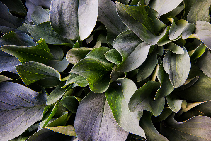
Outside of my comfort zone on this one. Not sure how others will feel about this, but I like it in a way. This is a plant of some type that was growing amongst the boulders up in Cloud Peak Wilderness. It's probably pretty common stuff. No idea what it is called.

Technical: This is an 8 image depth of field blend. Taken with a wide angle lens as close as I could get in focus. 29mm, iso 100, f/16, .6 seconds on all 8 images.

Thanks for any critiques...would be curious as to how this comes across as it's not something I do much. Used to the wide open dramatic scenics.

Comments

10 comments
Comment posted by Philip Hodgkins on August 5, 2011 at 3:36 PM
It seems undersaturated to me. Also, there is nothing to hold the eye in place. Selective saturation of the center green leaves might help focus the eye's attention. The stack is impressive! It is no mean feat to bring 8 images together at that lengthy an exposure.
Registered on July 24, 2006, 2741 Posts, 12349 Comments
Comment posted by Wayne Willison on August 5, 2011 at 3:40 PM
Got some hot spots, but terrific dof. Good job on the stack.
Registered on April 10, 2009, 292 Posts, 3967 Comments
Comment posted by Nicolaus Wegner on August 6, 2011 at 2:22 AM
It's actually a bit over saturated compared to the real thing Phil, but I can try to saturate the center a bit more. I also noticed that this has a more cohesive pattern that the eye can follow when it is vertical, so I may go that route as well.

Wayne, the hot spots are not technically hot, but they are pushing the limits of the highlights without losing the actual information. I can try to bring those back closer to the original in my next edit.

As for the stack, auto blend in photoshop did it all. It's been the first time I've managed to get that damn action to actually work like it's supposed to. But then there was little to no movement to start with as well as being made up of the same textures throughout the entire image, so that seems to have a huge impact on how the software handles the information. Learned something new about that at any rate.

Thank you both for the critiques.
Registered on February 21, 2010, 133 Posts, 1509 Comments
Comment posted by Pat Sampson on August 6, 2011 at 4:53 AM
I don't remember commenting on one of your images before in Flora Nic, so welcome to the gallery. I also looked at the rest of your NPN gallery and wanted to add that I admire it very much.

This is an interesting image to me. This is as fine a stack as I've seen and it does a great job of depicting the subject textures. With regard to composition, I see two basic repeated shapes here, leaves with sharp points and leaves with rounded tips. The repetition of the two throughout the image creates interest as do the alternating grey and green gradients they create. Nice light throughout as well.

So there's an interesting pattern here at one scale in the image. However, I don't see either of those shapes at a smaller or larger scale in the image nor any complementary or strongly contrasting shape at a different scale. That would be fine if there were some other subject feature that draws the eye and acts as a focal sink using the repeating leaf motif as a supporting bg. I guess where I'm ending up, is that compositionally, to me, this is a really strong and interesting bg but without anything I can clearly identify as a subject element or pattern - my two cents worth. Even so, this is so well done in all respects that it has a lot interest.

I hope you'll post more flora images over here - really fine work as are the images in the rest of your gallery - at least for my tastes.

pat
Registered on May 19, 2007, 953 Posts, 15989 Comments
Comment posted by Nicolaus Wegner on August 6, 2011 at 10:59 AM
Thank you for the thoughtful input Pat. This is definitely a first for me so any recommendations for improvement are much appreciated. The shots in this gallery are pretty amazing. I see a lot of foliage images in the landscape gallery and often wonder why they are not here as this seems like the proper place to receive input from people more studied in this subject matter.

Taking everyones' recommendations...hope this is slightly better. I realize the only way to get something better is to probably re-shoot, but thought I might try this and see how it comes across. It's a pretty quick edit and I will probably need to restart from scratch on the image to get all highlights/shadows properly processed, but any additional thoughts are appreciated. Thank you.
Registered on February 21, 2010, 133 Posts, 1509 Comments
Comment posted by Philip Hodgkins on August 6, 2011 at 2:02 PM
I like the vertical much better. The green saturation looks to be global; and, while giving a center of focus quite well, it has also made some funky green splashes elsewhere. I would suggest selectively saturating just the center leaves.
Registered on July 24, 2006, 2741 Posts, 12349 Comments
Comment posted by Pat Sampson on August 6, 2011 at 3:28 PM
I like the repost Nic. My eye goes to the center leaf, sees the framing around it from the echoing verticals and the flat grey leaf petals and then stays put. Much stronger comp without losing the other strengths.

pat
Registered on May 19, 2007, 953 Posts, 15989 Comments
Comment posted by Stan Rose on August 7, 2011 at 9:17 AM
The repost is much better! Nice shapes and textures. I have one suggestion which i learned quickly when i began experimenting with intimate flora shots like this (and you will learn quickly too! :wink: ) is to use a CP to control those hot spots--keep turning it until the light/reflections look optimal--live view helps here. :wavey:
Registered on September 15, 2005, 836 Posts, 17099 Comments
Comment posted by Ramamohan Pai on August 7, 2011 at 3:08 PM
Nicely seen, Nicolaus :smile: - well framed with so many repeating shapes and edges. If I were to suggest one thing, it would be to tone down or burn the brightness on the leaf at the top just left of center and one more on the right of center.
Registered on November 1, 2003, 550 Posts, 9037 Comments
Comment posted by Nicolaus Wegner on August 8, 2011 at 6:13 PM
Thank you for the comments and suggestions.

Stan and Ram, I think my biggest issue with what you see here is me overprocessing those highlights. The was no direct or reflected sunlight, so a cpl would not have done much here. I use some pretty unorthodox methods for editing my images...sometimes I forget to pay attention to things like this until it's too late. I'll re-edit it this week with everyones' suggestions though. Thanks much for the input.
Registered on February 21, 2010, 133 Posts, 1509 Comments