Nature Photographers Network
This is the preserved archive of the original Nature Photographers Network. The community continues at naturephotographers.network.
Resting
‹ PreviousWildlife GalleryNext ›

Resting

by Neal Cooper

Gallery: WildlifePosted August 7, 201190 views6 comments
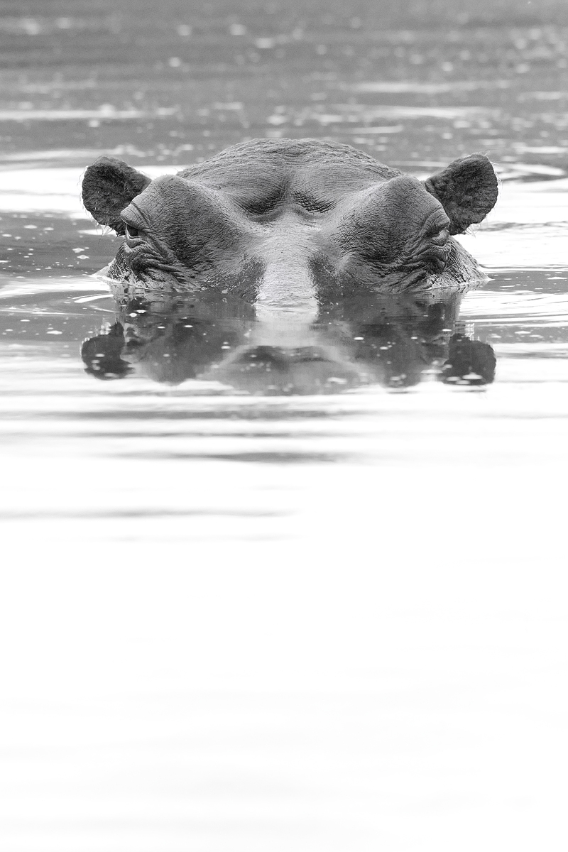
My first posting in Black and White. Your crits would be much appreciated as this is a new medium for me.

Camera Model Canon EOS-1D Mark IV
Shooting Mode Manual Exposure
Tv( Shutter Speed ) 1/1250
Av( Aperture Value ) 8.0
ISO Speed 3200
Focal Length 500.0mm

Comments

6 comments
Comment posted by Philip Hodgkins on August 7, 2011 at 4:45 PM
Neal, photographically this is a strong composition, with "in your face" impact. As B/W, not so much. Ideally, there should be tonal balance. You have way too much white and very little beyond mid-tone gray. I would play with tones on this some if it were mine. I would also consider whether this were better off in color.
Registered on July 24, 2006, 2741 Posts, 12349 Comments
Comment posted by Richard Teller on August 7, 2011 at 5:18 PM
I like the in your face feeling of the image. I would like it better in most of the foreground was cropped, maybe clear back to the ripples.
Registered on August 23, 2010, 1162 Posts, 6692 Comments
Comment posted by John Blumenkamp on August 8, 2011 at 12:02 AM
Very cool image, and that eye contact is awesome. I agree with Richard and think cropping some from the bottom will give this more impact.
Registered on February 26, 2011, 58 Posts, 313 Comments
Comment posted by Ajit Huilgol on August 8, 2011 at 8:06 AM
Agree with the others. There is too much detail-less foreground.
Registered on December 19, 2008, 302 Posts, 2055 Comments
Comment posted by Brad Hill on August 8, 2011 at 9:03 AM
Hi Neal,

I like your overall composition and the texture in the skin of the hippo is just great. And, the reflection adds to the image as well. I actually like the B&W conversion here - especially how it works in the top half of the frame - there's a nice tonal range there. I have no problem at all with using negative space in an image, but in this case the brightness of the bottom half of the frame and the complete lack of detail there makes the bottom half of the frame look as this region is simply blow-out (I'm not saying it is, but it has that APPEARANCE). So even tho I like the existing positioning of the hippo in the frame, I still think in this case cropping off a significant chunk of the foreground would increase the appeal of the image (at least to me!). Personally I'd cut it just below the horizontal ripples (cutting out the ripple closest to the bottom of the frame).

Cheers...thanks for sharing this...

Brad
Registered on May 29, 2007, 431 Posts, 6061 Comments
Comment posted by Neal Cooper on August 9, 2011 at 7:25 AM
Thanks for you comments. I am reposting the image, this time I have used a 1:1 ratio and cut off most off the white area below.
I think this works better.
Registered on June 3, 2009, 144 Posts, 306 Comments