Gallery: FloraPosted August 15, 201142 views9 comments
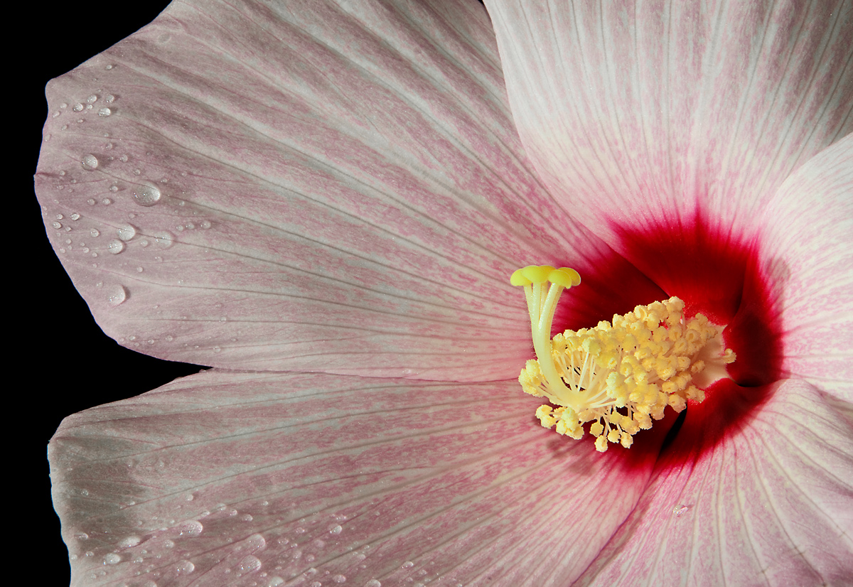
D300 18-200mm @ 200mm F38 1.5 sec. ISO 100
Another artificial light interior flower shot
Comments
9 comments
Comment posted by Ramamohan Pai on August 15, 2011 at 5:18 PM
Nicely done, superb details and water drops add a nice touch . A frame filling composition could have been another option here.
Registered on November 1, 2003, 550 Posts, 9037 Comments
Comment posted by Pat Sampson on August 15, 2011 at 7:37 PM
Bob,
I like the image but the black space on the side bothers me a little. Excellent detail in the center and while I'd hate to give up the droplets, I might be inclined to crop in some from the left.
pat
Registered on May 19, 2007, 953 Posts, 15989 Comments
Comment posted by Nancy Lea Sandy on August 15, 2011 at 8:12 PM
Excellent lighting. Petals look almost translucent. The drops are nice
Registered on January 24, 2011, 576 Posts, 6942 Comments
Comment posted by Gary Yeoh on August 15, 2011 at 8:33 PM
Bob:
Excellent lighting especially the slightly brighter red at the base of the pistil. Good details as well. I also find the dark area on the left merging with the bg frame confusing - a thin narrow frame or a lighter bg would resolve this issue.
Registered on September 1, 2009, 588 Posts, 8184 Comments
Comment posted by scott lanz on August 15, 2011 at 8:51 PM
Really looks great for F38. I like the detail throughout the image, the preservation of which is even more remarkable given the strong light. I like the inclusion of the waterdrops, and I don't see any crop I'd like better than the image as presented.
Registered on November 14, 2003, 840 Posts, 12902 Comments
Comment posted by Bill Fach on August 16, 2011 at 12:40 AM
Bob: Good light management. I agree with Ram regarding filling the frame. In the larger view there isn't as much apparent negative space since the edge of the photo doesn't merge with the BG frame. As a result I like the larger version more than this presentation. >=))>
Registered on November 1, 2003, 1805 Posts, 26981 Comments
Comment posted by Bob&Charly Nelson on August 16, 2011 at 6:54 AM
Gosh I like this Bob. I don't mind the negative space as I don't see any way to make a crop work with the drops (which are a big plus). Well done in my opinion.
Bob
Registered on October 27, 2005, 289 Posts, 4202 Comments
Comment posted by Mark Seaver on August 16, 2011 at 8:46 AM
This is a terrific image. The wash of red throughout the petals is great and the water drops are a fine addition. Given the details in the stamen and pistils and the leaves, I have to ask, Is this a stack?
Registered on January 23, 2011, 1103 Posts, 17270 Comments
Comment posted by Wayne Willison on August 16, 2011 at 10:57 AM
Striking image, Bob. f/38? Wow, it held together well. I like the comp, and have to say the black bordering the petals is effective in that it provides a punchy contrast.
Registered on April 10, 2009, 292 Posts, 3967 Comments

Comments
9 commentsI like the image but the black space on the side bothers me a little. Excellent detail in the center and while I'd hate to give up the droplets, I might be inclined to crop in some from the left.
pat
Excellent lighting especially the slightly brighter red at the base of the pistil. Good details as well. I also find the dark area on the left merging with the bg frame confusing - a thin narrow frame or a lighter bg would resolve this issue.
Bob