Nature Photographers Network
This is the preserved archive of the original Nature Photographers Network. The community continues at naturephotographers.network.
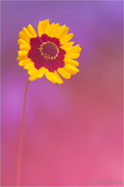
Coreopsis + One More
‹ PreviousFlora GalleryNext ›

Coreopsis + One More

by Ramamohan Pai

Gallery: FloraPosted August 28, 2011145 views14 comments
Continuing with my experiment with Crams (it literally gives me cramps, easy as it may look, its not). I need to thank Nathan for his feedback on my previous photo where he suggested I use wider aperture. I have tried that here.

ND300s, AFD200mm F/4 Micronikkor, F/6.3, 1/50 Sec, ISO400 and Tripod. The purples comes from Phlox and the Red one comes from the Red Begonia which is crammed.

Thanks a lot for your comments on Helenium in Purple Mist and do let me whether this one appeals or not.

Comments

14 comments
Comment posted by Ramamohan Pai on August 28, 2011 at 6:24 PM
Another Version.
Registered on November 1, 2003, 550 Posts, 9037 Comments
Comment posted by Pat Sampson on August 28, 2011 at 6:43 PM
Ram,

I like both images. My reservation is the wash covering the bloom. It makes me feel a little like I'm looking through something (which I suppose I am) in order to see the subject. Ideally for me, there would be less wash over the subject on both.

pat
Registered on May 19, 2007, 953 Posts, 15989 Comments
Comment posted by Nathan Buck on August 28, 2011 at 10:45 PM
Great riot of colors Ram. Excellent use of the begonia to cram with. I think this apreture works a bit better for me on this one (glad that I could help :smile:). I think there is a tad too much stem in the shot - so I would crop some, but not too much.

Nathan
Registered on November 1, 2003, 1101 Posts, 13589 Comments
Comment posted by Gary Yeoh on August 29, 2011 at 3:21 AM
Ram:
I prefer the red/purple version mainly because the bloom is more clearly seen with less cram effect over the flower. The colors on the bloom are striking. You may like to clone out the pollen grains on the red of the petals in the first version.
Registered on September 1, 2009, 588 Posts, 8184 Comments
Comment posted by scott lanz on August 29, 2011 at 7:08 AM
I like the first (red) version for the same reason Gary likes the purple. :confused: To me, the red looks a little clearer/sharper (less wash over the bloom). As I have commented in response to several recent images, including your Helenium image, I personally am not a big fan of images where the main subject is washed out or opaque. I personally would have favored more detail in the blooms of these images, but that's just me. The colors in both are beautiful, especially the first.
Registered on November 14, 2003, 840 Posts, 12902 Comments
Comment posted by Ramamohan Pai on August 29, 2011 at 9:49 AM
Thanks for the feedback everyone :cool: - it certainly helps as I make some progress in crammed photos :wavey: . I do have photos without any wash at all but it would have been just same old.
Registered on November 1, 2003, 550 Posts, 9037 Comments
Comment posted by Morris McClung on August 29, 2011 at 1:01 PM
Well, I'm hot then cold on these. :biggrin: Both are incredible to me. :toast: :toast:
Registered on May 7, 2007, 670 Posts, 19650 Comments
Comment posted by Wayne Willison on August 29, 2011 at 1:24 PM
Nice work, Ram. I vote for the red one for similar reasons being not so much wash on the petals. But I also favor it because of how the light purple washes down the stem. More of an all round visual impact for me.
Registered on April 10, 2009, 292 Posts, 3967 Comments
Comment posted by Bill Fach on August 29, 2011 at 4:27 PM
Ram: I vote for number 1 here for sure. I like seeing a bit more definition in the stem and I much prefer the varicolored BG. I second your comment about getting cramps when cramming. I have an angle finder that is indispensable for the low down work. Nathan is still a pup so he can get away with it. I'm an old codger and every time I cram my mind flashes to that old commercial where granny cries out "I've fallen and I can't get up!" :wink: Beautiful work. >=))>
Registered on November 1, 2003, 1805 Posts, 26981 Comments
Comment posted by Anne K. Rusk on August 29, 2011 at 5:32 PM
I like the first one especially with your color choices, but not so keen on the second. The second it seems like the flower is floating, which is not something I usually go for. I do like the first, but would like a little more yellow to come through!
Registered on October 10, 2010, 65 Posts, 904 Comments
Comment posted by Craig Strand on August 30, 2011 at 6:35 AM
This is really nice Ram, much better (IMHO) then the last with this wider aperture. I enjoy seeing more of the main bloom in focus by comparison and the soft pastel palette of color has a wonderful feeling. Well done!
Registered on March 30, 2008, 416 Posts, 2885 Comments
Comment posted by Krunal Janani on August 30, 2011 at 10:17 AM
Lovely cram Ram i m loving both the versions here, although this technique is somewhat alien to me but definitely something i wud love to learn from u & Nathan :)
Registered on September 16, 2010, 60 Posts, 1370 Comments
Comment posted by Robert Dayton on August 30, 2011 at 11:53 PM
Very sharp where it counts the most. I loke the varying tones of the background.
This works for me. I prefer the first version.
Registered on November 11, 2008, 281 Posts, 3958 Comments
Comment posted by Albert Darmo on September 2, 2011 at 9:11 PM
Hi Ram :wavey: Color and form to die for, love it :toast:
Albert Darmo
Registered on November 25, 2008, 1386 Posts, 11978 Comments