Nature Photographers Network
This is the preserved archive of the original Nature Photographers Network. The community continues at naturephotographers.network.
Relight my fire (repost)
‹ PreviousLandscape GalleryNext ›

Relight my fire (repost)

by Dorin Bofan

Gallery: LandscapePosted September 1, 2011638 views29 comments
Repost way below

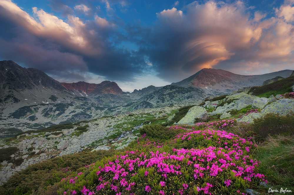
Here's another one from this summer, back in June when the alpine rhododendron was in full bloom. It was one of the finest clouds display at sunrise I've seen in Retezat National Park. Regarding processing, I still feel something's not right. I don't know exactly what it is, maybe you guys can give a helping hand here. Or maybe it's just my imagination.

450d, Tokina 12-24 at 12mm, f10, blend of three exposures

Comments

29 comments
Comment posted by Morkel Erasmus on September 1, 2011 at 3:23 PM
Those are some insane clouds! :eek:
Love the depth in your composition, the play of colours and the fine detail throughout. I assume the bright patches on the mountains are patches of snow? They seem a tad too bright? (Never seen snow so I might be off the mark here, they may very well reflect much more light than what is evident on the rest of the mountain?)
Registered on March 22, 2011, 385 Posts, 2068 Comments
Comment posted by Enrique Vizcarra on September 1, 2011 at 3:25 PM
Fantastic!!!!
Registered on September 10, 2009, 223 Posts, 393 Comments
Comment posted by Aaron Feinberg on September 1, 2011 at 3:34 PM
Looks pretty good...regarding processing the blend/grad line is a bit too strong and your fg/mg is more gray and doesnt pop...suggest some levels/curves and get that bad boy away from middle 'gray'. Rockin :)

aF
Registered on October 26, 2009, 399 Posts, 2789 Comments
Comment posted by Allen Brooks on September 1, 2011 at 3:55 PM
This is a very nice photograph. That's a very interesting cloud formation on the right and the sky colors came out well as did the rhododendron. I suppose there are ways to make this pop more, but I'll leave those suggestions to the experts. I think it is pretty darn nice as nice. :toast:
Registered on July 27, 2011, 262 Posts, 2597 Comments
Comment posted by Joshua Hardin on September 1, 2011 at 4:12 PM
Nice light, color and clouds! I think Aaron is on to something about the look of the overall image, although it might have less to do with the color and more to do with the midground looking brighter to my eyes than the rest of the image. This is an issue since your primary subjects are in the foreground (flowers) and background (mountains/clouds) while there isn't much going on in the middle.
Registered on July 29, 2006, 40 Posts, 414 Comments
Comment posted by Daniel Rappaport on September 1, 2011 at 4:46 PM
I don't see anything wrong with the processing, but at the risk of being offensive, if this were mine I'd crop the heck out of the left side of the image and a little of the left as well. That makes the leading line of the flowers more prominent taking me right to the beautiful light and shape of that cloud.
Registered on September 9, 2009, 294 Posts, 2006 Comments
Comment posted by Harry Lichtman on September 1, 2011 at 5:04 PM
Dorin - First, great find and comp. I would agree a small cropoff the left to the flowers wouldn't harm the image at all- and even a vertical of the right with the flowers peak and clouds would be really nice. Regarding the processing, the FG and midground lok a bit bright compared to the peaks (moreso on the left). Clouds can cast shadows on the higher summits to give this effect, so this could be the case. The left peaks throw this off more - scroll cropping the left seems to help the image overall. Great alpine scenery!
Registered on September 17, 2010, 304 Posts, 3507 Comments
Comment posted by Robert Stough on September 1, 2011 at 5:07 PM
I think this is excellent Dorin. The composition is very good just as it is and that is quite a spectacular sky. I do think the foreground brightness is a little high for the lighting conditions though and if it were mine I'd back off a bit on the magenta flowers.
Registered on November 20, 2010, 26 Posts, 273 Comments
Comment posted by Bill Chambers on September 1, 2011 at 5:13 PM
Beautiful Dorin. Those clouds are spectacular, and the flowers really jump off the screen. Actually, the flowers might be a little too bright to look realistic, but they look so nice as is I don't know if I would change anything. Really nice capture.
Registered on April 10, 2005, 753 Posts, 21216 Comments
Comment posted by Anthony Vincent on September 1, 2011 at 6:00 PM
Hard not to like this one Dorin. What a crazy cloud above that peak, yowzaa. I think from first impression (critique speaking) there is some heavy contrast in both the fg and bg. The mid and peaks seem hazy or lacking sufficient contrast. I might experiment with matching the mid to the rest and even accentuating the warm light on the peaks. Amp it up :smile:
You surpassed my blending skills here so take my advice with a grain of salt.

thanks for sharing
:toast:
Registered on February 5, 2009, 199 Posts, 2775 Comments
Comment posted by Michael J Greene, on September 1, 2011 at 6:14 PM
Awesome shot Dorin. The sky is amazing. I think your processing is suitable as is, but if you want to try to improve I think you could:
1) increase contrast on left hand side front in rocks 2) reduce brightness of flowers 3) even out blue tones in sky by dodging and burning.
A terrific scene for sure. The thumbnail jumps right off the page. Great work on some complex subject matter.

Michael :wavey:
Registered on June 18, 2009, 86 Posts, 2317 Comments
Comment posted by Marc Adamus on September 1, 2011 at 7:25 PM
Personally I'm seeing a stronger vertical image inside this horizontal one. A 2 by 3 crop around the lenticular clouds and flowers makes for a much more powerful composition with less open space. Still, the horizontal does present a nice sense of place and allows you to include the stream.
Registered on September 17, 2005, 780 Posts, 8091 Comments
Comment posted by Art Escobado on September 1, 2011 at 7:31 PM
Oh yeah that's cool!!
Registered on January 7, 2007, 0 Posts, 775 Comments
Comment posted by Phil Pogledich on September 1, 2011 at 7:47 PM
Looks from the comments like this is one of those images that everyone likes and (almost) everyone has some ideas for improvement. And I'm no exception! It's a fantastic scene and I like the composition. I'm on the same page as Anthony Vincent in terms of what could be addressed if you want to improve the processing a bit. The peaks just seem a bit lacking in contrast, and I notice some inconsistencies in contrast in the vegetation as well. There's also the difference in brightness between the foreground and more distant areas to balance out if you desire. Pretty minor stuff really.
Registered on August 24, 2009, 123 Posts, 3099 Comments
Comment posted by Ed Lowe on September 1, 2011 at 8:17 PM
Killer shot, Dorin. The expansive view of the mountains and FG rhodies along with the drama in the sky are simply outstanding. Did you happen to shoot any verticals of the flowers and the lenticular clouds on the right side? I think that would make for another great image. As far as the processing I think it looks pretty good, but I could see pumping up the contrast just a bit in the mountains. :toast:

Ed
Registered on February 7, 2004, 414 Posts, 7115 Comments
Comment posted by Eva McDermott on September 1, 2011 at 8:36 PM
That's a fantastic cloud on the right. Other than the pinks being a little hot for me, I love the overall scene Dorin. I love the range of greens and spectacular sky.
Registered on January 4, 2009, 1015 Posts, 13229 Comments
Comment posted by Nick Bristol on September 1, 2011 at 10:21 PM
Lots of good suggestions here, but I really think this is just a beautiful scene, and very well done. I like this alot.

Nick Bristol
Lone Rock, WI
Registered on February 1, 2004, 752 Posts, 14140 Comments
Comment posted by Raymond Klassen on September 1, 2011 at 10:31 PM
This is a great looking landscape, and I love those clouds against the deep blue sky. Good job!
Registered on November 30, 2008, 114 Posts, 790 Comments
Comment posted by Matt Anderson on September 1, 2011 at 10:33 PM
Work the grad line / darken the foreground, and hit print.

:toast:
Registered on September 6, 2007, 346 Posts, 2696 Comments
Comment posted by Tony Kuyper on September 1, 2011 at 11:12 PM
Is this for real :confused: Amazing image. Agree that the grad line could use some work, but you've got all here. Once in a lifetime moment for sure.
Registered on November 1, 2003, 364 Posts, 22328 Comments
Comment posted by Dorin Bofan on September 2, 2011 at 2:33 AM
Hey, guys! Thank you so much for your valuable responses. It's greatly appreciated and that's why I love NPN. I'll do a rework today based on your opinions and I'll try to post it. I have a vertical version too, but I decided to keep this one mainly because of the left cloud and the better sense of place it gives, as Marc said. I'll definitely look into the middle area of the image and the foreground. The peaks were pretty dull in the first place (the light that morning worked great only on the clouds) and that area already has boosted color and contrast. I guess it wouldn't hurt some more. Morkel, yes that's snow, and to my eye it looks pretty good, but I'll look into that also.
Registered on April 30, 2007, 122 Posts, 3086 Comments
Comment posted by Andreas Resch on September 2, 2011 at 2:39 AM
No these are some impressive clouds. It all comes very well in this shot. There are some little things you could think about, but they have already been mentioned - nothing that makes this one less enjoyable.
Registered on November 14, 2007, 322 Posts, 6101 Comments
Comment posted by Basil Greber on September 2, 2011 at 11:15 AM
Excellent choice of subject and composition. I think the blend is a bit too obvious, though. That's what might be "not right" in your opinion. You could try to make the blend more smooth, or match it to the photo somehow (follow the horizon or so).
Registered on November 8, 2005, 219 Posts, 1340 Comments
Comment posted by Morris McClung on September 2, 2011 at 1:26 PM
A fantastic cloud to compliment the scene. Great foreground flowers as well. Just a bit more balance in tones as has been suggested.
Registered on May 7, 2007, 670 Posts, 19650 Comments
Comment posted by Dorin Bofan on September 2, 2011 at 2:11 PM
Here's a repost and hopefully it's an improvement over the original. Actually, this is a different blend I did a few weeks back using Tony's masks and now I got to finish it taking into consideration your valuable feedback. There are some minor issues I didn't get to fix yet, but it's close to what I want. Thanks again.
I have a larger version on the website. I think this is the kind of image that's better appreciated on a darker background, so I recommend checking it.
Registered on April 30, 2007, 122 Posts, 3086 Comments
Comment posted by Michael R Reynolds on September 3, 2011 at 1:32 PM
Dorin,
This is a very nice scene. To my eye, the clouds seem just a touch too dark in comparison to the flowers. I would agree with the idea of cropping to a vertical. Still, a very pleasing image. Best Regards.
Registered on February 26, 2008, 54 Posts, 812 Comments
Comment posted by Jose Viegas on September 4, 2011 at 5:45 AM
Wow! That cloud over the mountain is incredible! Great composition and colors Dorin!
Jose
Registered on August 26, 2011, 3 Posts, 66 Comments
Comment posted by Jared Ropelato on September 5, 2011 at 5:08 PM
the cloud and how it's lit up is awesome!
Registered on March 1, 2011, 25 Posts, 204 Comments
Comment posted by Gary Minish on September 7, 2011 at 12:56 AM
An exceptional scene and a superb capture of it, Dorin! I definitely prefer the slightly darker and higher contrast version in the repost. The flowers look more natural in that version and the contrast makes the cloud formations even more powerful. Very, very nice!
Registered on February 4, 2006, 625 Posts, 3583 Comments