Nature Photographers Network
This is the preserved archive of the original Nature Photographers Network. The community continues at naturephotographers.network.
Weed seed dispersal
‹ PreviousFlora GalleryNext ›

Weed seed dispersal

by Charlie Baugh

Gallery: FloraPosted September 5, 201162 views15 comments
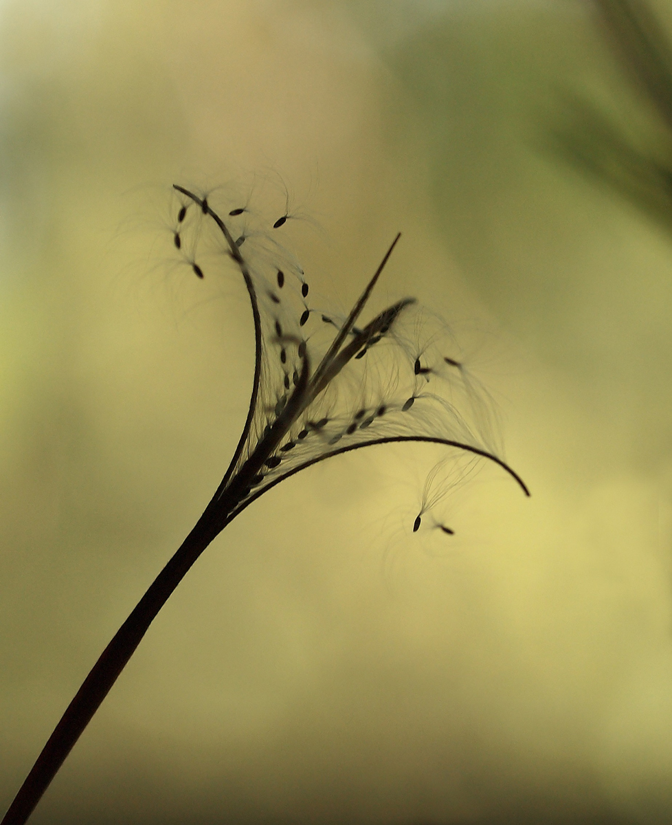
I have posted this weed before as a weed, curves, image and have since seen that the curved elements that I liked were actually the caseing for seeds. As the plant grows the lower and older shafts split and disperse seeds and then become a mass of curved elements which I found so appealing. This photo is more a silouette. I will probably post another photo of the seed dispersal showing pods splitting and two redish pods above not yet opened.

E-5, 50mm F2 macro lens
1/160 sec @ F 5.0, -0.3 EV
flash off
Northern light through window, backlite.
Center weighted avg. metering
ISO 200
manual focus
Tripod
approx 50% of FF

Large view provided

comments and critiques will be much appreciated

Comments

15 comments
Comment posted by Barbara Graham on September 5, 2011 at 6:32 AM
That's really interesting, Charlie, and the lines and curves are beautiful.
Registered on July 27, 2010, 1310 Posts, 5035 Comments
Comment posted by Pat Sampson on September 5, 2011 at 8:23 AM
Excellent documentary style image Charlie. Very interesting. I think the silhouette approach is perfect for what you wanted to show here.

pat
Registered on May 19, 2007, 953 Posts, 15989 Comments
Comment posted by Richard Teller on September 5, 2011 at 9:34 AM
i like the seeds very much. I think I might be tempted to take out some of the open space so that the focus is even more on the interesting part of the image. Well seen.
Registered on August 23, 2010, 1162 Posts, 6692 Comments
Comment posted by Monica Siri on September 5, 2011 at 10:20 AM
Charlie,
I really like your compositional choice and how the falling seeds give dynamism to the image.
Cool shot. :toast:
Registered on September 20, 2009, 132 Posts, 3764 Comments
Comment posted by Mark Seaver on September 5, 2011 at 11:02 AM
I like the curled pods and the winged seeds lined up to leave the nest. Nice job of seeing.
Registered on January 23, 2011, 1103 Posts, 17270 Comments
Comment posted by Charlie Baugh on September 5, 2011 at 12:02 PM
Thanks all for comments.

Pat: Yes i tried different ways to shoot this and backlite did what I wanted.

Richard: I did various crops and though I know others would be as or more effective, settled on this.

Monika: Though totally still at time of exposure this does give the feeling of motion. The blurring is more lack of dof than movement.

Mark: The curl of these pods are what fascinates me about this weed.
Registered on April 18, 2011, 329 Posts, 1985 Comments
Comment posted by Morris McClung on September 5, 2011 at 4:05 PM
Exquisite silouhette.Excellent diagonal comp giving a good sense of movement. If it was mine, I would probably clone out the dark area in the urc.
Registered on May 7, 2007, 670 Posts, 19650 Comments
Comment posted by Gary Yeoh on September 5, 2011 at 8:49 PM
Charlie:
Beautiful symmetry in this seed pod. I like the lines fanning out. The darken OOF area in the RUC is a little distracting but I don't know what you can do about it though.

In reply to your question about abstract -I specifically set out to make abstract images. However, I do find this style very challenging because I am not able to pre-visualize the image before making it. I find the 50mm lens with 32mm ET easy to use and handhold; so basically I just stick my nose into the flower and hunt for interesting image through the view finder - not a very efficient or creative way but that is the way I do this at this stage. Ram can pre-visualize the image by looking at the flower... that is the difference between a real master and an amateur like me :frown:
Registered on September 1, 2009, 588 Posts, 8184 Comments
Comment posted by Ramamohan Pai on September 5, 2011 at 9:08 PM
Charlie, What a painterly background :cool: - beautiful Y formation there well captured. The parachutes add to the beauty. If I had a go at this, I'd brighten the background a bit more to improve the starkness feel to this photo :smile:
Registered on November 1, 2003, 550 Posts, 9037 Comments
Comment posted by Charlie Baugh on September 6, 2011 at 12:08 AM
OK Ram, I gave it a quick lick and a promise and let me know if this is at least "towards" what you had in mind.
Registered on April 18, 2011, 329 Posts, 1985 Comments
Comment posted by Ramamohan Pai on September 6, 2011 at 4:11 PM
Yes, Charlie but I want that stuff in the URC to be still there. I want the Y to look upto something in that URC.
Registered on November 1, 2003, 550 Posts, 9037 Comments
Comment posted by Charlie Baugh on September 6, 2011 at 5:47 PM
Any closer? I don't mind if you have improvements.
Registered on April 18, 2011, 329 Posts, 1985 Comments
Comment posted by Ramamohan Pai on September 6, 2011 at 8:18 PM
Looks better with the last repost for me, Charlie :cool: - I am a bit biased towards painterly backgrounds.
Registered on November 1, 2003, 550 Posts, 9037 Comments
Comment posted by Mauro Pasquero on September 7, 2011 at 2:37 AM
Intriguing image, Charlie. Well seen and well done.
Mauro
Registered on January 21, 2010, 650 Posts, 2500 Comments
Comment posted by Albert Darmo on September 10, 2011 at 10:46 PM
Hi Charlie :wavey: Wonderfully composed and presented! Love the lines and light! each version has its merits :cool:
Albert Darmo
Registered on November 25, 2008, 1386 Posts, 11978 Comments