Nature Photographers Network
This is the preserved archive of the original Nature Photographers Network. The community continues at naturephotographers.network.
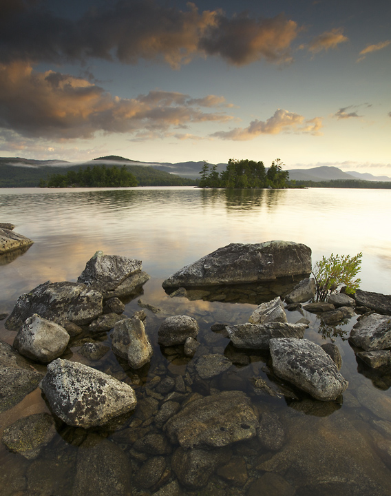
Loon Island
‹ PreviousLandscape GalleryNext ›

Loon Island

by Richie Graham

Gallery: LandscapePosted September 6, 2011176 views9 comments
Another early morning shot of Squam Lake in NH. Pictured here is Loon Island home to a nesting pair of Bald Eagles. Tried to capture the quiet mood of the start of another day on the lake. I like the clouds and the mist working its way through the in the background mountains (the Sandwich Range). Not excited about the colors as I do not feel they are as rich as what I remember seeing that morning. Tried to hold back the wash out on right. Canon 5DM2, 16mm (cropped), F22, 0.5s / -.67ev.

Comments

9 comments
Comment posted by Steve Sieren on September 6, 2011 at 6:26 PM
I like the composition Richie! I don't know if you were aiming just a little more color or heavily saturated colors I usually see here in this forum? Either way I'm sure you could work them in to your specific liking via a layer adjustment mask. Maybe even add more of a warmed tint to the almost blown hilights to tone them down.
Registered on January 2, 2008, 360 Posts, 5321 Comments
Comment posted by Eva McDermott on September 6, 2011 at 7:24 PM
I personally like the subdued color here Richie. Seems like a B&W might work well here.
Registered on January 4, 2009, 1015 Posts, 13229 Comments
Comment posted by Raymond Klassen on September 6, 2011 at 9:42 PM
There is a lot of interest in the shot. I really like the foreground rocks as well as those background wisps of fog. I agree, this might also be nice in black and white. Either way, I'd darken the top of the sky slightly.
Registered on November 30, 2008, 114 Posts, 790 Comments
Comment posted by Chris Chamberlain on September 6, 2011 at 10:03 PM
I like this scene alot, and your composition. I might try and darken the brightes areas of the reflection some. The subdued color works here, and I like it. I do think you have some room for a little more color too though.

Chris
Registered on March 13, 2007, 500 Posts, 8365 Comments
Comment posted by Bill Chambers on September 6, 2011 at 10:40 PM
Welcome to NPN Richie, and nice post. I pretty much like this as is (color wise), but do wish the highlights were perhaps toned down just a bit. Loevly composition, and I like the clouds floating by.
Registered on April 10, 2005, 753 Posts, 21216 Comments
Comment posted by Michael J Greene, on September 7, 2011 at 1:27 AM
Richie,

Sweet composition! I'm with Steve about adding some saturation, at least to the colors in the sky. I'd also burn down the highlights in the lake - if you can. Your composition is the star here - such simplicity and excellent spacing.

Michael
Registered on June 18, 2009, 86 Posts, 2317 Comments
Comment posted by Lon Overacker on September 7, 2011 at 3:16 AM
Richie,

I like the somewhat subdued color here - although personally I would play with the blue in the sky a little. It's like half the blue has been sucked out of the sky - or undersaturated if you will. Doesn't kill the image, but I think with some of the suggested tweaks I think you'll have a fine image here.

Lon
Registered on November 24, 2006, 521 Posts, 19147 Comments
Comment posted by Jose Viegas on September 7, 2011 at 4:29 AM
I agree with the other comments about the good compo and the room to improvement thru post processing.
Jose
Registered on August 26, 2011, 3 Posts, 66 Comments
Comment posted by Nancy Lea Sandy on September 9, 2011 at 10:19 AM
I have no problem with the colors here. they look very natural and appealling. I do agree that the highlights are a bit hot, especially in the lake. I'm a big fan of texture and find the fg rocks to be wonderful. also the mist rising off the bg hills. Great composition. Look forward to more
Registered on January 24, 2011, 576 Posts, 6942 Comments