Nature Photographers Network
This is the preserved archive of the original Nature Photographers Network. The community continues at naturephotographers.network.
Rising v5 -Your Opinion?
‹ PreviousMan & Nature GalleryNext ›

Rising v5 -Your Opinion?

by Wayne Jones

Gallery: Man & NaturePosted September 11, 2011181 views8 comments
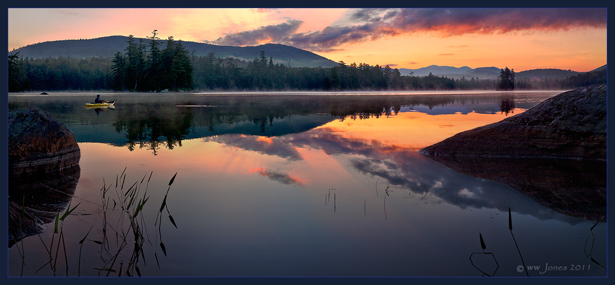
I need some help with this one. About a week ago I posted an earlier version of this image, and received 100% positive comments and even the weekly pick. THANKS! However, there was something that bothered me about my processing of it: it looked sort of "HDR-ish" to me even though it was hand-blended. The Shadow areas looked to me to be unnaturally light in contrast with the sky. The sky, on the other hand, looked unnaturally dark. While the underexposure of the sky produced dramatic deep colors, it did not convey the brilliance that I remember as I stood knee-deep shooting it.

Then I got a new wide-gamut monitor, and it looked even worse! After spending hours reprocessing it (more time than I have ever spent on any image, but partly getting used to the new monitor) here is version 5, which to me conveys better the darkness of the dawn shadows and the brilliance of the rising Sun. However, without the deep orange sky of the earlier image, I am not sure it still has the impact that brought all the great comments.

QUESTION: Of these two images, which draws and holds your attention more: This one with the brighter sky, or THE EARLIER ONE, with the deeper color in the sky?
Conversely, does one or both of these seem to be more of what some people would call "PhotoShopped?"

Larger veersions of both are provided.

Any other advice on this one will be appreciated.

Canon 50D
Sigma 17-70
1/100 sec. @ f/8; ISO 200
Tripod and 2-sec. timer
Two frames: Each double-processed in ACR to control high dynamic range; then hand-blended and stitched in CS5

Comments

8 comments
Comment posted by Peter Cross on September 11, 2011 at 9:55 PM
If this is the one you feel and think best captures what your eyes saw, then this is the best one. While I do like the vivid and saturated colors of your previous image, I can't say I've experienced such color myself. One thing I do like about v 5.0 is there seems to be more detail to ferret out and I like that. I went back and forth on this a number of times and it's a real tough choice as to which appeals more. Emotionally it seems the earlier version grabs me more but my brain (and the scientist in me) prefer v 5, which is more realistic. I don't know if this helps you but it was a good exercise.

Peter
Registered on April 3, 2010, 271 Posts, 1342 Comments
Comment posted by R.Bill Moser on September 12, 2011 at 12:29 PM
It's hard to say which one....I do like the vivid and saturated colors of your previous versions. in this versions i like the drtails in the shadows. I'd prefer the previous versions but this is probably more realstic, though the earlier version looked as real to me as this one.As Peter said, "it's a tough choice".....both are well executed and processed.
Registered on January 29, 2010, 285 Posts, 4281 Comments
Comment posted by David W. Kelly on September 12, 2011 at 1:36 PM
Just a wonderful image Wayne. I cast my vote for the earlier image but it is a real tough call. :toast:
Registered on October 7, 2005, 883 Posts, 6590 Comments
Comment posted by Jean Day on September 13, 2011 at 10:25 PM
It seems a difficult blend either way, but I do prefer the more natural look and feel to this one. :toast:
Registered on April 10, 2011, 36 Posts, 306 Comments
Comment posted by Mark Seaver on September 13, 2011 at 10:59 PM
Wow, that's a tough choice. I prefer the sky in the first post especially the fact that the yellow is not burned out, but I like the added contrast in the second version. Both are great shots.
Registered on January 23, 2011, 1103 Posts, 17270 Comments
Comment posted by Nancy de Flon on September 14, 2011 at 7:54 PM
Wayne, I much prefer this one. It calls to mind something the great Swedish nature photographer Hans Strand said recently, criticizing American landscape photographers for a tendency to overprocess and especially to open up shadows too much. In this image you've corrected that, and no one (not I, anyway) would look at this image and claim that "Photoshopped!!!" hit them in the eye.
as a fellow New Yorker (Lower Hudson Valley), may I ask where "upstate" you operate? Is this an ADK lake?
Registered on June 28, 2010, 61 Posts, 284 Comments
Comment posted by Rodney Dugmore on September 16, 2011 at 3:53 AM
No question this one is better ! This one speaks assuredly the other shouts. When I first saw the other I thought great shot but need to be dialled back a bit. This one hits the spot for me.
Registered on January 3, 2004, 76 Posts, 1028 Comments
Comment posted by Bill Caldwell on January 19, 2012 at 2:25 PM
Beautiful image Wayne! I know this is "old news" but after looking at both images and reading the comments, I wanted to put my 2 cents in and I don't think anyone else has said this. I'd like a combination of the 2 images--I like the darker, more saturated sky and the darker reflection of the sky (lower area) in the first image, but I like the darker middle/mountain/forest area in this image. For what its worth!
Registered on October 10, 2011, 62 Posts, 508 Comments