Nature Photographers Network
This is the preserved archive of the original Nature Photographers Network. The community continues at naturephotographers.network.
Glow Rings
‹ PreviousLandscape GalleryNext ›

Glow Rings

by Jimmy Gekas

Gallery: LandscapePosted September 16, 2011467 views29 comments
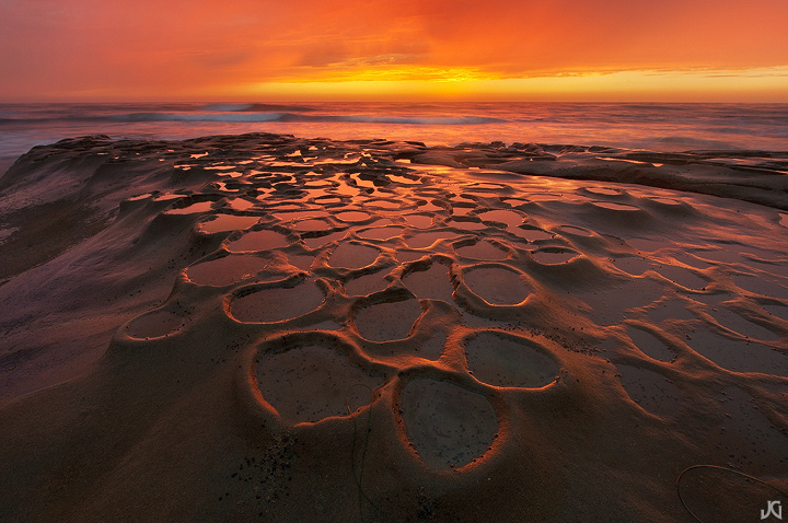
Yeah, I know, I know....Jimmy, why don't you find something else to shoot. Well, this place is just too convenient when the tide is high and other option don't exist. Maybe I need to move.

Canon 5Dmk2, Nikon 14-24. Hand blended two exposures.

Comments

29 comments
Comment posted by Joseph Rossbach on September 16, 2011 at 3:42 PM
No way man, this is amazing! Another great image :toast: :toast:
Registered on November 25, 2005, 484 Posts, 1377 Comments
Comment posted by Marc Adamus on September 16, 2011 at 3:43 PM
This is really nice, Jimmy. Maybe my favorite in some aspects that I have seen from here. To my eye, I'm seeing an even stronger vertical crop from the middle. The symmetry and simplification of that central collection of 'rings' leads me right in along the same line.
Registered on September 17, 2005, 780 Posts, 8091 Comments
Comment posted by Jimmy Gekas on September 16, 2011 at 3:55 PM
Thanks Marc, for the idea. I guess I've tried the vertical before, but never really thought it worked. Here's a vertical crop to see what others think. I am open to any suggestions on the crop.
Registered on July 26, 2007, 244 Posts, 2807 Comments
Comment posted by Thomas Miller on September 16, 2011 at 4:02 PM
This is excellent! :toast:
Registered on March 10, 2011, 56 Posts, 56 Comments
Comment posted by Marc Adamus on September 16, 2011 at 4:24 PM
The vertical absolutely maximizes the space filled with interests. It's a winner in my book!
Registered on September 17, 2005, 780 Posts, 8091 Comments
Comment posted by Joseph Kayne on September 16, 2011 at 4:49 PM
Vertical appeals to me more, Jimmy. :toast: :toast: :toast:
Registered on November 1, 2003, 573 Posts, 2619 Comments
Comment posted by Kory Lidstrom on September 16, 2011 at 6:06 PM
Wow, very sexy and compelling stuff here with the awesome light. Have you thought about doing a vertical crop of just the middle? I think if you did, it might further strengthen the image by focusing on the meat.

EDIT: LOL, as soon as I scrolled down, I saw that Marc already beat me to the punch. I definitely feel that the cropped version is the stronger of the two.
Registered on November 19, 2008, 49 Posts, 1035 Comments
Comment posted by Koveh Tavakkol on September 16, 2011 at 6:08 PM
Really nice Jimmy. Can't get enough of those formations, and the sky is excellent.

PS: Just saw the vertical...even better. I was thinking this would look great in vertical when I saw the first. Killer!
Registered on September 1, 2009, 41 Posts, 608 Comments
Comment posted by James Fougère on September 16, 2011 at 6:15 PM
Onboard with the vertical crop :cool: Nice capture !!
Registered on October 25, 2010, 41 Posts, 831 Comments
Comment posted by Lorna Taylor on September 16, 2011 at 6:47 PM
Stunning image !
Registered on November 12, 2010, 254 Posts, 3083 Comments
Comment posted by Chris Chamberlain on September 16, 2011 at 8:49 PM
All of your shots from here are good. Compositionally I like this on as much or more than any. I like the vertical a lot too. The color and light take this one up a notch or two imo! Really nice!!!!!
Registered on March 13, 2007, 500 Posts, 8365 Comments
Comment posted by Todd Liotine on September 16, 2011 at 10:16 PM
Great shot and colors. I know the place well, one of my favorite images is a vertical comp from this location, so my vote it for the vertical as well.
Registered on July 1, 2008, 131 Posts, 671 Comments
Comment posted by Tony Kuyper on September 16, 2011 at 11:48 PM
Don't stop, Jimmy. You show us this place like no one else can. This is really nice light.
Registered on November 1, 2003, 364 Posts, 22328 Comments
Comment posted by Rick Goldwasser on September 17, 2011 at 12:37 AM
I vote for the vertical, the glow here is truly amazing!
Registered on May 10, 2009, 127 Posts, 970 Comments
Comment posted by Neale Dyster on September 17, 2011 at 2:17 AM
Don't move!
Love the first image posted, but I agree the vertical is even stronger. :toast:
Registered on February 19, 2008, 94 Posts, 738 Comments
Comment posted by Jorne de Bruin on September 17, 2011 at 6:16 AM
The 1st image is great, but the vertical is just superb! Love the fg and the crazy light! :toast:
Registered on June 26, 2008, 178 Posts, 2136 Comments
Comment posted by Jared Atencio on September 17, 2011 at 11:26 AM
Gee, what a SHAME to have this place "so convenient"!!! I've always loved this spot, and this is one of, if not THE best i've seen from here. Really great glow and color around the rings and terrific control of light here. I think the vert is much bolder and stronger, but do like the context the horizontal crop provides. I would try to remove the piece of grass in the FG (even more noticeable in the vert), but know it's a personal choice. I even think there's an abstract comp w/out the sky somewhere in there, keep em coming!
Registered on June 23, 2009, 21 Posts, 422 Comments
Comment posted by Hamed Musharbak on September 17, 2011 at 4:07 PM
the 2nd ver is the winner :toast:
Registered on June 1, 2009, 372 Posts, 2282 Comments
Comment posted by Morris McClung on September 17, 2011 at 4:26 PM
Well, why would you when you get images like this? :biggrin: I like the horizontal, but I do like the vertical a little more for the frame filling goodness. Great sky!
Registered on May 7, 2007, 670 Posts, 19650 Comments
Comment posted by Mark Metternich on September 17, 2011 at 9:26 PM
Cool and bizarre! I too am seeing a vertical crop. :toast:
Registered on June 19, 2009, 276 Posts, 6240 Comments
Comment posted by Anthony Vincent on September 17, 2011 at 11:31 PM
Awesome Jimmy. I have to say that im all for the original. It gives it more impact to me. If it were mine I would leave it and maybe darken the edges in then forcing the eye towards the center but keeping its scale. Hope that makes sense
Thanks for sharing
Registered on February 5, 2009, 199 Posts, 2775 Comments
Comment posted by Scott Lawson on September 17, 2011 at 11:47 PM
Really nice Jimmy. I like the vertical crop idea but feel like the reposted version is maybe a little too tight. Regardless, it's a fantastic scene and I remember this night very clearly (but was unfortunately far from the coast).
Registered on March 3, 2008, 29 Posts, 337 Comments
Comment posted by Doug Roane on September 18, 2011 at 1:20 AM
this is totally AWESOME! :toast: :toast:
Registered on December 12, 2008, 213 Posts, 2226 Comments
Comment posted by Alex Mody on September 18, 2011 at 6:50 AM
Man, I love your images from this spot. I'd go repeatedly whenever the tides are ideal for this place. Jimmy, why don't you keep shooting this because it is awesome!
Registered on December 25, 2007, 163 Posts, 1896 Comments
Comment posted by Nick Bristol on September 18, 2011 at 11:58 AM
Amazing! This is wonderful Jimmy. I like the original myself even though the crop looks nice too. The wider view just works better for me. I think Anthonys suggestion might work well too by darkening the edges a bit, but not to much. Its beautiful just as it is!

Nick Bristol
Lone Rock, WI
Registered on February 1, 2004, 752 Posts, 14140 Comments
Comment posted by Lon Overacker on September 18, 2011 at 8:28 PM
Jimmy,

If they haven't already, they should officially name these the "Gekas pools." I think you've done quite well with this location and this is a beautiful rendition. No nits or suggestions. If you move on, don't forget about this place!

Lon
Registered on November 24, 2006, 521 Posts, 19147 Comments
Comment posted by David Edwards on September 19, 2011 at 3:39 AM
Awesome shot, Jimmy. Love the rich color and cool fg shapes. Both versions are very nice. I like the falloff on the left of the original version, and I like the compact comp of the cropped version. Exquisite light.
:toast:
Registered on December 6, 2008, 142 Posts, 2623 Comments
Comment posted by Anil Rao on September 19, 2011 at 3:47 AM
Very nice, Jimmy. You have a good hold on this location and it shows in your photos.

I actually prefer the original (horizontal) post. The wider view is not in your face and allows me to enjoy the scene at my own pace.
Registered on November 15, 2003, 234 Posts, 4923 Comments
Comment posted by Larry Fischer on September 19, 2011 at 8:16 AM
Do not move; this is wonderful.
the fisch
Registered on July 28, 2008, 155 Posts, 874 Comments