Boom
by Nicolaus Wegner
Waiting on my wide angles to be repaired so I have not had much of a chance to shoot any landscapes...sadness.
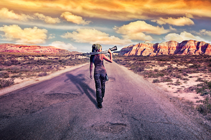
In the meantime, I've been playing around with more advanced composite stuff, and wanted to share one I thought turned out pretty well.
Original image is from Honeycomb Buttes, WSA. It's actually in danger of losing its WSA status thanks to our current buttnuggets in state government and the BLM.
The road, craters in the road, cracks in the road, hill on the right, clouds, water bottle, and model are all separate images. No roads in the buttes...just some trails. This one took me all day but I had nothing else to do. 35 layers total I think.
Model was shot in studio using 4 einsteins. 2 with 10x36 gridded stripboxes (left and right), 1 silver 64plm (front right of camera), and one hanging overhead attached to a beauty dish.
This one may be pushing the rules a bit as a nature theme...if so, feel free to delete it. The buttes are pretty amazing though, if you ever get a chance to go see them, do so...I'd recommend May or early June as it's super green and there are wildflowers all over the place. Who knows..in a few years it may have a road running through the middle of it. :[...
Edit: Please see final post for corrected version. Fixed the shadow (again) and toned the processing down just a notch.

Comments
15 commentspat
Pat, I'm glad you like the shadow. I had a comment from a graphic designer friend who told me my shadow was too far in front of her due to the main shadow in her right arm, but you just confirmed my theory that most people won't notice this with the average amount of time spent viewing an image before moving on. So unless I get a horde of comments about the shadow being off, I'm not thinking it's worth the time to go back and change. ;]
I actually did spend some time looking at it. The only oddness I saw and still see is the left arm and there it's because the hand and forearm don't seem to taper quite the way they should to my eye. Again, I'd say it doesn't matter. The shadow is certainly convincing enough to me to add the realism I want in the image.
I also liked what appears to be a Benelli M4 to me but wouldn't normally have commented on that aspect of the image. (smile)
pat
The shotgun is a Mossberg 590 special purpose with a heat sink above the barrel...it's our boom stick. A wonderful tool and home defense weapon (loaded with 00 (when not photographing with it of course) for shooting through those pesky walls). ;]
In the shadow of her left arm, it seems to me that the wrist should taper a bit more and then flare back out for her hand. Again, I don't claim to know shadows and projective geometry, so it may just be my eye.
pat
I took my friend's advice on the shadow and redid the image as well as some softer final processing. Perhaps you can take a look and tell me if the arm looks better as well? It's a bit hidden in the crater which may help some.
See below edit for fix.
The last version looks more natural to me. The proportion of the upper arm seems a little long to me but again, my sense of proportion, leaves a lot to be desired. (smile) IMO it was close enough in the original.
pat
May
I like the original as well, but after looking at it for a while and having a graphic designer friend look it over, I decided to go with something that fit the lighting on the model a bit better. Not that the shadows anywhere else are correct, but since she is the point of focus, I figured I'd at least try to make it appear somewhat less ameuturish. ;]
Very well done concept and processing. I like the shadow placement in the second one better. I might like to see the shadow have a bit of Gaussian blur added and a drop in the opacity. Nice image.