Black and Blue +ver 1.5
by Lon Overacker
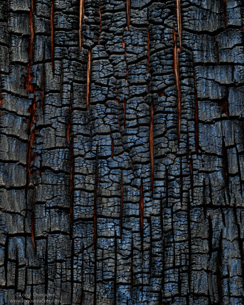
I'm sure you'll recognize this as it was part of the triptych we posted a couple weeks ago. But this version is cropped and I'm also providing an alternate. I'm torn with this one. While I clearly remember reflected blue light I'm having a hard time deciding 1. what I actually remember and 2. How I want to ultimately display this. For #2, I ask for your opinions. In the triptych I processed mine and eliminated a lot of blue to help match up with the other images. My original processing is the repost and this image here is my latest attempt. This is a crop of the original frame. Oh, and you might notice in the second/repost some reflected light coming up from the bottom that is warmer, almost yellow. Well, it was the second time on this trip I used a gold reflector tossing in some additional and contrasting color to the blues.
Your comments and/or suggestions welcome. Curious to see folks reaction. I can go either way.
4x5, Nikkor 300mm, V100F, f/45 @9s
Tons of TK's masks, actions and stuff with this one!
Thanks!
Lon

Comments
39 commentsI think I have the answer to my own question, but would still like some input.
Thanks!
Despite the more colorful version being colored in a very nice way, I enjoy the above version just as much. I actually enjoy looking a little bit harder for the colors that are there. Excellent work, as usual.
Peter
You found some real fine art here. Of course I love the comp and story to go with it. The second is a winner for me and I think you just pulled the color that was already present. It has more depth and clarity in the second. No nits for me, love it.
Well done
Second version the word is vibrancy, the reflected light and added color add life to the image. Odd in an image of something that may be dead. However more effective more compelling. It looks like the fire was just extinguished.
Paul
And Andreas is right about it being soft.
prefer the second one for its artistry.
This is a wonderful abstract, I really like the second version it has a fantastic metallic look.
In the second version I see lava flowing cracked volcanic soil.
The first version reminds me more of a lizard's skin.
Now don't tell me these are trees!
And you're right, this is a little soft which shouldn't be an issue for print, if it gets that far.
Thanks for the response and comments! I appreciate it.
Lon
Nick Bristol
Lone Rock, WI
Thanks for the feedback
I've been doing a little tweaking on my shot of this tree, and may post it at some point. Anyway, the entire exercise has been very interesting in so far as realizing the various tonalities and color present in a subject that looks quite black on a first look.
Nice work, Lon!
--P
Both versions are really beautiful -- they sing because of the composition IMHO. Out of the two, I prefer the first version. It is more natural and the subtle blue tones are more to my liking.
Good stuff!
I'll definitely vote for the first repost, more colorful version, as the blue and gold/brown contrast makes it much more interesting than the first. They are both obviously abstract interpretations, but for the first version, the pattern alone is not making up for the lack of a well defined focal point. In the second, the pattern + color is what really makes it work for me. Nice job! (and I still like the 2nd over the third version!)
Chris
What an awful thing to imply. I'm ashamed for you.