Nature Photographers Network
This is the preserved archive of the original Nature Photographers Network. The community continues at naturephotographers.network.
My favorite
‹ PreviousFlora GalleryNext ›

My favorite

by Anne K. Rusk

Gallery: FloraPosted December 11, 2011137 views12 comments
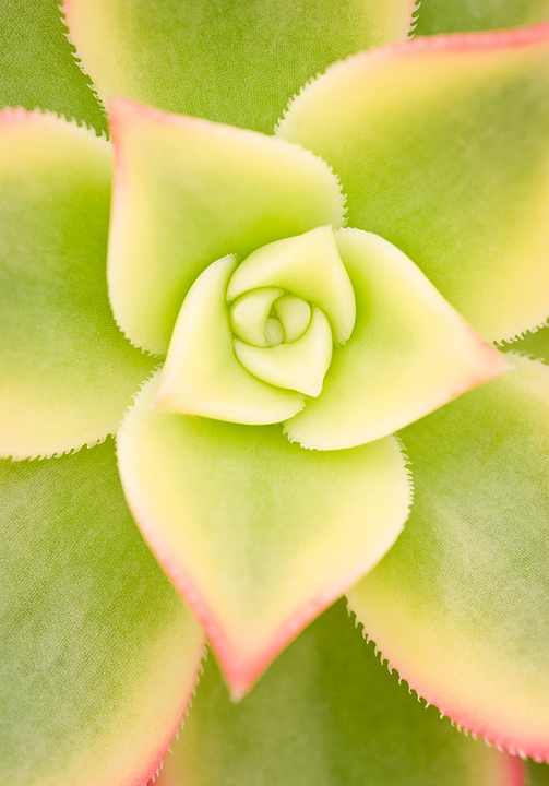
This October, after spending my afternoon wandering around doing landscape stuff, I decided to pop by the Botanic Gardens to see what was happening there. Not much, actually. I was heading out when I wandered through the Orangery and found these succulents. I only took a few shots, but this turned out to be one of my favorite images of the year. I haven't shared this for critique before, so please let me know what would improve this image!
Thank you for looking!
Anne

Comments

12 comments
Comment posted by Mauro Pasquero on December 12, 2011 at 3:08 AM
Lovely image, Anne. I like very much the composition and the soft colors.
Mauro
Registered on January 21, 2010, 650 Posts, 2500 Comments
Comment posted by Bob Duff on December 12, 2011 at 6:45 AM
I can certainly see why it's your favorite. Love the strong graphical lines, comp and then the pastel colours make this one work for me. Great job.
Registered on April 21, 2010, 160 Posts, 1675 Comments
Comment posted by Tonia Graves on December 12, 2011 at 10:54 AM
Anne, nice colors & comp. I like this a lot but feel a bit more DOF might make this better IMO, just enough to make the tips of the succulent sharp.
Registered on October 29, 2011, 92 Posts, 1035 Comments
Comment posted by Ned Fenimore on December 12, 2011 at 11:39 AM
This is great. I like the delicate coloration..
Registered on November 1, 2003, 467 Posts, 2803 Comments
Comment posted by scott lanz on December 12, 2011 at 1:07 PM
Anne, this is quite beautiful. I like the soft light and design. I think more DOF would have been good to show more of the interesting serrated edges to the leaves, but the shallow DOF brings a softness to the image that is appealing, and it is sharp where needed (i.e., the center).
Registered on November 14, 2003, 840 Posts, 12902 Comments
Comment posted by Bill Fach on December 12, 2011 at 4:59 PM
Anne: Seems like there have been a lot of frame filling beauties lately and this one fits in great. Wonderful color palette especially. For me a touch more DOF would have more impact but I like this a lot as is. 2 thumbs up! >=))>
Registered on November 1, 2003, 1805 Posts, 26981 Comments
Comment posted by Barbara Graham on December 12, 2011 at 6:36 PM
This is beautiful, and the center is so perfect. I agree about more DOF. I wonder also if maybe a tiny curves adjustment might make the different parts of the image stand out a bit more. But it's very beautiful as is.
Registered on July 27, 2010, 1310 Posts, 5035 Comments
Comment posted by Gary Yeoh on December 12, 2011 at 7:47 PM
Anne:
Lovely graphical image. I like how the smooth leaves morph into larger ones with serrated edges. The muted color is soothing. Frame filling magic. I wonder how this would look with a less centered image?
Registered on September 1, 2009, 588 Posts, 8184 Comments
Comment posted by Anne K. Rusk on December 12, 2011 at 8:41 PM
I totally agree on the DOF! I took this hand held (unfortunately) so I needed all the shutter speed I could get. Barbara, I will give the curves a try! Gary, I like the idea of a crop, thanks!
Wonderful feedback! :toast:
Registered on October 10, 2010, 65 Posts, 904 Comments
Comment posted by Carolyn Derstine on December 12, 2011 at 11:46 PM
Love the pale colors and the frame filling comp of this photo. I like the soft look of this but think more DOF would make this even better. Very lovely!
Registered on February 16, 2011, 610 Posts, 3684 Comments
Comment posted by Ian Wolfenden on December 15, 2011 at 9:43 AM
It's a beautiful composition, Anne, with a delightful softness and gentle colouring - a lovely mage altogether. Maybe I would agree with the thoughts that a touch more in focus at the top of the upper leaf edges would be good, but perhaps the overall softness makes that unnecessary. Whatever, this is lovely !!
Registered on May 18, 2007, 1108 Posts, 7647 Comments
Comment posted by Pat Sampson on December 24, 2011 at 6:40 AM
This is gorgeous Anne. I love the composition and the symmetry.

I suppose I might bring a bit more darkness into it, possibly with a very light vignette or by slightly darkening the areas where you want to emphasize pattern. That's all a nit though. This is perfect as posted.

pat
Registered on May 19, 2007, 953 Posts, 15989 Comments