Val di Mello
by Daniel & Loana
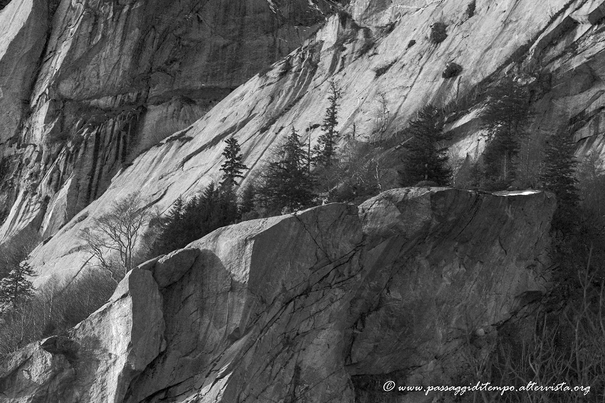
This shot is from a recent hike in a small valley on the border between Italy and Switzerland. It is called Val di Mello and it is well known for ice climbing.
This is probably our fist BW so we would be really interested in your comments and suggestions also on the improvements of the conversion to BW.
Thanks a lot
D&L
Canon 40D, Canon EF100-400@150mm, f/6.3, 1/400sec, ISO500.

Comments
5 commentsI like this scene quite a lot. There's an excellent nature about the coexistence of the hard geology and surviving flora on these cliffs. The b&w processing looks very good, but I'm also curious about the color. I can envision the greens of the pines against the either very cool granite or warm stone depending on light and makeup. Often times b&w works very well in concealing elements in the scene such as the barren branches in the LRC. I'm wondering if they are more prominent and distracting in the color version. Also, I'm also curious as to what makes people decide to convert to b&w. I'm not saying it's a bad choice here, the processing looks good to me. I'm just curious about the decision.
BTW, I really like the composition and how there's a line of trees growing in what appears to be a pretty formidable granite quarry.
Lon
Lon: we post here the colour version. I think that also in this case the LRC branches are not too distracting.
Why B&W? Well, we thought that this scene with no strong colours (the sky, for example) could work well in B&W. Another reason, but we are a bit shy writing this, could be that almost two months ago we visited a wondeful exhibition of original Ansel Adams prints here in Italy (currently I am reading his autobiography) and we were impressed by those images. It could seem strange that B&W images can be so strong (maybe B&W could be seen as something "missing" colours) and dramatic.
No intention of emulation
Thanks again
D&L
Thank you for taking the time to repost and offer your thoughts. I hope you didn't take offense. I was more interested to get you to think about your answer than hearing for myself - if that makes sense. As an old film guy I used to think, and sometimes still do, that b&w photography should be shot as that (either film or digital) with the intention of seeing the scene and shooting for that purpose. As opposed to converting afterwards to "see what it looks like." Mr. Adams continues to have a huge influence on how many of us see the landscape and kudos to you two for absorbing and putting in to practice those things you're reading and learning.
BTW, good choice going b&w. I do think the branches in the LR are less distracting, but not a big difference. to me, the tonality of the scene is more obvious than the color and going the b&w route emphasizes that.
Lon
Thank you again
D&L