Nature Photographers Network
This is the preserved archive of the original Nature Photographers Network. The community continues at naturephotographers.network.
Light in the Marsh +repost
‹ PreviousLandscape GalleryNext ›

Light in the Marsh +repost

by Nick Bristol

Gallery: LandscapePosted January 13, 2012356 views27 comments
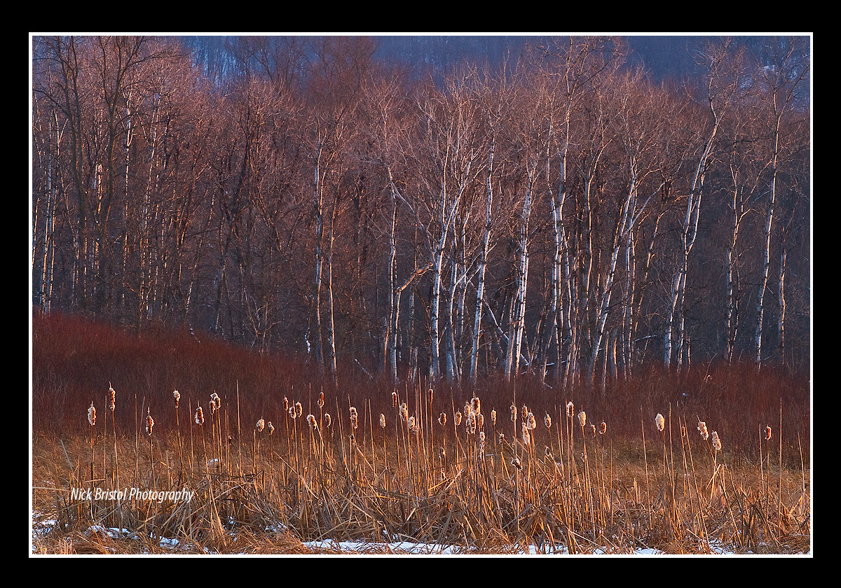
A few of you might remember a very similar image to this one from last winter. I shot this one at a little tighter comp and just worked the file for posting. That was while I was waiting for snow here. Now we do have new snow so hopefully I can make some new winter images.
This was in a marsh area close to my home. The sun was just setting off to the the right and I really enjoyed that late light on the birch and cattails. That light made all the difference for this scene, but then I guess it always does. I included a larger view for a better look.
Thanks much for all your comments on my last post too!
7D, 70-200L @170, iso 200, f/16 and 1/8 sec.

Comments

27 comments
Comment posted by Phil Pogledich on January 13, 2012 at 6:23 PM
This is some excellent light and I like the distinct layers of the scene. For me, it's a more powerful image if you crop off the very top, eliminating the distant blue hills. Then it's all warm goodness and a very pleasing array of vertical lines.
Registered on August 24, 2009, 123 Posts, 3099 Comments
Comment posted by Rick Lundh on January 13, 2012 at 6:43 PM
the light really makes this scene work well!
Registered on April 28, 2004, 774 Posts, 4351 Comments
Comment posted by Nick Bristol on January 13, 2012 at 6:48 PM
Thanks Phil, If I remember right I think that was a thought on the version I posted last year, which had a little more of the distant hills showing over this one. I can see your thoughts on that too, and I agree that it seems to work quite well that way. I actually thought about that and ended up liking it this way better, but that is just me. Guess it will be interesting to see what others think about that too. Thanks, always appreciate your thoughts! Nick
Registered on February 1, 2004, 752 Posts, 14140 Comments
Comment posted by Nick Bristol on January 13, 2012 at 6:50 PM
Rick, Yes, before that late light did its work on this it looked pretty dull! :smile: Thanks.
Registered on February 1, 2004, 752 Posts, 14140 Comments
Comment posted by Joseph Campisi on January 13, 2012 at 9:45 PM
My first thought was to crop the sky Nick. I can also see cropping the strip of snow on the bottom as well. That would accentuate the strong verticals IMO. I love that light hitting the cattails and trees!
Registered on November 24, 2008, 304 Posts, 3211 Comments
Comment posted by scott lanz on January 13, 2012 at 10:04 PM
My thoughts matched Joe's (before I read Joe's). You might crop the sky and the bottom snow, and make this about the three patterned layers in between.
Registered on November 14, 2003, 840 Posts, 12902 Comments
Comment posted by Tony Kuyper on January 13, 2012 at 10:24 PM
Very nice, Nick. I like the layer. I find the blue in the back just a bit distracting as is. Would like to either see more or less of it.
Registered on November 1, 2003, 364 Posts, 22328 Comments
Comment posted by Chris Chamberlain on January 13, 2012 at 11:07 PM
I remember the scene well, Nick. Just beautiful! I had a thought or two about crops from the top and bottom too???

Chris
Registered on March 13, 2007, 500 Posts, 8365 Comments
Comment posted by Abdullaziz Bin Ali on January 14, 2012 at 5:48 AM
I like the layers and the side light on the objects
beautiful :wink:
Registered on May 31, 2009, 112 Posts, 1590 Comments
Comment posted by Dan Baumbach on January 14, 2012 at 8:14 AM
Nice light and color.

- Dan.
Registered on November 1, 2003, 473 Posts, 7980 Comments
Comment posted by Nick Bristol on January 14, 2012 at 9:00 AM
Thanks for the thoughts! Looks like most are leaning towards cropping the background hills out so far. I would have liked a bit more of the hills showing originally but then I started to get the sky which I did not want. Maybe this crop version is the best way to go with this. I decided I would like to print this so really do appreciate your thoughts. Thought I would go with all the suggestions here for this version and crop the snow as well. Appreciate your thoughts!, and thanks. Nick
Registered on February 1, 2004, 752 Posts, 14140 Comments
Comment posted by Harley Goldman on January 14, 2012 at 9:30 AM
Excellent light, colors and layers. I am liking the cropped version!
Registered on November 19, 2003, 586 Posts, 11271 Comments
Comment posted by Nick Bristol on January 14, 2012 at 9:46 AM
Thanks Harley. Now that I did the suggested crop I like it better too. Didn't think I would. :smile: Nick
Registered on February 1, 2004, 752 Posts, 14140 Comments
Comment posted by Rick Goldwasser on January 14, 2012 at 10:43 AM
I like it! I prefer the repost, it seems to accentuate the layers.
Registered on May 10, 2009, 127 Posts, 970 Comments
Comment posted by Chris Chamberlain on January 14, 2012 at 11:07 AM
Yeah, that's it!

Chris
Registered on March 13, 2007, 500 Posts, 8365 Comments
Comment posted by Stan Rose on January 14, 2012 at 12:42 PM
The cropped version works for me, Nick--nice layers! I might brighten it up just a tad, the darks at least. Real pretty scene. :wavey:
Registered on September 15, 2005, 836 Posts, 17099 Comments
Comment posted by Lon Overacker on January 14, 2012 at 1:41 PM
Nick,

The cropped version is outstanding. I didn't mind the upper bg so much, it's subtle and allowed room for the tops of the trees. It was the snow that I was going to suggest cropping out. In the end, simple is almost always good and your final crop really reduced this image down to a very simple image of color and layers as well as letting the light really stand out. A beautiful scene that will make an equally beautiful print.

Lon
Registered on November 24, 2006, 521 Posts, 19147 Comments
Comment posted by Raymond Klassen on January 14, 2012 at 3:56 PM
Man, the lighting here is gorgeous. I love the trees and I especially like the lighting on those cattails! I like it with or without the top. I personally like the bit of snow you left on the bottom of the original.
Registered on November 30, 2008, 114 Posts, 790 Comments
Comment posted by John Kerr on January 15, 2012 at 7:25 AM
Nice lighting here Nick and I like the layers of color. Looking forward to more.
Registered on October 28, 2009, 111 Posts, 1070 Comments
Comment posted by John Williams on January 15, 2012 at 11:45 AM
Simpler is often stronger, and this is a perfect example to my tastes. The original is a great photo, but the crop just focuses on the strongest points and is an amazing photo; love the layers in that light.
Registered on September 6, 2007, 221 Posts, 5985 Comments
Comment posted by Nancy Lea Sandy on January 15, 2012 at 12:56 PM
Really like the crop. The light on the cattails is very eye-catching
Registered on January 24, 2011, 576 Posts, 6942 Comments
Comment posted by Tom Haxby on January 15, 2012 at 8:51 PM
Nick: Really sweet light and I don't think that you needed to wait for the snow. The cropped version is the one that I prefer. This photo says Midwest US because it is one of those intimate landscapes that Mid-westerners learn to rely on. Really well done, and thanks for sharing.
Registered on July 6, 2006, 126 Posts, 647 Comments
Comment posted by Eva McDermott on January 16, 2012 at 9:39 AM
You caught some really gorgeous light here Nick. I like the original myself since the blue in the background is a nice combo the the warm orange light. Beautiful work.
Registered on January 4, 2009, 1015 Posts, 13229 Comments
Comment posted by Gary McGhee on January 16, 2012 at 2:14 PM
Very nice shot Nick, I prefer the second upload. You've captured some nice light here and very natural looking colour.

Gary.
Registered on April 15, 2010, 142 Posts, 2416 Comments
Comment posted by Nick Bristol on January 16, 2012 at 3:30 PM
Thanks so much to all of you for your thoughts on this. I appreciate hearing your feelings about both versions here as well. Very helpful! Cheers, Nick
Registered on February 1, 2004, 752 Posts, 14140 Comments
Comment posted by Peter Richter on January 18, 2012 at 12:55 PM
Nick, your repost works extremely well for me. An exceptional composition to my eye, based on the diverse layers, with areas of interest in the near as well as in the distance. The color palette fits in perfectly with this autumn scene in my opinion. Thanks for sharing.

Peter
Registered on November 10, 2010, 218 Posts, 2723 Comments
Comment posted by Nick Bristol on January 18, 2012 at 10:20 PM
Thank you Peter! :wavey: Nick
Registered on February 1, 2004, 752 Posts, 14140 Comments