Nature Photographers Network
This is the preserved archive of the original Nature Photographers Network. The community continues at naturephotographers.network.
Does Simple = Stupid?
‹ PreviousLandscape GalleryNext ›

Does Simple = Stupid?

by Russell Colletta

Gallery: LandscapePosted January 21, 2012142 views6 comments
Conventional wisdom tells us that a great image is, at a minimum, three things: great subject, great light, skillful technique. Each category has an almost infinite variety of options associated with it. If one area is weak, we can compensate, to some degree in the other areas. But in the end, nothing beats an image that maximizes all three.

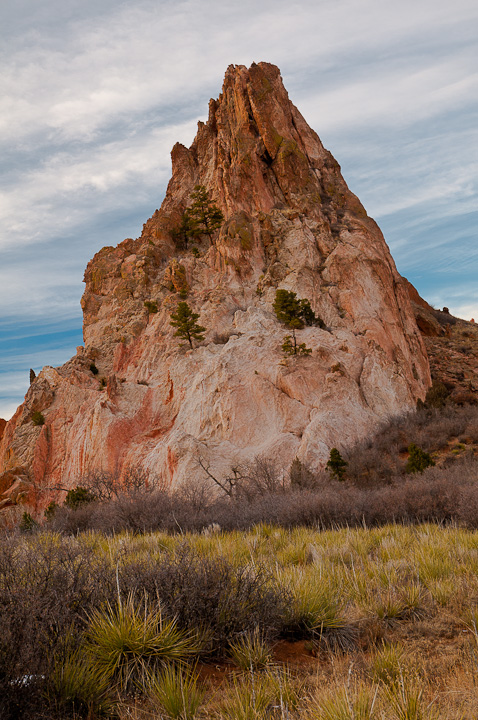
But lately, simple has new appeal to me. Probably just a phase I'll grow out of someday. Life has spectacular moments, but it's tough to live there all the time. Sometimes we just need to appreciate the simple, more mundane moments and celebrate them like they were something special. That was the purpose of this image. Not an iconic location, it's not mid-day, but the light didn't fire up into something spectacular, and the processing is pretty simple.

Art should provoke emotion and I have spent my entire career attempting to provoke thought. That's what I like about good photography, it should do both. So, what are your thoughts on simple?

Comments

6 comments
Comment posted by Barbara Graham on January 22, 2012 at 7:08 AM
My thoughts are that simple can provoke thought and imagination, that simplicity in life in general promotes more use of the imagination than complexity, and I don't think there's a reason that wouldn't apply to photography.

Caveat: I know nothing about landscape photography, so you may need to disregard everything I say now. It looks to me that more DOF would work better for the grasses, and I'd like to see the lower left of the peak/hill/whatever is the right term for it, so for me shooting a bit further left would work better. Second caveat: I obviously know nothing about the elements of landscapes in the West. Third caveat: You refer to your entire career, and if that career has been in landscape photography that's another reason you should ignore everything I just said.
Registered on July 27, 2010, 1310 Posts, 5035 Comments
Comment posted by Tony Kuyper on January 22, 2012 at 11:21 AM
The composition is easy to comprehend: foreground grasses, rocks, sky with clouds. Light-wise it feels a little flat to me. The colors are nicely balanced and look right, but it doesn't create sustained interest for me. Not sure where to go. Maybe a bit more saturation would help, but that's only a guess.
Registered on November 1, 2003, 364 Posts, 22328 Comments
Comment posted by R.Bill Moser on January 22, 2012 at 1:27 PM
The comp looks ok but the light looks a bit flat to me.It's a beautiful image but i'm not sure if it could have made stronger with a more interesting composition
Registered on January 29, 2010, 285 Posts, 4281 Comments
Comment posted by Harry Lichtman on January 23, 2012 at 8:11 PM
Russ - I'm all for simple. It helps create impactful images. This image is maybe more complex than you think, and maybe that is why it isn't as strong for me. The lighting is a bit flat, lots of tones and textures with the rock, grasses, sky and deep shadows on the left corner. Some late or early light might have created a more colorful image, but might also have helped simplify the scene by creating deeper shadows and showing off the rock's textures. So I guess while the photo taking is much simpler, I don't think the end results can always match up. I like to think that by enjoying, appreciating and observing the day to day you are better able identify those siutations when a scene like this can be transformed.
Registered on September 17, 2010, 304 Posts, 3507 Comments
Comment posted by Russell Colletta on January 23, 2012 at 10:12 PM
Thanks guys. Actually, this was taken just before sunset on a day with high overcast, thus the flat light. Simple can also be deceiving, or as Harley points out, more complex than we perceive.

I'm not sure this particular subject offered a lot of other successful comp options, however, in retrospect I see lots of other subjects within this one. I liked the soft light on the rock, particularly the gleam on the upper parts. Maybe the right term isn't "simple", it was subtlety I was going for, yeah, that's it, subtlety! That's my story and I'm sticking to it.
Registered on October 31, 2009, 114 Posts, 1008 Comments
Comment posted by Genny K. on January 25, 2012 at 1:37 AM
I like simple. :smile:

Even with simple, though, there needs to be something that holds your attention. I feel there's potential here, but this image doesn't really grab me. That bright spot in the grass in the lower left really bothers me; my eye just keeps going back there. I really like that bunch of grass in front,and I'd like to se it be more prominent. The rock formation is fascinating, too, but it seems dark? Maybe different lighting, some cross-lighting, maybe, would really show the nooks and crannies there.
Registered on June 5, 2006, 132 Posts, 2001 Comments