Gallery: POP PhotosPosted February 19, 2012115 views7 comments
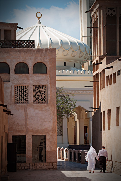
Another shot from that stop-over in Dubai on my way to Oman. Experimented with slightly different processing than I usually do. Please let me know what you think.
Techs: Nikon D90, 70-300 AF-S VR
Thanks for looking!
Comments
7 comments
Comment posted by Fabio Giarrizzo on February 19, 2012 at 8:21 AM
Very nice image- Like your composition choice, quality of light and processing job- Very well done, Fabio
Registered on December 3, 2010, 90 Posts, 1614 Comments
Comment posted by Preston Birdwell on February 19, 2012 at 11:52 AM
I like the composition with all the different lines and curves. Did you darken the corners? If so, the darkening at the top corners is a little to much; especially on the left. I like the contrast of the western vs. mid-eastern dress.
--P
Registered on November 1, 2003, 471 Posts, 5188 Comments
Comment posted by Carol Hyman on February 19, 2012 at 12:35 PM
I like the white and beige tones as well as the lines and curves. Including people adds so much interest to this scene. the gradient on the left appears to add to the depth of the scene. If it's a processing gradient, I think I would angle it so it covers the sky a bit less.
Carol
PS Think the re-post is a better rendition of the photo, Basil. Gradient is far less obvious but very effective on the building as it increased the feeling of depth.
Registered on January 18, 2007, 597 Posts, 8062 Comments
Comment posted by Basil Greber on February 19, 2012 at 1:25 PM
Thanks for your comments! The vignette is part of the processing. Here's a version with a slightly less darkened upper left corner.
Registered on November 8, 2005, 219 Posts, 1340 Comments
Comment posted by Carol Nichols on February 19, 2012 at 3:26 PM
I like you repost much better Basil as I thought the upper left corner was too dark in the original. I really like your composition, especially the inclusion of the two pedestrians, one in traditional and the other in modern clothing. This theme is echoed by the mosque and the modern high rise building behind and to the right of it. Very nice!
Registered on November 7, 2007, 161 Posts, 1420 Comments
Comment posted by Miro Susta on February 20, 2012 at 5:45 AM
The repost is much better. I like the well presented composition of this image.
Registered on August 18, 2006, 719 Posts, 3736 Comments
Comment posted by Robert Dayton on February 25, 2012 at 6:46 PM
Many interesting shapes and formations. The solitary walkers add a nice touch.
Registered on November 11, 2008, 281 Posts, 3958 Comments

Comments
7 comments--P
Carol
PS Think the re-post is a better rendition of the photo, Basil. Gradient is far less obvious but very effective on the building as it increased the feeling of depth.