Gallery: POP PhotosPosted February 26, 201235 views4 comments
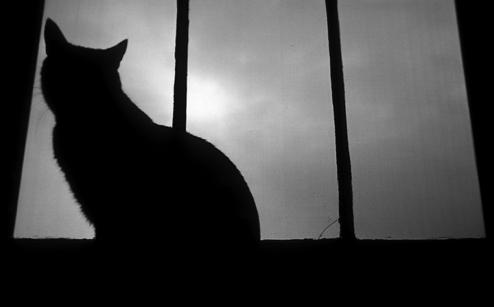
Kodachrome slide from 1971 scanned and converted to Grey 2.2.
Comments
4 comments
Comment posted by Philip Hodgkins on February 26, 2012 at 1:00 PM
Love to see the color. This is pretty drab.
Registered on July 24, 2006, 2741 Posts, 12349 Comments
Comment posted by Richard Sogn on February 26, 2012 at 2:45 PM
I think this is an excellent black and white photograph, and very dramatic with the contrast between the parallel lines of the window pane and the curved lines of the cat. My eye prefers cropping off a little of the base--it's such a wide black line that my eye is drawn to that instead of the cat. Well done.
Registered on January 17, 2007, 68 Posts, 210 Comments
Comment posted by Mark R Friedman on February 27, 2012 at 10:21 AM
I appreciate the comments on this; thank you. The proper way to have taken this image would be with a tilt-shift lens, which I can't afford and didn't exist when I created the image.
I want to fix the perspective issues without losing the feeling (I remember that crack in the middle window. It wasn't worth fixing in general, and adds a sense of balance to the composition, I think).
I agree with Richard's comment about doing some cropping at the base - and when I revisit the image while going through my archive, I'll look at implementing it.
Thanks
Registered on February 11, 2012, 3 Posts, 3 Comments
Comment posted by Howard Cheek on July 4, 2012 at 8:32 PM
Unusual comp Mark, the dark silhouette of the cat as it looks to the light's interesting to me.
I also like the vertical lines that frame it.
Well done
Registered on July 24, 2008, 1201 Posts, 10758 Comments

Comments
4 commentsI appreciate the comments on this; thank you. The proper way to have taken this image would be with a tilt-shift lens, which I can't afford and didn't exist when I created the image.
I want to fix the perspective issues without losing the feeling (I remember that crack in the middle window. It wasn't worth fixing in general, and adds a sense of balance to the composition, I think).
I agree with Richard's comment about doing some cropping at the base - and when I revisit the image while going through my archive, I'll look at implementing it.
Thanks
I also like the vertical lines that frame it.
Well done