Nature Photographers Network
This is the preserved archive of the original Nature Photographers Network. The community continues at naturephotographers.network.
Hopeman Stones3+ Repost
‹ PreviousLandscape GalleryNext ›

Hopeman Stones3+ Repost

by Eva McDermott

Gallery: LandscapePosted February 27, 2012793 views13 comments
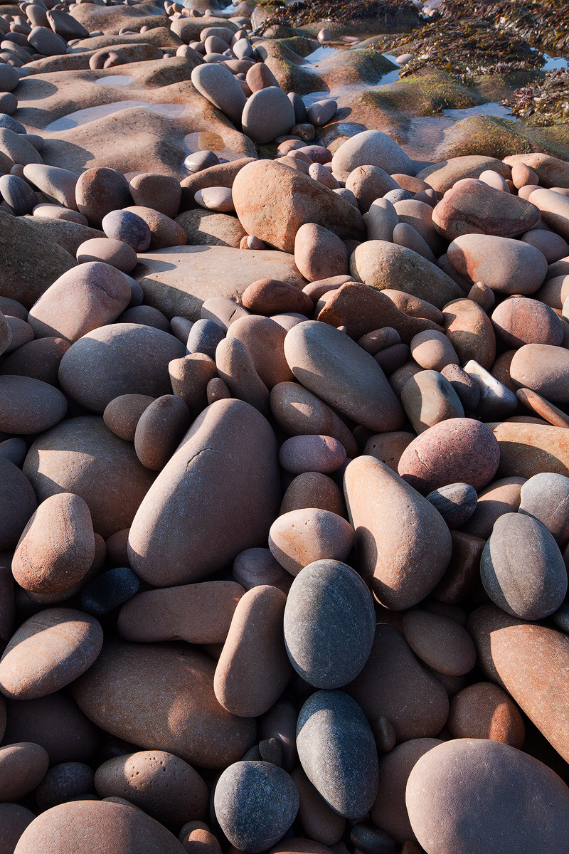
Another rock-scape at Clashach Cove, Hopeman, Moray, Scotland.

Thanks for having a look. Appreciate your comments and critiques.

Canon 5DM2
Canon TS-E 24mm f/3.5L II
ISO100 1/13sec f/11
SR Color Combo Polarizer

A quote by Edward Weston - "This then: to photograph a rock, have it look like a rock, but be more than a rock."

Comments

13 comments
Comment posted by Hamed Musharbak on February 27, 2012 at 7:57 AM
this is so good Eva, i like the size of the shapes

Hamed
Registered on June 1, 2009, 372 Posts, 2282 Comments
Comment posted by Peter Cross on February 27, 2012 at 12:08 PM
Very nice. I really like the variety of shapes, sizes, and colors in the rocks. Good example fo natural process at work to round and smooth all of those rocks whwich probably started out being very angular. The only thing I might change would be to crop so the URC disappears as it doesn't add to he composition in this case. Nevertheless, a great image.
Registered on April 3, 2010, 271 Posts, 1342 Comments
Comment posted by Kah Kit Yoong on February 27, 2012 at 1:09 PM
I like the idea and composition, perhaps cropped as suggested but don't think the harsh light was kind to you, washing out some of the colours. I think you could process working from an underexposed version to hold better colour.
Registered on September 27, 2006, 636 Posts, 10682 Comments
Comment posted by Morris McClung on February 27, 2012 at 1:11 PM
I also like the variety of shape, size, and color in this. I also agree that a crop off of the top might work. I find the foreground rocks to be the most interesting.
Registered on May 7, 2007, 670 Posts, 19650 Comments
Comment posted by Zack Clothier on February 27, 2012 at 1:36 PM
Very nice Eva! I would consider a small crop off the top to remove that darker shadow area in the right center. I like Kah's suggestion with working with a slightly underexposed version to see if you can bring out some more color in the rocks. It's still beautiful as posted though. :smile:
Registered on January 28, 2010, 343 Posts, 2257 Comments
Comment posted by Nick Bristol on February 27, 2012 at 5:00 PM
Very nice Eva. What I like most about this is the wonderful smooth texture of the rocks. Makes me want to reach out and touch them. I agree with Peter's crop suggestion. :smile:

Nick Bristol
Lone Rock, WI
Registered on February 1, 2004, 752 Posts, 14140 Comments
Comment posted by Eva McDermott on February 28, 2012 at 12:29 AM
Thanks all foUralic tour input. Here is a cropped version with some additional processing to saturate the color of the rocks. By cropping however, I loose the arc created by the smaller stones in the upper portion of the frame.
Registered on January 4, 2009, 1015 Posts, 13229 Comments
Comment posted by Tony Kuyper on February 28, 2012 at 9:47 AM
I really like the composition here and its abstract quality. Processing-wise, could maybe see pulling down the highlights a bit and opening the shadows, less contrasty.
Edit: Yes, more like that image above this comment.
Registered on November 1, 2003, 364 Posts, 22328 Comments
Comment posted by Lucy Aron on February 28, 2012 at 11:50 AM
Very nice. The angle makes the shot, cool subtle colors on the rocks.


lucy
Registered on February 25, 2011, 189 Posts, 1160 Comments
Comment posted by Chris Chamberlain on February 28, 2012 at 11:37 PM
I agree about the harsh light. But, I like the contrast and shadows created by that harsher light. It really helps to show the shapes and different sizes/relief of the cobbles in relationship to one another. You managed to retain that effect pretty well in the revision, and get the added color. I like it!

Chris
Registered on March 13, 2007, 500 Posts, 8365 Comments
Comment posted by Lon Overacker on February 29, 2012 at 1:29 AM
Eva,

This is very nice, and I really like the repost. For me the cropped version just takes this down and presents the core of the subject. I'm not sure I see the "arc" up top so for me the crop is a big improvement. I also like the adjustments you made in processing. I like this very much and would even say that I wouldn't even call the light harsh at all in the repost. Nice work.

Lon
Registered on November 24, 2006, 521 Posts, 19147 Comments
Comment posted by Anil Rao on March 2, 2012 at 11:59 AM
This kind of scene is dear to me and I love how you have portrayed it. The revised version is wonderful.
Registered on November 15, 2003, 234 Posts, 4923 Comments
Comment posted by Bill Chambers on March 3, 2012 at 4:49 PM
Beautiful Eva. I love the mix of shapes and sizes, and espcecially color and the speckles. I might crop from the top to remove the standing water, but that's subjective.
Registered on April 10, 2005, 753 Posts, 21216 Comments