Nature Photographers Network
This is the preserved archive of the original Nature Photographers Network. The community continues at naturephotographers.network.
Untitled
‹ PreviousLandscape GalleryNext ›

Untitled

by Tony Kuyper

Gallery: LandscapePosted March 30, 2012541 views33 comments
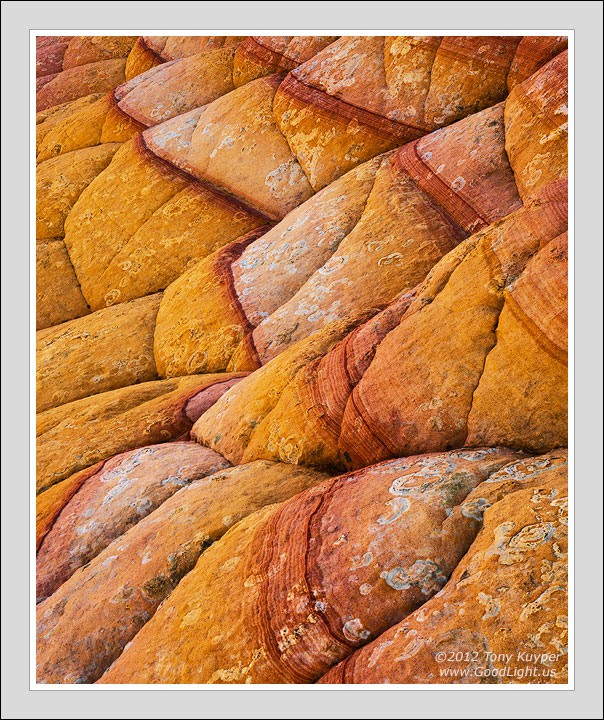
I find this area interesting, but none of my comps from a trip here last fall thrilled me when I got home. Nonetheless, I decided to pull one into Photoshop and see where it might take me. It was an interesting experience. While I wasn't sure where to go with the image initially, it eventually developed into the repeating forms and patterns that seemed to work well together.

I can't say that I fell in love with this image like I sometimes do, but as it progressed, I wanted to help it go as far as it could. The merit to this, it seems, is that it helped me see possibilities that I didn't when I took the picture. I didn't "visualize" this image. It's a product of Photoshop and experimentation--sort of a Photoshopic visualization, I suppose. That's not to say it's unreal, but it's not exactly what I saw when I took the picture either.

Would be curious as to your thoughts.

5D2, 28-300 @55mm, f/16, 1/10 sec. Complete Photoshopping for the image is at the bottom of this page.

Comments

33 comments
Comment posted by John Williams on March 30, 2012 at 11:38 PM
The patterns work really well for me Tony, lots of different lines to keep the interest. The heavy yellow-orange is also an interesting dynamic. I'd say it worked out well for an image that had to grow on you.
Registered on September 6, 2007, 221 Posts, 5985 Comments
Comment posted by Stuart Williams on March 31, 2012 at 12:03 AM
tony, i love the composition here - semi-abstract - the lines and textures are compelling. i like less the slightly muddy yellows to the left ... the lichen (or let's say what appears might be lichen) adds much.
Registered on December 7, 2007, 247 Posts, 4792 Comments
Comment posted by Peter Coskun on March 31, 2012 at 12:14 AM
I like the colors and the patterns in these rocks and the wave effect I see. Nicely done.
Registered on October 31, 2011, 170 Posts, 1240 Comments
Comment posted by Kory Lidstrom on March 31, 2012 at 2:18 AM
A fine abstract.
Registered on November 19, 2008, 49 Posts, 1035 Comments
Comment posted by Karsten Wrobel on March 31, 2012 at 4:08 AM
Tony, not quite as spectacular as some of your other work, but I really like the darker red band that nicely leads my eye through the frame... and the lichens in the lrc corner add interest and provide an anchor... the image works well for me
Registered on November 1, 2008, 117 Posts, 851 Comments
Comment posted by Sebastian Kraus on March 31, 2012 at 5:36 AM
I just love your work!
Registered on March 17, 2011, 30 Posts, 132 Comments
Comment posted by Andy Astbury on March 31, 2012 at 7:39 AM
The way you control contrast and luminosity is amazing Tony - there's so much textural detail here, and compositionally it sits in the frame great :toast:
Registered on January 11, 2007, 28 Posts, 257 Comments
Comment posted by Peter Richter on March 31, 2012 at 9:00 AM
Tony, your abstract has an amazing three dimensional quality that really brings it to life for me. The composition based on diverse diagonals works very well for me.

Peter
Registered on November 10, 2010, 218 Posts, 2723 Comments
Comment posted by Nick Bristol on March 31, 2012 at 9:03 AM
This worked out really well, Tony. I think your comp works well to show the nice shapes and patterns. The lichen adds some extra interest for me, and as always the processing and detail is wonderful. Your work is always amazing to me :smile: .

Nick Bristol
Lone Rock, WI
Registered on February 1, 2004, 752 Posts, 14140 Comments
Comment posted by Nancy Lea Sandy on March 31, 2012 at 9:33 AM
The patterns and folds really capture and hold my attention. I love the up close, personal feel to this image and battle-scarred appearance of the rocks.
Registered on January 24, 2011, 576 Posts, 6942 Comments
Comment posted by Paul Breitkreuz on March 31, 2012 at 9:52 AM
Tony, the undulating formation along with the lichen patterns here and there as well as the rolling stripes all add to the visual impact of the image. Well captured and processed as always. :cool:
Registered on February 25, 2006, 525 Posts, 8448 Comments
Comment posted by Harley Goldman on March 31, 2012 at 10:02 AM
I am enjoying the jogging patterns and rock detail. Nicely controlled jumble. I find the colors a bit too intense for my tastes.
Registered on November 19, 2003, 586 Posts, 11271 Comments
Comment posted by Taylor Reed on March 31, 2012 at 1:20 PM
Tony, incredible work as usual. The yellows seem to pop out more in the finished product vs RAW than the pinks/reds do, I wonder if that is ideal?

I think your unique willingness to share PSD files is perhaps the greatest single resource freely available to any budding nature photographer who has yet to grasp what it takes to get from a RAW file to the finished product (the only thing most folks share). On behalf of myself from several years ago, thanks again!
Registered on February 18, 2010, 26 Posts, 556 Comments
Comment posted by Ken Smith on March 31, 2012 at 2:37 PM
I enjoy the gritty textures on the billowing rock. The banding, and folds ...like dough that has risen with yeast ..then hardened in God's oven. Who will try to bite it?
Registered on September 5, 2008, 449 Posts, 2444 Comments
Comment posted by Peter Gordon on March 31, 2012 at 3:56 PM
Not sure of the in's and outs of the photoshopping but the end result looks great..
Registered on May 31, 2007, 224 Posts, 1490 Comments
Comment posted by Nathan Apodaca on March 31, 2012 at 4:39 PM
Very nice! Reminds me of a quilt or something. IMO, the comp. is incredible.
Registered on November 16, 2011, 67 Posts, 1127 Comments
Comment posted by Mark Metternich on March 31, 2012 at 5:49 PM
I think it works really well in a stacked symmetrical yet convoluted way. You are excellent at these abstract type shots!

My only wondering is if the yellows might be a hair strong and maybe better shifted a little toward cooler?
Registered on June 19, 2009, 276 Posts, 6240 Comments
Comment posted by John Fan on March 31, 2012 at 6:41 PM
Like the strong lines, texture and color.
Registered on August 24, 2010, 135 Posts, 489 Comments
Comment posted by Jon Daining on March 31, 2012 at 9:30 PM
This is a classic Tony Kuyper composition! I love that you have such a unique style. I like how you used the red stratification to produce leading lines, while the rock fissures provide strong diagonals. I personally would tone down the saturation in the orange/yellow bands. But as is, this is still a fine image.
Registered on February 25, 2012, 25 Posts, 191 Comments
Comment posted by Mark Seaver on March 31, 2012 at 11:12 PM
I think it's great. The variety of textures and colors flows so nicely from the lr to ul. I'd like to see a larger version to thoroughly enjoy all of the details in those lichen (I guess) covered areas.
Registered on January 23, 2011, 1103 Posts, 17270 Comments
Comment posted by Chris Chamberlain on April 1, 2012 at 12:14 AM
Wonderfully abstract ! I thought at first it was maybe too yellow. But not so much now after looking at it for a bit. I love the contrasty red lines. One of them looks almost like a crack/fracture. All of the lines and folds? work together very harmoniuosly.

Chris
Registered on March 13, 2007, 500 Posts, 8365 Comments
Comment posted by Gary McGhee on April 1, 2012 at 11:52 AM
All the shapes in this fit beautifully into your framing Tony, it looks very well balanced. Super colour and fine detail as per usual. I like this a lot.

Gary.
Registered on April 15, 2010, 142 Posts, 2416 Comments
Comment posted by Gerald Liddelow on April 1, 2012 at 5:49 PM
I like how the darker lines guide my eye over the rocks, it reminds me of swells in the ocean, the colors are nice they don't seem artificial. Lovely work.
Registered on August 10, 2011, 30 Posts, 40 Comments
Comment posted by Scott Smorra on April 1, 2012 at 6:41 PM
I definitely like it Tony. The crisscrossing lines work very well here. I'm not completely sold on the colors though...maybe a bit less yellow?
Registered on November 2, 2009, 161 Posts, 2143 Comments
Comment posted by Maciej B. Markiewi on April 2, 2012 at 3:35 AM
This pattern image as always have your unwritten signature Tony. It works for me
Registered on July 16, 2008, 23 Posts, 77 Comments
Comment posted by Peyton Hale on April 2, 2012 at 10:18 AM
I must say I really love the patterns and hues of this image. And thanks for showcasing the various steps you took in PS to create the final product, this has really helped me see some other potentials in my PP workflow
Registered on December 9, 2011, 8 Posts, 43 Comments
Comment posted by David Chauvin on April 2, 2012 at 10:34 AM
Glad you took the time to bring this one to life, Tony. The repeating forms pull together nicely to form a coherent whole. :cool: :cool:
Registered on August 5, 2004, 1007 Posts, 5595 Comments
Comment posted by Hamed Musharbak on April 2, 2012 at 12:13 PM
Tony Kuyper is always special :toast:
Registered on June 1, 2009, 372 Posts, 2282 Comments
Comment posted by Rudy Ruberti on April 2, 2012 at 12:25 PM
The geologist in me finds the color a little strong, but regardless, I still like this a lot. The combination of color and texture really makes this pop. Nicely done.
Registered on October 28, 2008, 179 Posts, 1875 Comments
Comment posted by Morris McClung on April 3, 2012 at 2:56 PM
Different, unique, fascinating. Outstanding, Tony! :toast:
Registered on May 7, 2007, 670 Posts, 19650 Comments
Comment posted by Jimmy Gekas on April 3, 2012 at 3:11 PM
Another TK classic. :toast:
Registered on July 26, 2007, 244 Posts, 2807 Comments
Comment posted by Doug Koepsel on April 11, 2012 at 11:06 PM
Tony, this image does not have the continuous flow that I usually see in these images from you. To me, the bottom third is blocking that flow; I almost automatically scroll crop it off. My $0.02 anyway.
Registered on April 1, 2010, 196 Posts, 1592 Comments
Comment posted by Tom Haxby on April 21, 2012 at 11:23 AM
As always, really well done. Shapes, lines and colors all work for me. :toast:
Registered on July 6, 2006, 126 Posts, 647 Comments