Nature Photographers Network
This is the preserved archive of the original Nature Photographers Network. The community continues at naturephotographers.network.
Lake In The Clouds IV:
‹ PreviousLandscape GalleryNext ›

Lake In The Clouds IV:

by Wayne Jones

Gallery: LandscapePosted May 15, 2012260 views20 comments
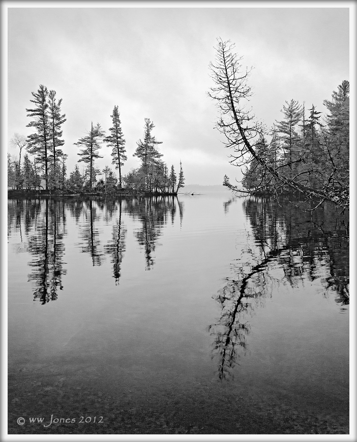
Lake In The Clouds IV: Leaning Cedars Vertical

Looking for COMPOSITION advice. Will you please compare this vertical version with the WIDER HORIZONTAL VIEW I posted last week? (Both are essentially full-frame shots taken from slightly different angles.) Any thoughts?

It's one of those views I have a hard time composing, so I took both horizontal and vertical shot. I was attracted to the leaning cedars, but I can't decide between the two.

Note: In revisiting these, I made some curves adjustments to bring out cloud details. That I like, but the composition still has me torn. Thanks


Canon 5DII
Canon 24-105
1/30 sec. @ f/11; ISO 640
Hand-held from canoe
Converted to B&W in CS5

Please see the larger version.

Comments

20 comments
Comment posted by Morris McClung on May 15, 2012 at 5:32 PM
I like this comp a little better, Wayne. Maybe because the trees are more prominent? I still like the tonal range you achieved with your pp. A very nice series!
Registered on May 7, 2007, 670 Posts, 19650 Comments
Comment posted by Nathan Apodaca on May 15, 2012 at 5:41 PM
I'm lovin' these B+W images! I like both comps, so I guess I'm not that much help... :wavey:
Registered on November 16, 2011, 67 Posts, 1127 Comments
Comment posted by Harley Goldman on May 15, 2012 at 5:48 PM
I like this a lot, Wayne. It is a very nicely balanced comp and works great in B&W.
Registered on November 19, 2003, 586 Posts, 11271 Comments
Comment posted by Jared Warren on May 15, 2012 at 7:22 PM
Very nice image. I prefer this vertical composition. The darker and slightly more visible foreground helps, I think. I'd be tempted to add a very subtle graduated filter from the top to mirror the darker foreground, but it already works very well for me.
Registered on May 11, 2012, 84 Posts, 931 Comments
Comment posted by Rick Turner on May 15, 2012 at 7:27 PM
Wayne,

The horizontal is tons better. I like them both.
Registered on February 18, 2012, 534 Posts, 2755 Comments
Comment posted by Shane McDermott on May 15, 2012 at 8:38 PM
Hi Wayne

Definitely the vertical, it brings the trees into more prominence, as well as balancing the heavy right sided horizontal comp. The vert has a consistent airy and spacious feel in and around the trees. The horizontal feels so right side dominant with the heavy dense nature of the vegetation along the shoreline.

Hope that helps.

Shane
Registered on November 12, 2007, 49 Posts, 1074 Comments
Comment posted by scott lanz on May 15, 2012 at 8:48 PM
Both excellent, Wayne, but put me down for the vertical. :toast:
Registered on November 14, 2003, 840 Posts, 12902 Comments
Comment posted by Navin Sarma on May 15, 2012 at 10:01 PM
Vertical. Much more interest for me :)
Registered on July 17, 2011, 233 Posts, 1373 Comments
Comment posted by Peter Cross on May 15, 2012 at 11:07 PM
I like the vertical better. The horizontal has too much of that large tree coming across the water. The vertical still captures it well but doesn't overdo it.
Registered on April 3, 2010, 271 Posts, 1342 Comments
Comment posted by Aaron Feinberg on May 16, 2012 at 1:11 AM
Looks good to me actually. Dig it as is. Nice work :)

aF
Registered on October 26, 2009, 399 Posts, 2789 Comments
Comment posted by Bill Chambers on May 16, 2012 at 12:06 PM
Really hard to compare IMO. Depends on the situation. If it were hanging over my mantelplace I would choose the horizontal version, but just taken on it's own I prefer the vertical version. How's that for ambigious?? :biggrin:

Beautiful shot either way. I like the quieter water in the horz version best.
Registered on April 10, 2005, 753 Posts, 21216 Comments
Comment posted by Phil Pogledich on May 16, 2012 at 12:23 PM
I like the composition of this version and prefer it to the landscape format of the shot at the link. This feels very balanced and cohesive, and the B&W conversion looks excellent. The landscape format shot is also very nice, but this one resounds with me more...perhaps it's because the vertical format helps distill the scene more effectively and allows me to focus on the key elements without distraction.
Registered on August 24, 2009, 123 Posts, 3099 Comments
Comment posted by Lon Overacker on May 16, 2012 at 3:51 PM
Wayne,

I failed to comment on your previous entries, but since I like this one the best anyway, now's the time! Contrast and tones are excellent, but what makes this one work so well is simply the design and composition. Excellent!

Lon
Registered on November 24, 2006, 521 Posts, 19147 Comments
Comment posted by Stan Rose on May 16, 2012 at 3:56 PM
It aint even close, Wayne--this one by a mile! It's an 'airy' subject, and the heavier blacks in the first one are counterproductive. Id back off the sharpening just a wee bit and call it a winner. :toast:
Registered on September 15, 2005, 836 Posts, 17099 Comments
Comment posted by Durwood Edwards on May 16, 2012 at 3:58 PM
The vertical is my choice, also. Not only for its emphasis of the trees, but it is just a much more intimate rendering of the scene. I feel very present in this comp, rather than just looking at the scenery from afar. :toast:
Registered on December 8, 2006, 116 Posts, 394 Comments
Comment posted by Bill Leggett on May 16, 2012 at 6:33 PM
Vert nice, Wayne. Kinda reminds me of the Boundary Waters is Northern Minnesota.
Registered on July 21, 2004, 706 Posts, 3233 Comments
Comment posted by Michael Westerbeck on May 16, 2012 at 6:47 PM
Very nice Wayne. I like this version better as my eye seems to focus more on the leaning cedar tree. Well done...
Registered on March 21, 2012, 32 Posts, 111 Comments
Comment posted by Danny Laureys on May 17, 2012 at 7:34 PM
Excellent, I like this one more, specially the reflection, in particular the right side, excellent comp and conversion. :toast: :toast:
Registered on January 5, 2008, 590 Posts, 1261 Comments
Comment posted by Tony Kuyper on May 18, 2012 at 9:21 AM
This may be the best one yet, Wayne. This feels as much like and etching as a photograph.
Registered on November 1, 2003, 364 Posts, 22328 Comments
Comment posted by Howard Cheek on June 4, 2012 at 6:24 PM
I prefer this one Wayne. The vertical is better suited for the prominent leaning/curved tree.
You've also eliminated those dark areas of the horizontal comp rt side in deep shadow.
I see you've removed the underwater root FG as well.
Very nice series Wayne :toast:
Registered on July 24, 2008, 1201 Posts, 10758 Comments