Gallery: LandscapePosted May 28, 2012269 views18 comments
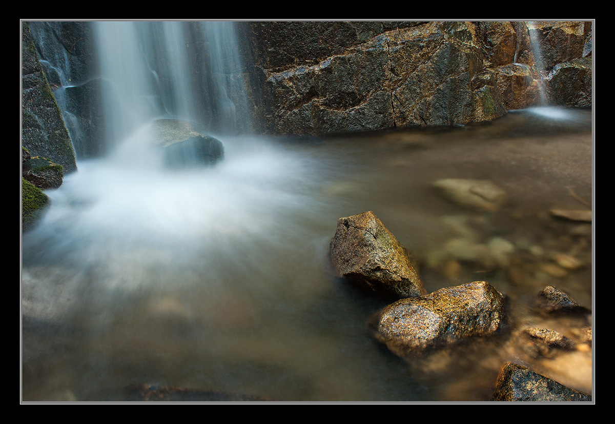
Another angle of view from this waterfall in Yosemite that I had not seen before. Thanks for your thoughts. Large version too!
D200,
24-70 2.8
6sec, F/22
Thanks,
Chris
Comments
18 comments
Comment posted by Jeremy Calow on May 28, 2012 at 1:29 PM
I really like the comp Chris. The detail and texture is spot on as well.. My nit (though it may just be my mind playing tricks) is because the water isn't falling straight up and down the image feels tilted - perhaps rotate a bit (unfortunately that would move the line of rocks off of the corner..) Just my thought - by no means an expert
Registered on November 8, 2007, 39 Posts, 363 Comments
Comment posted by Navin Sarma on May 28, 2012 at 1:44 PM
A soothing scene, Chris. I'm diggin the mini fall on the right; the shutter speed was perfect to give it form.
Registered on July 17, 2011, 233 Posts, 1373 Comments
Comment posted by Tony Kuyper on May 28, 2012 at 1:53 PM
Yeah, this is nice. Reminds of one of Michael Gordon's black and white images. Textures here are very appealing. Light area in LRC a bit distracting.
Registered on November 1, 2003, 364 Posts, 22328 Comments
Comment posted by Daniel Rappaport on May 28, 2012 at 2:08 PM
Nice angle and composition. Like the golden glow of tne RLC rocks.
Registered on September 9, 2009, 294 Posts, 2006 Comments
Comment posted by Morris McClung on May 28, 2012 at 2:08 PM
Very natural, but rich colors and tones throughout this one. The comp is excellent, too. I agree with Tony about the bright area lrc. Darken that a little and then all of these rocks you made so beautiful will really shine!
Registered on May 7, 2007, 670 Posts, 19650 Comments
Comment posted by Karsten Wrobel on May 28, 2012 at 2:32 PM
I really like the dynamic here driven by the powerful diagonal line which leads my eye from the lrc to the falls and back...
Registered on November 1, 2008, 117 Posts, 851 Comments
Comment posted by Peter Richter on May 28, 2012 at 2:42 PM
Chris, your composition works very well for me, especially the smaller fall at the right counteracting the large one. I also enjoy the colors and textures of the rocks, they make for nice focal points to me.
Peter
Registered on November 10, 2010, 218 Posts, 2723 Comments
Comment posted by Preston Birdwell on May 28, 2012 at 3:02 PM
Chris,
This is an interesting take on Wildcat. I like the comp, but I do prefer the earlier shot.
I am noticing a pronounced cyan cast in the whitewater in IE-9. I also viewed this in Firefox. The cast is less pronounced, but still visible.
--P
Registered on November 1, 2003, 471 Posts, 5188 Comments
Comment posted by Chris Chamberlain on May 28, 2012 at 3:08 PM
Thanks Preston!
I don't what to say about a pronounced cyan cast, I just don't see it. I can see how it's possibly slightly dark/underexposed in the white areas. Not that it's not there, just not to my eyes/ monitor. But I have this issue often enough that you are probably right Maybe I'm color blind?
Chris
Registered on March 13, 2007, 500 Posts, 8365 Comments
Comment posted by Anil Rao on May 28, 2012 at 3:46 PM
Beautiful composition, Chris. Especially, the inclusion of the smaller second fall.
Registered on November 15, 2003, 234 Posts, 4923 Comments
Comment posted by Tom Kualii on May 28, 2012 at 3:50 PM
Like the warm feel. Doesn't it make you wish that was a gold nugget!! Nice shot.
Registered on November 24, 2010, 53 Posts, 139 Comments
Comment posted by Nick Bristol on May 28, 2012 at 6:43 PM
Chris, This is so nice! I think this comp works so well, especially with the smaller falls included in the scene. The colors and detail look great to me. I also like how the falls look from your 6 sec exposure. Very nice work with a wonderful feel.
Nick Bristol
Lone Rock, WI
Registered on February 1, 2004, 752 Posts, 14140 Comments
Comment posted by Lon Overacker on May 28, 2012 at 9:06 PM
Hey Chris,
Great take on these falls. Perhaps Kyle will post his version - as you know the comp is the same, but his processing and timing are quite different. This is wonderful and view I've never really considered as it's really not completely obvious standing there. Anyway, great job including the golden rocks in the foreground and I really love the comp with the background cascade completing the scene.
I would agree about burning down the bright area in the LRC. Also, I'm not going to mention this just to agree with Preston, but I see the cyan too. Sometimes these things are subtle and we lose sight of them after working on an image for a while. Just try taking a regular hue/sat adjust layer and play with the cyan slider - increase it and you see the cyan pop out of the cascade. Dial it back down and you can see it go away too. Another way to check is with the color picker tool. anyway, it's most notable around the fringes in the pool, but also the falling water against the rocks, both left and right. In the end though, it's more subtle than obvious, but it's there.
A couple of tweaks and you've got yourself a keeper.
Lon
Registered on November 24, 2006, 521 Posts, 19147 Comments
Comment posted by Chris Chamberlain on May 28, 2012 at 11:02 PM
Okay, here's a version with the cyan in the white water reduced, and burned down the bright spot in the LRC.
I think cyan reduction is something I'm just going to have to automatically think about. Seems to be an Achilles Heal for me.
Thanks
Registered on March 13, 2007, 500 Posts, 8365 Comments
Comment posted by Stan Rose on May 29, 2012 at 1:24 AM
I like the gold sheen on the rocks, and the comp is kind of quirky--which is a good think in my book. I would have preferred a shorter exposure for more detail in the falls--i just scolded another poster for a 5 s exposure--6 s is too long for most water shots IMO, unless its being used for some specific artistic purpose (and i dont see how removing detail is helpful--just my take)
Registered on September 15, 2005, 836 Posts, 17099 Comments
Comment posted by Rick Turner on May 29, 2012 at 9:27 AM
I like the 6 sec exposure results..
Registered on February 18, 2012, 534 Posts, 2755 Comments
Comment posted by Vance Gese on May 30, 2012 at 12:00 AM
Love your composition, Chris. The rocks in the lower right act perfectly as a counter to the falls. Love the golden hues in the rocks. Your repost is spot on perfect in my opinion; the cyan cast is gone. Exquisite work.
Registered on November 13, 2008, 298 Posts, 6629 Comments
Comment posted by Mark Metternich on May 31, 2012 at 12:15 PM
Looks great. I might cool it a hair.
Registered on June 19, 2009, 276 Posts, 6240 Comments

Comments
18 commentsPeter
This is an interesting take on Wildcat. I like the comp, but I do prefer the earlier shot.
I am noticing a pronounced cyan cast in the whitewater in IE-9. I also viewed this in Firefox. The cast is less pronounced, but still visible.
--P
I don't what to say about a pronounced cyan cast, I just don't see it. I can see how it's possibly slightly dark/underexposed in the white areas. Not that it's not there, just not to my eyes/ monitor. But I have this issue often enough that you are probably right
Chris
Nick Bristol
Lone Rock, WI
Great take on these falls. Perhaps Kyle will post his version - as you know the comp is the same, but his processing and timing are quite different. This is wonderful and view I've never really considered as it's really not completely obvious standing there. Anyway, great job including the golden rocks in the foreground and I really love the comp with the background cascade completing the scene.
I would agree about burning down the bright area in the LRC. Also, I'm not going to mention this just to agree with Preston, but I see the cyan too. Sometimes these things are subtle and we lose sight of them after working on an image for a while. Just try taking a regular hue/sat adjust layer and play with the cyan slider - increase it and you see the cyan pop out of the cascade. Dial it back down and you can see it go away too. Another way to check is with the color picker tool. anyway, it's most notable around the fringes in the pool, but also the falling water against the rocks, both left and right. In the end though, it's more subtle than obvious, but it's there.
A couple of tweaks and you've got yourself a keeper.
Lon
I think cyan reduction is something I'm just going to have to automatically think about. Seems to be an Achilles Heal for me.
Thanks