Nature Photographers Network
This is the preserved archive of the original Nature Photographers Network. The community continues at naturephotographers.network.
Polychrome Badlands
‹ PreviousLandscape GalleryNext ›

Polychrome Badlands

by Tony Kuyper

Gallery: LandscapePosted June 15, 2012555 views35 comments
I've spent most of my adult life working at clinic's on the western side of the Navajo Reservation in northern Arizona. I've always enjoyed the area and after nearly 29 years am still finding new things.

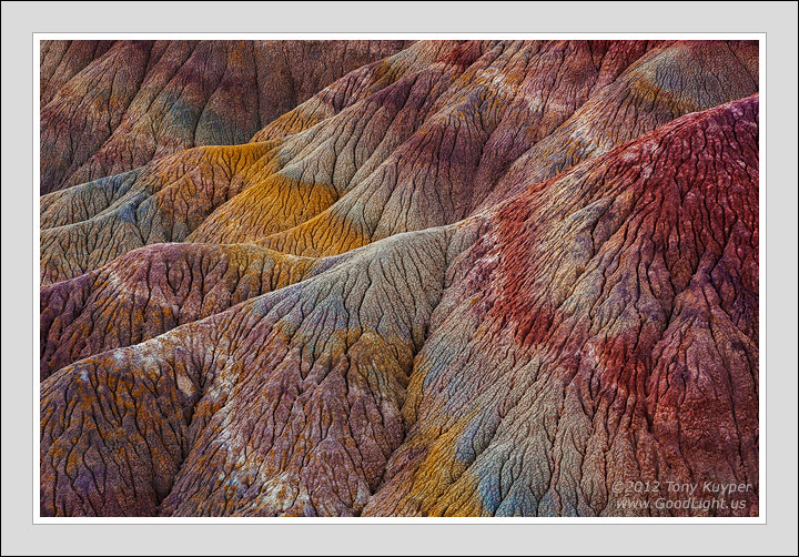
This particular place is a bit distant from where I live, and even though I first photographed here several years ago, it's only recently that I've figured out how to work the images. I've found that it's a place that actually Photoshops better than it photographs. There are subtle colors here, but it's the heavy-handed Photoshopping that helps bring them out (+80 Vibrance in the RAW converter to start).

At least I think it seems to help. The colors do exist, though they don't look like this. I've gone here with friends who were more impressed with the small plants growing in the cracks than with the coloration in the formations. So it's necessary to push, I think, to get people's attention. Not sure if that's a good rationale or not (probably not), but I like going in this direction anyway, so it doesn't bother me if it departs from what is true.

Would be interested in your thoughts on this image. If it bothers you, please feel free to say so. I like the different opinions here.

5D2, 28-300 @ 109mm, f/16, 1/2 sec. A bit of the Photoshopping is here.

Appreciate hearing below that the image looks a little dark. This always seems to happen to images that I prep for posting here, and I usually pull back my normal post-sharpening adjustment layer, which darkens the image slightly, to 50% opacity. However, I purposely left it at 100% opacity here as I liked the richer colors. Good to know, however, that the 50% mark is probably a better bet. Thanks.

Comments

35 comments
Comment posted by Lon Overacker on June 15, 2012 at 11:24 PM
Hi Tony,

Great to see a post from you. Your ears must have been burning as I just was writing about your masks and actions in Morris' post. ;-)
Photoshops better than it photographs.

I can't say I've ever heard something expressed like this when it comes to photography and processing. Speaks volumes to the creative side of our craft and art. And I have to say that what I've learned from you, your tutorials, and sharing your processing and knowledge that I have moved further beyond just a point-n-shoot documentary photographer. I've learned how to make the very best of out every image I work on.

But to your image. I find this one much closer to reality than any of your previous sandstone entries from a couple months ago. This one is masterful because it's not so clear to me that you "Photoshopped" this. Where as previously, through artistic license of course, you took these to a level where it was very clear what you were expressing.

Here, at least to me, the colors aren't bold or brash, but are more believable and not overdone. Oh, and aside from color, the forms, lines, texture and details here are just fantastic.

I'm thoroughly enjoying this image. thanks for posting!

Lon
Registered on November 24, 2006, 521 Posts, 19147 Comments
Comment posted by Stan Rose on June 16, 2012 at 12:41 AM
It don't bother me, Tony. If the colors were there, they were there--you didn't 'create them. I learned years ago from painting that how and what we see differs from minute to minute, and is obviously light dependent. If you need to boost saturation +300 to bring out the colors you saw, then have at it. I personally distinguish photo-art from photography by defining the former as a fantasy, a creation of the imagination, while the latter is reality. But reality is subjective IMO. Which is why i always argue for disclosure--it's a matter of integrity if you ask me.
I like this image--has great subtle hues and textures--nicely balanced and natural looking. :wavey:
Registered on September 15, 2005, 836 Posts, 17099 Comments
Comment posted by Jean Day on June 16, 2012 at 1:39 AM
It's a beautiful abstract of a unique looking landscape. I think as art is subjective and a reflection of our vision, you're justified in deepening the colors here. You're not adding something that isn't there, just enhancing...and doing so beautifully. :toast:
Registered on April 10, 2011, 36 Posts, 306 Comments
Comment posted by Shantikara Valuska on June 16, 2012 at 2:12 AM
Very beautiful abstract! I can just stare at it and enjoy the amazing colors. Even though you really pushed the saturation, it looks natural. I tend to be too careful with my processing, afraid to overdo things, and than end up with a weak image. In today's virtual world the borders became very elusive. You managed to find the right balance with this image.
:toast: :toast: :toast:
Registered on July 25, 2011, 38 Posts, 451 Comments
Comment posted by Bill Chambers on June 16, 2012 at 2:19 AM
The colors are always enjoyable, but it's your compositional skill that always grabs me. Very organic and "alive" - I would love to see this in person.
Registered on April 10, 2005, 753 Posts, 21216 Comments
Comment posted by Youssef Ismail on June 16, 2012 at 3:06 AM
Tony it does not look photoshopped at all. The colors are completely believable and I would have assumed they were. In any case it is a well crafted image. I like how you bring out the subtleties of colors that do exist even if they are faint in capture. And I do echo Lon's comment on your contributions in processing. It has taken the work of everyone I know who uses them to new levels. Thanks.
Registered on November 1, 2003, 474 Posts, 5555 Comments
Comment posted by Tom Kualii on June 16, 2012 at 4:29 AM
Sweet work....
Registered on November 24, 2010, 53 Posts, 139 Comments
Comment posted by Alister Benn on June 16, 2012 at 7:05 AM
Simply gorgeous, the range of color and structures is magnificent...
Registered on June 9, 2011, 23 Posts, 258 Comments
Comment posted by Gary McGhee on June 16, 2012 at 7:57 AM
Amazing shot as usual Tony, IMO it doesn't matter how you got to this point it's the final product that counts. Your work is very inpirational to me.

Gary.
Registered on April 15, 2010, 142 Posts, 2416 Comments
Comment posted by Floris van Breugel on June 16, 2012 at 8:04 AM
In all honesty, I'm a little torn. On the one hand, it's an absolutely beautifully crafted piece of art that doesn't make me think of photoshop at all. And one can fairly argue that the discussion should end there. But if I were to visit this place, based on your description, it wouldn't look anything like this.. and in some sense that's a little disappointing.

In this case, contrary to what others typically say, I'd rather not have known the details of the processing.. since it focuses my attention on that. It's art for arts sake, and for that reason, the details of processing are unnecessary, and IMO actually detract from my appreciation for it. There are very few types of photographs that I would say that for, but this is one of them. Of course, there's plenty of people that will want to know, but I think for an image like this it might actually be best not to share those details until asked, and at that point be completely forthcoming with the processing details.
Registered on December 19, 2008, 306 Posts, 4840 Comments
Comment posted by Nick Bristol on June 16, 2012 at 8:37 AM
Beautiful! I love this image, Tony. It has a wonderful feel with texture that is just amazing. I love the color!...and to me it looks very real even if not what we would have seen if there. Excellent work...as always.

Nick Bristol
Lone Rock, WI
Registered on February 1, 2004, 752 Posts, 14140 Comments
Comment posted by Marc Adamus on June 16, 2012 at 8:59 AM
I think a little brighter would do it for me, Tony. Outstanding layered composition. And what Floris said.
Registered on September 17, 2005, 780 Posts, 8091 Comments
Comment posted by Morris McClung on June 16, 2012 at 9:41 AM
Palpable textures, Tony! It looks and "feels" like an old chenile(?) bedspread from the 50's like my Grandmother used to have. i love the colors and your use of lines is excellent. No mistaking this as anything but a "Kuyper." :smile:

I will just second what Lon wrote about your work enabling me to get the best out of every image I work on, and I'm just getting started on that journey. So, I look forward to where it might take me in the future. Thanks again. :toast:
Registered on May 7, 2007, 670 Posts, 19650 Comments
Comment posted by Eva McDermott on June 16, 2012 at 9:41 AM
Love the rich layers of color Tony. Spectacular texture too.
Registered on January 4, 2009, 1015 Posts, 13229 Comments
Comment posted by Jorne de Bruin on June 16, 2012 at 9:50 AM
A stunning range of colours and a strong comp as well! :toast:
Registered on June 26, 2008, 178 Posts, 2136 Comments
Comment posted by Rick Turner on June 16, 2012 at 9:51 AM
What this great capture does for me is awaken my senses to other directions I can take. Bravo :wavey:
Registered on February 18, 2012, 534 Posts, 2755 Comments
Comment posted by Paul Marcellini on June 16, 2012 at 9:51 AM
Definitely what we have come to expect from you Tony! It seems a touch dark to me though.
Registered on November 27, 2007, 250 Posts, 2468 Comments
Comment posted by Joseph Campisi on June 16, 2012 at 12:47 PM
Gorgeous colors and textures here Tony! I too think it looks pretty natural. You are the master at these kinds of images. Keep them coming!
Registered on November 24, 2008, 304 Posts, 3211 Comments
Comment posted by dean hebert on June 16, 2012 at 1:56 PM
Moving a slider or intensifying what's already there is definitely fair game. I always carry a couple of cans of spray paint with me! :wink: Great lines and texture! :toast:
Registered on August 4, 2010, 70 Posts, 1132 Comments
Comment posted by Kathy Barnhart on June 16, 2012 at 2:49 PM
I love this image as it is, regardless of how "true" it is. The colors and textures and lines are what make it unique and fun to look at, for a long time. Thanks for your vision and for sharing!
Registered on November 11, 2011, 404 Posts, 1639 Comments
Comment posted by Harley Goldman on June 16, 2012 at 3:44 PM
I am definitely enjoying the composition, with its rolling "dunes" and lines. I am finding the colors a bit too saturated for my tastes, but far less so than in many of your images.
Registered on November 19, 2003, 586 Posts, 11271 Comments
Comment posted by Tom Hilton on June 16, 2012 at 6:44 PM
Tony,
I really like the image.
But it seems to me what really matters is:
Do YOU like it.
or Does your client like it.
Me, I love the color bal.
saturation, texture and vibrance
I think this will be a killer large print.
Registered on September 19, 2011, 68 Posts, 668 Comments
Comment posted by Tony Kuyper on June 16, 2012 at 8:55 PM
Like this image:confused:

I'll be honest and say that I'm so far beyond "like" in every picture I post here that my objectivity is seriously compromised. I invite criticism to pull me back to reality. There are things I just can't see without the help of others.
Registered on November 1, 2003, 364 Posts, 22328 Comments
Comment posted by Stan Rose on June 16, 2012 at 9:10 PM
OK, Tony, it sucks :wink:
Seriously, I hear what Floris is saying, But im not sure i agree with his conclusion. Maybe Joe Public wouldn't see what you saw--but i'd like to think i would (even if it took me a few shots of tequila beforehand...)
Registered on September 15, 2005, 836 Posts, 17099 Comments
Comment posted by Peter Richter on June 17, 2012 at 8:47 AM
Tony, the repetititve pattern together with the color palette works wonderfully for me. Your composition and crop is spot on to my eye.

Peter
Registered on November 10, 2010, 218 Posts, 2723 Comments
Comment posted by Mark Seaver on June 17, 2012 at 1:37 PM
Tony, this is an awesome collection of lines, layers, shapes, and colors. I especially find the juxtaposition of lines running left to right and colors running right to left interesting. In my opinion, since you're already creating an abstract, there's no reason not to push further using photoshop.
Registered on January 23, 2011, 1103 Posts, 17270 Comments
Comment posted by Harry Lichtman on June 17, 2012 at 8:12 PM
Very intriguing patterns and colors. Maybe just post in the art category instead of landscape and avoid the dilemma. You saw the possibilities and made the most of it. A little brighter would help.
Registered on September 17, 2010, 304 Posts, 3507 Comments
Comment posted by Doug Koepsel on June 17, 2012 at 8:32 PM
Tony, it seems the front ridge blends in with the middle since there is not much difference in brightness and vibrance, as there is between the middle and back. This image has the characteristic lines and colors that I like in your art.
Registered on April 1, 2010, 196 Posts, 1592 Comments
Comment posted by David Edwards on June 18, 2012 at 3:32 AM
Love the textures and color you've highlighted here Tony. It certainly is a wonderful work of art, and I appreciate it as such. It's your interpretation of the scene, and you've brought your vision forth very clearly in it. I don't want to see how it actually looked, I'm more interested in the way you've expressed your feelings about it. Beautiful work.
Registered on December 6, 2008, 142 Posts, 2623 Comments
Comment posted by Kah Kit Yoong on June 18, 2012 at 7:35 AM
I'm happy with the lighting levels. Absolutely beautiful image however I would also concur that if it differs that much from reality it should be in photo art.
Registered on September 27, 2006, 636 Posts, 10682 Comments
Comment posted by Michael J Greene, on June 18, 2012 at 12:35 PM
Hi Tony,

I like the image and composition. I do agree that it feels a little dark, especially the tonality throughout the image. The magenta tones especially noticeable. I could see increasing the luminance if possible in that area. Overall, I do it like very much. No issues at all with the colors. Good to see you posting.

PS - I don't think I have mentioned this to you, but I have been more impressed with the print quality of your published images in the books that I have seen - than pretty much anyone else on this site.
Registered on June 18, 2009, 86 Posts, 2317 Comments
Comment posted by Bruce King on June 18, 2012 at 12:55 PM
I like this a lot Tony. The processing doesn't bother me at all and I'm glad you included some of the details. If I were to ever visit the area I might be looking for this scene and of course would find it if I based the search on the image posted. As long as you're pushing it I might try adding a little Orton or Glow from Nik. Not too dark IMO but maybe a little flat? Probably not.......but I had to find something to critique. :wink:
Registered on January 14, 2010, 276 Posts, 2212 Comments
Comment posted by Helmut Steidl on June 19, 2012 at 1:28 AM
Hello Tony ...

Like the colours and lines in this Image .... very well done ...

Helmut
Registered on May 18, 2011, 17 Posts, 67 Comments
Comment posted by Michael Anderson on June 19, 2012 at 5:12 PM
I love it Tony. The colors make it quite unique and beautiful. Just out of curiosity, do the colors gain a natural extra bit of saturation when the area is wet?
Registered on January 31, 2006, 228 Posts, 3072 Comments
Comment posted by Anil Rao on June 20, 2012 at 2:22 AM
The location as depicted in this photograph is simply magical. The composition perfectly accentuates the myriad of undulating patterns and I also love the assortment of colors.

I love your vision, Tony, and this photograph does is justice.
Registered on November 15, 2003, 234 Posts, 4923 Comments