Gallery: LandscapePosted June 28, 2012175 views5 comments
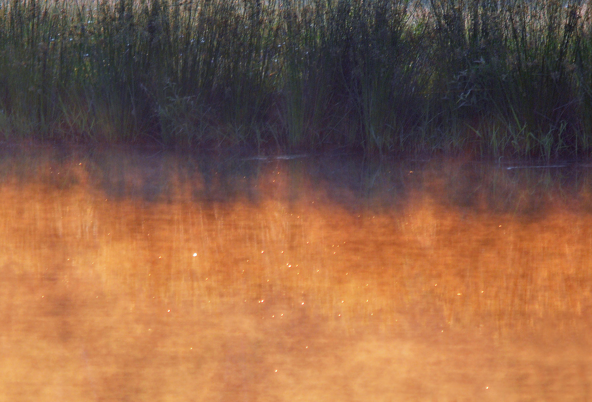
This is a close-up of the pond from my previous Landscape post. Very little was done in terms of saturation. Just cloned out some OOF weeds in the FG, sharpened, crop, etc. D90, larger posted too, thanks for your comments!!
Comments
5 comments
Comment posted by Bill Maile on June 28, 2012 at 10:55 AM
another crop idea...
Registered on March 2, 2009, 984 Posts, 2518 Comments
Comment posted by Luke Ormand on June 28, 2012 at 11:39 AM
Nicole colors and a decent scene here - but the white reflections are a bit distracting and I would like more color and a little less grass - in the middle of your two posts
Registered on February 4, 2009, 1093 Posts, 7035 Comments
Comment posted by Tony Kuyper on June 28, 2012 at 2:57 PM
Works for me. Simple, elegant, and some nice color contrast.
Registered on November 1, 2003, 364 Posts, 22328 Comments
Comment posted by Lon Overacker on June 28, 2012 at 5:17 PM
Bill,
Nice and simple. the warm light and mist rising off the water are nice. Gotta be straight though, this one just isn't keeping me engaged. Like it's missing something.
Lon
Registered on November 24, 2006, 521 Posts, 19147 Comments
Comment posted by Jared Atencio on June 29, 2012 at 10:14 AM
The reflection and light reminds me of Monet's famous sunset in Venice painting, and that I very much like. As nice as the light is, there doesn't seem to be a very strong or defined subject to anchor this down, so it almost feels like a crop from a larger photo (which it is). I like the second version with just a little more on top if possible.
Registered on June 23, 2009, 21 Posts, 422 Comments

Comments
5 commentsNice and simple. the warm light and mist rising off the water are nice. Gotta be straight though, this one just isn't keeping me engaged. Like it's missing something.
Lon