Gallery: FloraPosted June 29, 201272 views8 comments
Re-post based on feedback. Thanks for the suggestions.
Comments
8 comments
Comment posted by Carolyn Derstine on June 29, 2012 at 10:50 AM
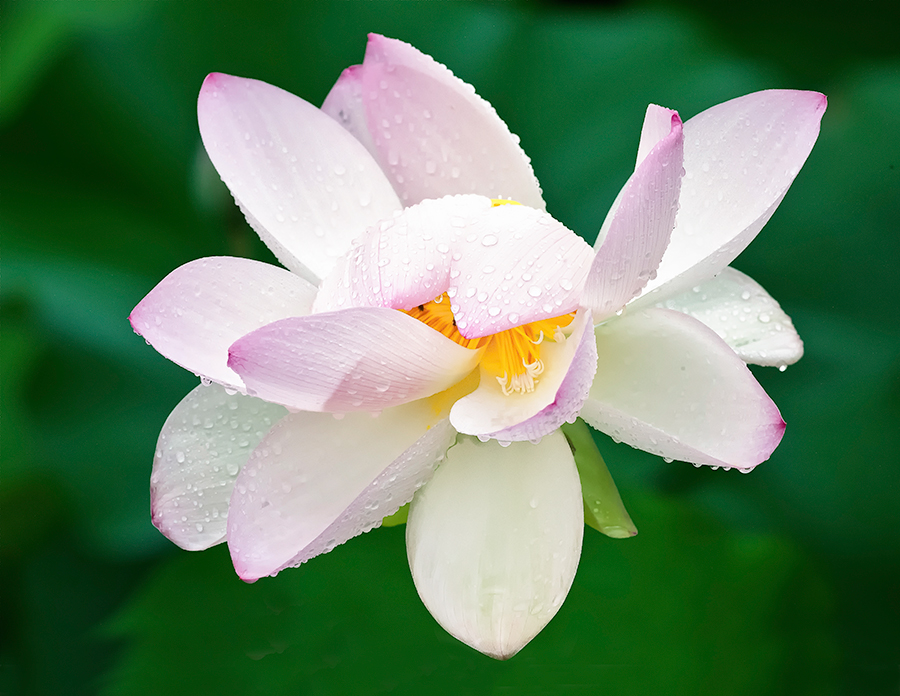
Much better, Bunn! This comp feels "right" to me. A lovely image of a lovely flower! However, if you ever want to print it large, there are a few minor processing artifacts--some barely visible lines to the right of the bottom petal and some cloning "ghosts" to the left of the bottom petal--that you may want to clean up first.
Registered on February 16, 2011, 610 Posts, 3684 Comments
Comment posted by Ken Smith on June 29, 2012 at 3:13 PM
I like those dew drops...looks like the rain pounded it into submission! Treat seeing the center with escaping pistols. DOF is good...puts the weight on the very center.
Registered on September 5, 2008, 449 Posts, 2444 Comments
Comment posted by John Williams on June 29, 2012 at 3:56 PM
What a beauty. I like how the inner portion is hinted at; it is quite the tease.
Registered on September 6, 2007, 221 Posts, 5985 Comments
Comment posted by Walt Sterneman on June 29, 2012 at 4:08 PM
Nice job Bunn. The water drops are quite nice.
Registered on March 24, 2010, 73 Posts, 1268 Comments
Comment posted by Ramamohan Pai on June 29, 2012 at 10:34 PM
Bunn - Good take on the Lotus. Love the water drops and being able to see the yellow portions in the center in a peekaboo fashion.
Reducing the exposure a bit might bring forward slightly more saturated pinks.
Registered on November 1, 2003, 550 Posts, 9037 Comments
Comment posted by Gary Yeoh on June 30, 2012 at 7:19 AM
Bunn:
I like the original but this one is even better. Just lovely
If you have time, please comment on others' postings as well. It may be intimidating at first but you will find that you also learn a lot from the exercise; copy what others have done and avoid their mistakes without having to make them yourselves
Registered on September 1, 2009, 588 Posts, 8184 Comments
Comment posted by Bill Fach on June 30, 2012 at 4:06 PM
Bunn: This is wonderful. Terrific subject superbly presented. >=))>
Registered on November 1, 2003, 1805 Posts, 26981 Comments
Comment posted by Morris McClung on July 4, 2012 at 11:34 PM
Radiant.
Registered on May 7, 2007, 670 Posts, 19650 Comments

Comments
8 commentsReducing the exposure a bit might bring forward slightly more saturated pinks.
I like the original but this one is even better. Just lovely
If you have time, please comment on others' postings as well. It may be intimidating at first but you will find that you also learn a lot from the exercise; copy what others have done and avoid their mistakes without having to make them yourselves