Nature Photographers Network
This is the preserved archive of the original Nature Photographers Network. The community continues at naturephotographers.network.
Arizona Sunset
‹ PreviousLandscape GalleryNext ›

Arizona Sunset

by Jason Keefe

Gallery: LandscapePosted July 1, 2012259 views17 comments
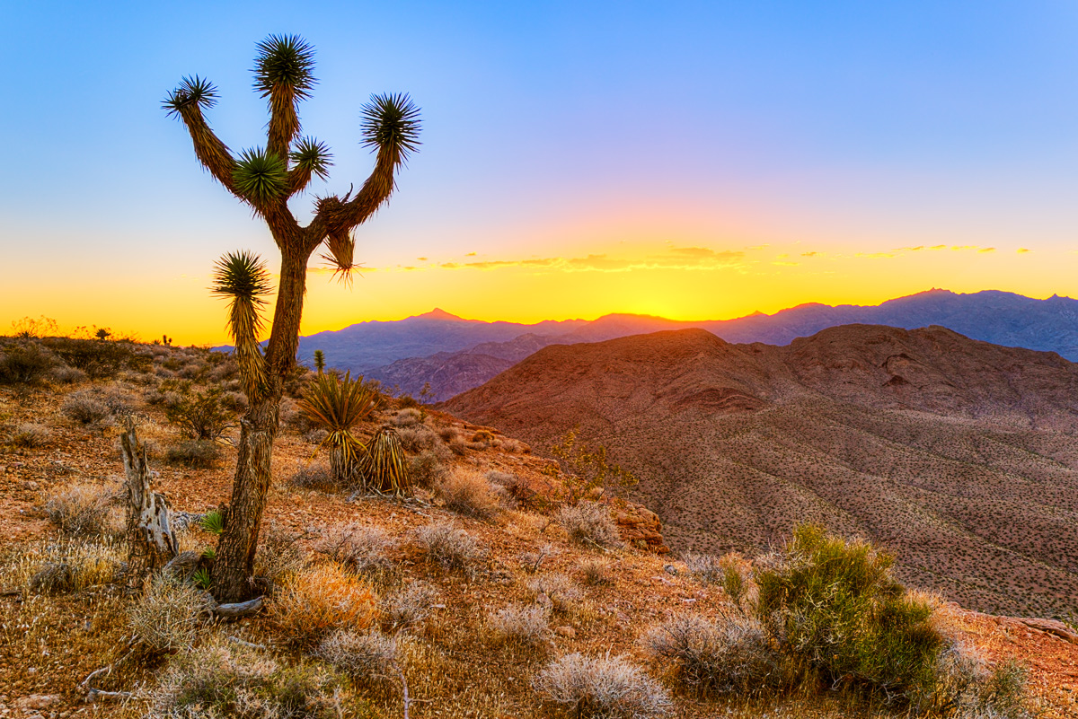
Created this image last Wednesday night near Meadview Arizona. It is an HDR comprised of 5 exposures (-2,-1,0,+1,+2) merged using Photomatix, then post processed in Photoshop using various adjustment layers and masks. Any comments would be greatly appreciated.
Canon 5D MKII, 24-105f4L at 28mm, Tripod.

Comments

17 comments
Comment posted by Marc Adamus on July 1, 2012 at 1:41 PM
Nice, Jason. My initial thought is that the sky saturation is too strong but that's all personal preference. I know there wasn't clouds so it does make for something of a focal point back there. I would consider a very small crop or vignette from the left side, to focus the eye toward that point, fluidly, in one direction a bit more as I am split on either side of the Joshua right now. The HDR work seems natural enough IMO.
Registered on September 17, 2005, 780 Posts, 8091 Comments
Comment posted by John Williams on July 1, 2012 at 2:24 PM
Hi Jason, welcome to Landscape. :wavey:

Despite the different angles, there's a nice flow to the composition. The Joshua helps break up the empty sky nicely. I'm typically not a big fan of HDR, but you've done a good job on keeping this one more natural.

I too would decrease the cyan and yellow saturation ever so slightly, and totally agree with Marc on the vignette. When I see a scene with a bright sun or sunset, I expect the corners to be a bit darker, the way my eye would probably see the scene if I was there.

Feel free to jump in on the commenting; we'd love to hear your thoughts.
:toast:
Registered on September 6, 2007, 221 Posts, 5985 Comments
Comment posted by Jason Keefe on July 1, 2012 at 3:25 PM
Thanks for the comments. I'm working on the image right now. The saturation in the sky is just a little to much. I think I pushed a little to far on my last adjustment to brighten the overall sky. I also agree about the crop. Just a little to much space on the left to trap the eye in. I'll post my adjusted image as soon as I finish. Thanks again for the comments. This is literally my first HDR image. It's nice to know I didn't overdo the process.
Registered on June 22, 2012, 2 Posts, 9 Comments
Comment posted by Richard Teller on July 1, 2012 at 4:25 PM
I like the scene and the composition, but I agree with the saturation in the sky and you have already started on the fix. Welcome to NPN also. This sight has some to the finest landscape work I have seen.
Registered on August 23, 2010, 1162 Posts, 6692 Comments
Comment posted by Jason Keefe on July 1, 2012 at 5:08 PM
Here are the edits. I lowered the saturation in the blues and yellows in the sky. I also did a different crop, as to not allow so much space on the left side to trap the eye. Let me know what you think. Again I appreciate everyones comments.
Registered on June 22, 2012, 2 Posts, 9 Comments
Comment posted by Nancy Lea Sandy on July 1, 2012 at 5:16 PM
The crop in your second post is an improvement. I'm not a fan of HDR so can't comment on the processing but I think the reduced saturation in the re-post is also an improvement. It's a beautiful scene and you've captured it very well.
Registered on January 24, 2011, 576 Posts, 6942 Comments
Comment posted by Tony Kuyper on July 1, 2012 at 5:51 PM
I like the scene and the light. Second version definitely looks better with more even light. Oranges in the sky still seem a bit strong. Since they are nearest the sun, they should be lighter than the blues further up, but they actually seem darker, though it looks improved in the second post.
Registered on November 1, 2003, 364 Posts, 22328 Comments
Comment posted by Robert Dayton on July 1, 2012 at 6:13 PM
Lovely, Jason. This encourages me to try more HDR work. I slightly prefer the second version.
Registered on November 11, 2008, 281 Posts, 3958 Comments
Comment posted by Lon Overacker on July 1, 2012 at 8:34 PM
Jason,

First of all, welcome to NPN and the Landscape Gallery!

I actually like the composition as presented. Of course to each our own, but my feeling is that the bottom of the "v" as the branches of the JT spread out, is actually right about in the "rule of thirds" junction. Additionally, I think the space to the left does more to keep it from being cramped - which I feel it is now in the repost. In the end, you'll decide which is more comfortable for you.

I'll have to agree with the others that the orange saturation is a bit strong and this does have that "hdr" look that some folks like and live with, while others it just doesn't look natural. To me, it's not the technique really, but the end result that matters - and I think you're pretty close, but again I think this comes across as over saturated. An image most definitely worthy of making it the best it can be.

Welcome aboard! We look forward to your images and contributions.

Lon
Registered on November 24, 2006, 521 Posts, 19147 Comments
Comment posted by Jeffrey Sipress on July 1, 2012 at 10:49 PM
Hi Jason, and Welcome!

Nice scene, image and comp. I mostly agree with the other comments, but for me this doesn't look real enough. For a sunset like that, the foreground would not look like it is illuminated as if it was daytime. It's just too bright. It would be much darker at that time of day under these conditions. And in a photograph that would also increase the saturation.
Registered on February 17, 2004, 236 Posts, 1197 Comments
Comment posted by Harry Lichtman on July 2, 2012 at 5:43 AM
Jason - I prefer the second version. I might consider slightly darkening the mid ground mesa. The top portion seems a bit darker thatn the bottom. It might add some depth to the image by further separating brightnes levels between it and the FG, which I would expect to be brighter. Spectacular country.
Registered on September 17, 2010, 304 Posts, 3507 Comments
Comment posted by Jason Keefe on July 2, 2012 at 9:13 AM
I appreciate all of the comments. I think what accounts for the saturation and lighting affect on the FG is reflected light from a smoke cloud on the eastern horizon from a wildfire up on the plateau. I originally went to this location to photograph the Grand Wash Cliffs off to the east, however I took relatively few shots looking that direction due to the smoke. I will be sharing one more image from this trip where the smoke will be visible in the shot. As for this image, I think I have it pretty close to what I saw and experienced. Thanks for the comments, particularly about the crop. I like this version much better.
Registered on June 22, 2012, 2 Posts, 9 Comments
Comment posted by Jeffrey Sipress on July 2, 2012 at 12:51 PM
Jason wrote:

"I think what accounts for the saturation and lighting affect on the FG is reflected light from a smoke cloud on the eastern horizon from a wildfire up on the plateau."
-----------------------

I don't think so. It's the HDR thing.
Registered on February 17, 2004, 236 Posts, 1197 Comments
Comment posted by Jason Keefe on July 2, 2012 at 12:55 PM
OK, final edit. Thanks to Tony and Lon for pointing out the orange in the sky was to dark and saturated. I noticed this also from the start and couldn't figure out where in the processing I was losing the brightness and gaining the saturation. The fix: I took the original normal exposure unedited and overlayed it on my master file as the top layer. I changed the blending mode to lighten, and lowered the opacity to 75%. The result, orange saturation gone and brightness restored. Hope this helps someone else facing a similar situation. Again thanks to all for the help and comments.
Registered on June 22, 2012, 2 Posts, 9 Comments
Comment posted by Lon Overacker on July 2, 2012 at 2:05 PM
Jason,

Final looks much better and more natural. thanks for taking the time to re-work and post.

Lon
Registered on November 24, 2006, 521 Posts, 19147 Comments
Comment posted by Alister Benn on July 3, 2012 at 7:27 AM
Great crit from Marc... spot on. Sweet comp Jason.
Registered on June 9, 2011, 23 Posts, 258 Comments
Comment posted by Bill Chambers on July 5, 2012 at 11:47 AM
Welcome to NPN and Landscape Jason! I've had to comeback to re-edit this because I didn't see the reposts at first. The final draft looks very nice, and much better than the original version.
Registered on April 10, 2005, 753 Posts, 21216 Comments