Nature Photographers Network
This is the preserved archive of the original Nature Photographers Network. The community continues at naturephotographers.network.
Dawn Durness Beach +2Reposts
‹ PreviousLandscape GalleryNext ›

Dawn Durness Beach +2Reposts

by Eva McDermott

Gallery: LandscapePosted July 4, 2012819 views18 comments
Durness, Sutherland, Scotland

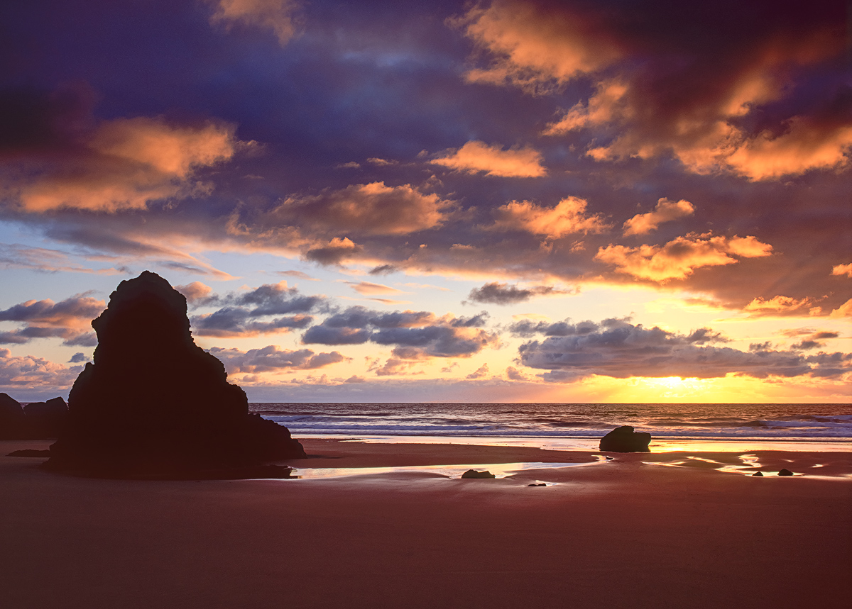
Dawn amongst the sea stacks on Durness Beach. This was taken on a Transient Light Workshop shortly after Durness Sunrise but has quite a different mood. Thanks for having a look and for any C&C. Hope everyone has a great 4th of July!

Pentax 67II
Pentax 67 55-100mm
1.5 Stop HE Grad
Velvia50

Multiple exposure scans with an Epson V750, Silverfast Ai Studio 8 software, and Better Scanning height adjustable film holder with Anti-Newton ring glass.

Comments

18 comments
Comment posted by Wick Smith on July 4, 2012 at 1:46 PM
Great light! I love that the cloud reflections are casting the warm glow on the sand - matches the scene well.
Registered on June 12, 2009, 91 Posts, 379 Comments
Comment posted by Nancy Lea Sandy on July 4, 2012 at 3:22 PM
Beautiful. Rich colors really set this apart.
Registered on January 24, 2011, 576 Posts, 6942 Comments
Comment posted by Walt Sterneman on July 4, 2012 at 4:24 PM
Great shot Eva. In addition to what has already been mentioned I like to lower point of vkew you took here. It works quite well.
Registered on March 24, 2010, 73 Posts, 1268 Comments
Comment posted by Eva McDermott on July 4, 2012 at 4:45 PM
Once I posted this image, there seemed to be a red cast at least on my monitor, so I decided to bring the reds and magenta down each about 20 points each. Does it make a difference?
Registered on January 4, 2009, 1015 Posts, 13229 Comments
Comment posted by Morris McClung on July 4, 2012 at 4:49 PM
Oh, Mommy!
Registered on May 7, 2007, 670 Posts, 19650 Comments
Comment posted by Brian Schrayer on July 4, 2012 at 5:08 PM
Wow, I love that color. This looks like one of those moments where you wish you could just freeze time and enjoy it for just a little longer.

EDIT: Just saw the repost - I think I actually like the original post a little better. It seems the repost, although possibly more accurate, has lost some of the life of the original post.
Registered on May 28, 2004, 114 Posts, 2890 Comments
Comment posted by Carol Nichols on July 4, 2012 at 6:02 PM
Eva, I agree with Brian. The original post is better, although if we had never seen the original I'm sure the repost would look great as well.
Registered on November 7, 2007, 161 Posts, 1420 Comments
Comment posted by Nick Bristol on July 4, 2012 at 7:17 PM
Another beautiful scene, Eva. Really some wonderful light and colors here. The repost probably is more accurate to the scene but the original post does look really nice with a bit more pop. I do like them both.

Nick Bristol
Lone Rock, WI
Registered on February 1, 2004, 752 Posts, 14140 Comments
Comment posted by Tony Kuyper on July 4, 2012 at 8:45 PM
I like both version. You did a great job with the light. The details and colors all work well together.
Registered on November 1, 2003, 364 Posts, 22328 Comments
Comment posted by Kah Kit Yoong on July 5, 2012 at 1:26 AM
Beautiful light. The silhouetted rock looks a but funny to me not quite very dark but holding no detail. What about just letting it go to black?
Registered on September 27, 2006, 636 Posts, 10682 Comments
Comment posted by Andreas Resch on July 5, 2012 at 2:39 AM
Wonderful mood, great colors and details. I agree with Kah Kit about the foreground rock - looks a little strange to me.
Registered on November 14, 2007, 322 Posts, 6101 Comments
Comment posted by David Edwards on July 5, 2012 at 3:35 AM
I like warm images and bold color so I prefer the original. Love the light on the clouds and the sunburst on the horizon... that sky is pretty awesome! I also think the fg rock and the sand also could have some more detail :smile:
Registered on December 6, 2008, 142 Posts, 2623 Comments
Comment posted by Catherine Reilly on July 5, 2012 at 5:37 AM
Stunning luminosity and clarity in this image, Eva. The color is magnificent as well. (Gotta love the Velvia 50!) I think the sea stack looks stark in comparison to the rest of the scene and sort of cuts me off from your signature "far away" look. A different kind of comp for you, where I've gotten so used to the other... The fg area of beach is totally smooth, and if not for the sky, would leave me pretty flat. If you were striving for a mood of "amongst the sea stacks," perhaps a crop from the bottom, for less beach, would help?
Registered on August 16, 2006, 603 Posts, 9192 Comments
Comment posted by Gary McGhee on July 5, 2012 at 2:17 PM
Eva, you're really opening my eyes to some great locations with all your Scotland photo's.

I prefer your first post, the colour looks better to me. I like your placement of the stack too with the smaller rock balancing the comp nicely.

Gary.
Registered on April 15, 2010, 142 Posts, 2416 Comments
Comment posted by Bill Chambers on July 5, 2012 at 2:59 PM
Oooooh, I like this!! Very nice and crisp, with excellent detail. Just noticed the repost - I actually prefer the original overall, although the sand color in the repost looks nice. The original has much more impact IMO. Very pretty.
Registered on April 10, 2005, 753 Posts, 21216 Comments
Comment posted by Ian Cameron on July 5, 2012 at 4:52 PM
Hi Eva These both look fine to me but it looks like a little bit of lens flare has crept in. Does the tranny show this? I have found this happens when you get a very thin coating of salt spray built up on the filter or glass. I might also do what Kah Kit is suggesting and let the stack go to silhouette it largely is in my trannies.
Registered on August 6, 2004, 1125 Posts, 3318 Comments
Comment posted by Eva McDermott on July 5, 2012 at 9:23 PM
Hi Ian - Thank you very much for your input. I really appreciate that since I am still trying to work through a good workflow for scanning and processing my film images. I do not have the original transparencies in front of me since I am away in Maine until Monday but I do have my workstation with me with a variety of scans I took with different parameters in Silverfast. The original image posted is a multiple scan image in Silverfast to improve dynamic range and reduce noise. It did that but I think it also created, accentuated the artifacts you and Kah Kit mentioned. This post is a single scan with the noise cleaned up with Nik Define 2 but I still needed to darken potions of the left stack which I did in LR4 but to a much lesser degree than what I would have to do with the original master file of the image I posted. BTW I personally find it easier to use LR than PS even with film scans which I discovered last week and contrary to what I mentioned to you at some point on the workshop. I just can't have too many large scanned files in the specific LR4 catalog. LR is just more intuitive to me especially now with LR4 than Photoshop CS5 or 6.

I also want to thank everyone for your comments and critiques.
Registered on January 4, 2009, 1015 Posts, 13229 Comments
Comment posted by Vlad Sadovsky on July 9, 2012 at 1:53 AM
Beautiful light, larger version is very impressive. Composition with arranements of clouds in upper corner is nice and balanced. I like the original more , deeper contrast accentuates the light.
Registered on November 12, 2010, 48 Posts, 358 Comments