Nature Photographers Network
This is the preserved archive of the original Nature Photographers Network. The community continues at naturephotographers.network.
WC #544 - Mirror Mirror
‹ PreviousWeekly Challenge GalleryNext ›

WC #544 - Mirror Mirror

by Jim Greenwood

Gallery: Weekly ChallengePosted July 27, 201272 views4 comments
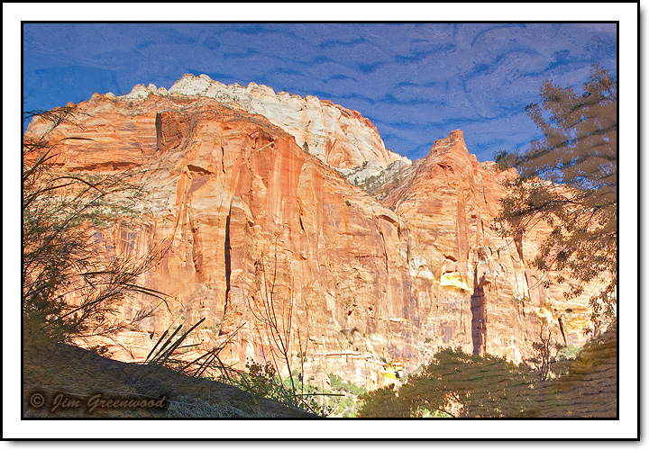
I was thinking about this today. So I thought I'd post this image, mostly for the fun of it, but also for comparison. The only difference between the image posted yesterday and this image is that this image is flipped vertically instead of rotated 180 degrees. So in effect, now of course the reflection of the cliffs and peaks are basically the way they looked when viewing the actual scene.

The subdued reflection on the right is of the tops of trees higher than a little ridge within the canyon formed by Pine Creek, and the shadowy reflection on the left is actually of grass right on the bank of the creek in the canyon.

Canon 5DII
Canon 24-105mm f/4L IS
28mm, f/11, 1/4 second, ISO 50

Comments

4 comments
Comment posted by Jim Greenwood on July 27, 2012 at 12:18 AM
I also thought it would be interesting to post the original full-frame composition.
Registered on November 9, 2003, 229 Posts, 1523 Comments
Comment posted by Carolyn Derstine on July 27, 2012 at 10:29 AM
I think I like this one slightly better; the comp feels more "right", to me, with the higher ridge on the left.

Thanks for including the full-scene view also. That cleared up some of my confusion re the ripples which I now realize are the bottom sand ripples and not water ripples. :rolleyes: (I added an "edit" about this also in your previous posting.)
Registered on February 16, 2011, 610 Posts, 3684 Comments
Comment posted by scott lanz on July 29, 2012 at 9:27 AM
Like Carolyn, I was confused about the textures in the sky and LRC. Sand patterns did not occur to me. They add a lot to the image. The reflection of the tower is perfect in color and detail.
Registered on November 14, 2003, 840 Posts, 12902 Comments
Comment posted by Mark Seaver on July 29, 2012 at 9:35 AM
Neat comparison. I like the first post slightly better. For me having the visual weight in the upper right feels more comfortable. Thanks for the full frame (it's a fine image on it's own), I too was wondering about the "ripples". It neat seeing that they're natural, but they would also be a nice "Van Gogh" ish addition as an artistic treatment.
Registered on January 23, 2011, 1103 Posts, 17270 Comments