Nature Photographers Network
This is the preserved archive of the original Nature Photographers Network. The community continues at naturephotographers.network.
Black River Dawn
‹ PreviousLandscape GalleryNext ›

Black River Dawn

by Kurt Budliger

Gallery: LandscapePosted July 31, 2012384 views13 comments
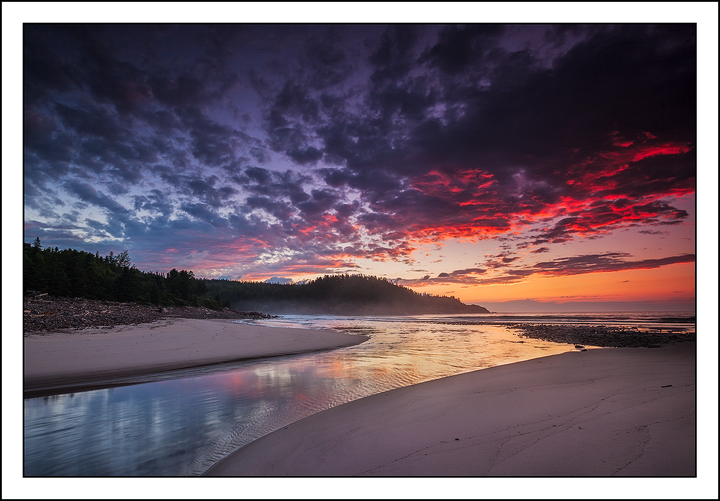
Here's another from my trip up to Cape Breton earlier in the month. It's the same morning as my River of Light image from a week or so ago. This was from 10 or 15 minutes before the sun broke the horizon. It's always amazing to see how different a scene looks as the light changes. I like them both but for different reasons. This has a much cooler, moody feeling.

Here's a link to the other version: River of Light

Which do you prefer? As always thanks for taking peek.

Comments

13 comments
Comment posted by Yiming Hu on July 31, 2012 at 11:14 AM
Hard to make a choice. I will probably choose the previous one. This version has some killer clouds, but the upper part is too dark, probably caused by the use of a GND.
Registered on April 28, 2011, 38 Posts, 733 Comments
Comment posted by Nancy Lea Sandy on July 31, 2012 at 1:17 PM
Perfectly composed, beautifully executed. This is a stand-out. I prefer it for the richer palette and more intense mood.
Registered on January 24, 2011, 576 Posts, 6942 Comments
Comment posted by Navin Sarma on July 31, 2012 at 2:10 PM
Kurt, I have to say I choose the previous. The light seems more natural and I prefer the composition, just slightly. Though both are killer images.
Registered on July 17, 2011, 233 Posts, 1373 Comments
Comment posted by Rick Lundh on July 31, 2012 at 3:40 PM
Awesome sunrise!
Registered on April 28, 2004, 774 Posts, 4351 Comments
Comment posted by Harry Lichtman on July 31, 2012 at 4:15 PM
I like the drama an moodiness of this one. The upper parts of the sky look a bit too dark. not sure if you are able to open up these area some more. The light and mood can change so quickly.
Registered on September 17, 2010, 304 Posts, 3507 Comments
Comment posted by Nick Bristol on July 31, 2012 at 5:06 PM
This is beautiful, Kurt. Both version are really nice, but I prefer this one a bit more just for being a little more dramatic and I love the colors. The upper sky is a little dark but it does add to the mood I think. Maybe it could be lightened a little? Wonderful reflection too. Great you have both images you can use! :smile:

Nick Bristol
Lone Rock, WI
Registered on February 1, 2004, 752 Posts, 14140 Comments
Comment posted by Eva McDermott on July 31, 2012 at 6:48 PM
I like your previous post better Kurt. I too think the upper sky is too dark but this surely has some wonderful color, great mood, and lines.
Registered on January 4, 2009, 1015 Posts, 13229 Comments
Comment posted by Vance Gese on July 31, 2012 at 9:36 PM
Gorgeous, Kurt. Love the graceful curve of the river and the beautiful color. Both this one and the later image are outstanding. Hard pressed to choose between the two.
Registered on November 13, 2008, 298 Posts, 6629 Comments
Comment posted by Tony Kuyper on July 31, 2012 at 11:31 PM
I like this better. More dramatic light and more balanced presentation.
Registered on November 1, 2003, 364 Posts, 22328 Comments
Comment posted by Dean Sauskojus on August 1, 2012 at 2:55 AM
I would have to choose this one. There is just something about red that gets the blood going. Nice work Kurt!
Registered on September 29, 2009, 137 Posts, 2659 Comments
Comment posted by Jim Hackley on August 1, 2012 at 1:51 PM
I happen to like this one better even though it is a darker image. The color in the clouds and reflected water seem to really stand out more in this one plus you get a little more detail along the sand. Well done, looks like a magical morning.
Registered on September 17, 2009, 302 Posts, 5535 Comments
Comment posted by Zack Clothier on August 2, 2012 at 1:54 AM
Both shots are nice, Kurt, and each evokes a different emotion. Hard to pick a favorite, I think they both deserve a spot in the portfolio :toast:
Registered on January 28, 2010, 343 Posts, 2257 Comments
Comment posted by John Williams on August 3, 2012 at 3:12 PM
Somehow the thumbnail is wrong on this one.

Perfection in the comp sweeping into that superb color!
Registered on September 6, 2007, 221 Posts, 5985 Comments