Nature Photographers Network
This is the preserved archive of the original Nature Photographers Network. The community continues at naturephotographers.network.
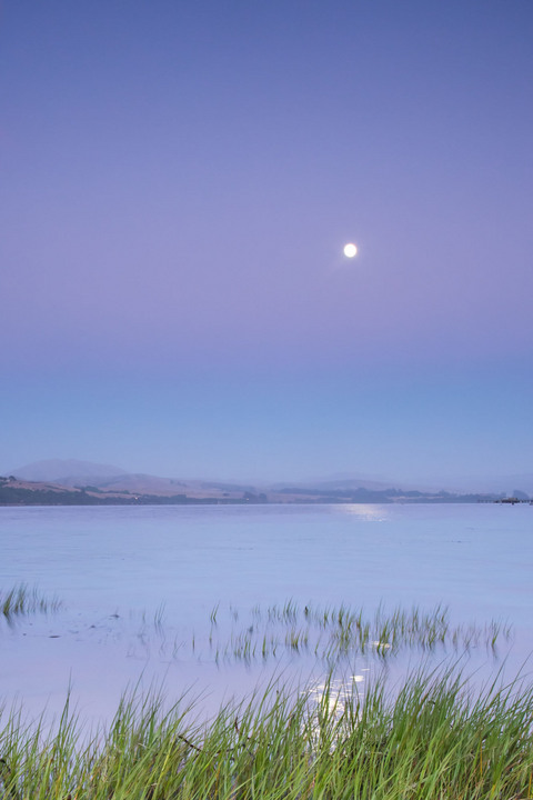
Tomales sunset
‹ PreviousLandscape GalleryNext ›

Tomales sunset

by Kathy Barnhart

Gallery: LandscapePosted August 1, 2012278 views15 comments
Taken at Tomales Bay, California, near Pt.Reyes National Seashore

Canon 5d, Mk3, ISO800, 32 mm, f/16, 0.5 sec.

This is very simple....too simple? Do the grasses at the left side detract?

Thanks for comments and critiques.

Comments

15 comments
Comment posted by Bill Chambers on August 1, 2012 at 3:05 PM
Hi Kathy. I wasn't really familiar with your work so I first viewed your gallery. You seem to have a variety of photo interests, and your work is very nice. I like this image a lot - very peaceful and soothing. I might consider cropping about 10% off the top, but that's subjective of course. Hope to see a lot more of your work here in the Landscape gallery.
Registered on April 10, 2005, 753 Posts, 21216 Comments
Comment posted by Nick Bristol on August 1, 2012 at 3:52 PM
Hi Kathy, This image really has a nice feel and mood. The soft colors and conditions you captured work so well with that mood. I could see a crop of a little of the sky as well. It might be nice if the second layer of grass wasn't as close to the left edge as it is, but doesn't really bother me to much either. Really enjoy the mood!

Nick Bristol
Lone Rock, WI
Registered on February 1, 2004, 752 Posts, 14140 Comments
Comment posted by Ronald Murphy on August 1, 2012 at 3:59 PM
I especially like the pastel banding in this. You could clone away the one or two left-most clumps of grass for better balance. I would have taken a second photo with the moon properly exposed and replaced the over-exposed one with it, and then possibly toned-down its reflections.
Registered on March 13, 2012, 279 Posts, 975 Comments
Comment posted by Bruce King on August 1, 2012 at 4:07 PM
I enjoy minimalist landscapes and this one is very nice as presented. Bill's crop suggestion might be a slight improvement and removing the grass at the far left asyou mentioned is something I might also consider. But as I said....very nice as is. Love the subtle colors. :toast:
Registered on January 14, 2010, 276 Posts, 2212 Comments
Comment posted by Rick Turner on August 1, 2012 at 4:22 PM
Simple and beautiful. I tend to agree that it has a bit too much top. I would love to see a horizontal version of this. :toast:
Thanks for the share.
Registered on February 18, 2012, 534 Posts, 2755 Comments
Comment posted by Jim Hackley on August 1, 2012 at 7:14 PM
I think this is a wonderful composition and the branches on the left do not bother me. What stands out for me is the nice layers of color starting with the water and going up through the sky. I also might think about taking a small amount off the top but either way a fine image. Well seen and well done.
Registered on September 17, 2009, 302 Posts, 5535 Comments
Comment posted by Andrew Morrill on August 1, 2012 at 10:44 PM
The basics of the comp may be simple, but I think the very pleasing green/violet/blue color combo more than makes up for it - really nice.
Registered on June 10, 2010, 51 Posts, 216 Comments
Comment posted by Nancy Lea Sandy on August 1, 2012 at 11:47 PM
Sweet. This has a wonderful mood to it. I agree with the suggestions to crop some from the top . I really like the soft, dreamy feel of this. Excellent job
Registered on January 24, 2011, 576 Posts, 6942 Comments
Comment posted by Stuart Williams on August 2, 2012 at 4:37 AM
is there such a thing as too simple? a photo of an 18% grey card would be mind-numbingly boring. this image is neither too simple nor boring. i'd consider experimenting with some cropping - some off the top and then, maybe, experiment with removing (crop & some cloning) the bottom grass .... i love the pastel tones.
Registered on December 7, 2007, 247 Posts, 4792 Comments
Comment posted by Tony Kuyper on August 2, 2012 at 9:22 AM
I like the light and colors. Sort of wish for a little more grass and a little less sky.
Registered on November 1, 2003, 364 Posts, 22328 Comments
Comment posted by dean hebert on August 2, 2012 at 10:21 AM
I like the simplicity of the scene and think a crop off the top and bottom to a square format would emphasize that minimalist idea. :toast:
Registered on August 4, 2010, 70 Posts, 1132 Comments
Comment posted by Mark Seaver on August 2, 2012 at 12:42 PM
The bands of gentle colors in the sky and lake make this so tranquil and soothing. It's great as posted, but I can also see some alternatives such as cropping from the top or trying one without the thick grass on the shoreline...probably need boots to make that happen.
Registered on January 23, 2011, 1103 Posts, 17270 Comments
Comment posted by Ant on August 2, 2012 at 4:25 PM
This image is simple and beautiful. A peaceful scene which benefits from the pastel colors and the horizontal bands...
Maybe yes, a little crop from the top, but am not sure.

Ant
Registered on April 13, 2009, 27 Posts, 474 Comments
Comment posted by Mark Metternich on August 3, 2012 at 12:28 AM
Love the simplicity! :toast:
Registered on June 19, 2009, 276 Posts, 6240 Comments
Comment posted by Eva McDermott on August 3, 2012 at 2:49 PM
Simply a beautiful image Kathy. Love the tranquil mood and pastel colors.
Registered on January 4, 2009, 1015 Posts, 13229 Comments