Nature Photographers Network
This is the preserved archive of the original Nature Photographers Network. The community continues at naturephotographers.network.
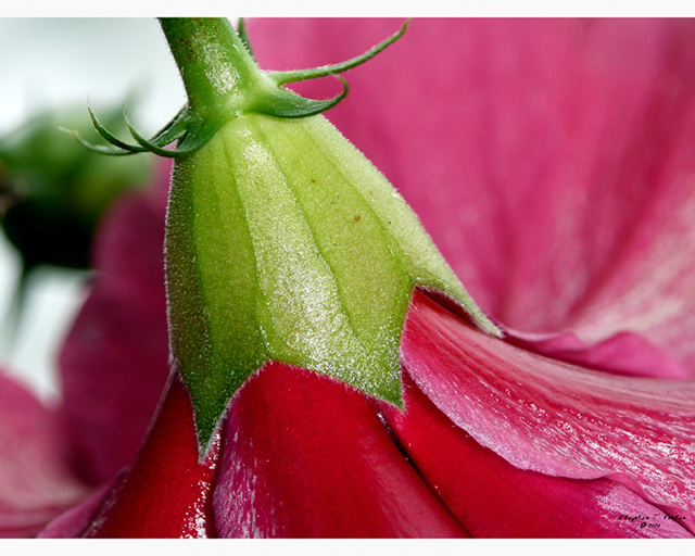
Big Red
‹ PreviousFlora GalleryNext ›

Big Red

by Stephen Porter

Gallery: FloraPosted September 4, 201262 views6 comments
Big Red, September 16th 2010

This colourful bloom, looked like a red umbrella. Or maybe a fancy hat, one might wear to a royal wedding. :)

Panasonic Lumix DMC-TZ3
Focal Length 26mm
Shutter Speed 1/30 sec
Aperture f/4.8
ISO/Film 100

I was asked to post the camera settings, for my photos. I could not afford an expensive camera body and macro equipment, so I built an attachment for my camera, that included cardboard tubing and lots of duct tape. The above settings, may or may not make any sense since the attachment changes just about everything. :)

For more details, regarding my background and photos, please visit my profile page.

http://www.photoportfolios.net/portfolio/profile.cgi?&pi=TINYBYNATURE

Comments

6 comments
Comment posted by scott lanz on September 4, 2012 at 10:05 PM
I like the detail up front, but the bg doesn't quite work for me, mostly due to the busy, bright ULC. It's a good image, but I personally don't find this one quite as strong as your other work, Stephen, but we'll see what others think. I've been out voted before. :wavey:
Registered on November 14, 2003, 840 Posts, 12902 Comments
Comment posted by Stephen Porter on September 4, 2012 at 10:22 PM
Thanks for the feedback Scott :) I will work on a crop, that takes out the ULC and re-post, to see what you think :)

Registered on August 27, 2012, 56 Posts, 69 Comments
Comment posted by Bob&Charly Nelson on September 5, 2012 at 12:41 AM
I don't know if a crop is what is needed here as I really like the diag. composition. I might fill with the light color as there is great separation shown here.
Bob :wavey:
Registered on October 27, 2005, 289 Posts, 4202 Comments
Comment posted by Eirini Pajak on September 5, 2012 at 7:48 AM
Yes, it seems like a crop would be too much as you would not want to lose your main composition here (which is nice), but I also don't like the light corner as much...maybe you could have propped up the petals in the back a little more to cover it? Also the flash or whatever you used for lighting seems a bit harsh.
Registered on December 13, 2011, 216 Posts, 1671 Comments
Comment posted by Gary Yeoh on September 5, 2012 at 8:58 PM
Stephen:
I in complete agreement with Scott about the RUC. The composition and detail in the rest of the image is just fine.
Registered on September 1, 2009, 588 Posts, 8184 Comments
Comment posted by Ramamohan Pai on September 5, 2012 at 10:11 PM
Stephen - Full marks for the innovative point of view here showing the base of the Hibiscus as the main pivot. The upper left corner is the only thing that does not sit well in the frame for me and I am not sure what options you might have had to prevent it.
Registered on November 1, 2003, 550 Posts, 9037 Comments