Sublime Colors
by Peter Coskun
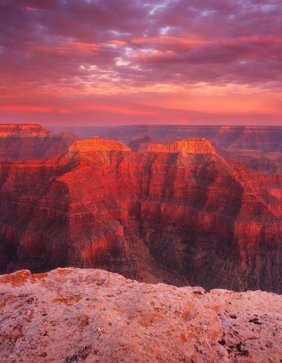
Here is another image from the North rim meet up. Although the light and location were spectacular, I feel like I didn't do it justice. Comments and critiques appreciated. Large version included.
Canon 7d
Canon 17-40mm @17mm
ISO 100
f14
2 sec
3 stop and 2 stop grad ND
CPL
Tripod

Comments
21 commentsSublime?
Might be pretty tough to improve this... but I was thinking about getting rid of maybe 1/2 of the foreground rock? Nice texture and color, but to me the show is the light, color of the canyon and sky. The other thing I would do if mine, would be to increase the microcontrast just along the face of the canyon. Not by much at all, but maybe just darkening the deep shadows a skosh. Anyway, just my thoughts. I'd love to have this one to work on!
Lon
Eva, the good thing about this point was that it was about 20 miles down dirt roads so that kept whatever crowds away. We shared the point with only a handful of others so we had plenty of space to move around and not be shoulder to shoulder
I also prefer the repost, although adding contrast boosted the saturation levels a bit. Try boosting contrast using a 'Luminosity' blend mode in layers rather than 'Normal' blend mode.
You might also consider trying the Image Polish technique usin the Unsharp Mask filter.
Kyle, we did have ourselves quite the weekend in terms of quality light. This was probably the best light we had, although we had some pretty special light that morning at cape royal.
well done
Nick Bristol
Lone Rock, WI
thanks for taking the time and reposting. The contrast looks great to me now. Just my personal taste, but I'm not sure you needed to crop the sides all that much.... nothin' wrong with a 4:5 ratio...
Lon