Nature Photographers Network
This is the preserved archive of the original Nature Photographers Network. The community continues at naturephotographers.network.
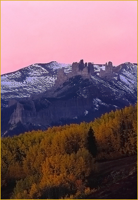
Pink Castles
‹ PreviousLandscape GalleryNext ›

Pink Castles

by Morris McClung

Gallery: LandscapePosted September 12, 2012360 views15 comments
I'm going through old files whetting my appetite for Fall. This was 6 years ago, and it's a scan of Velvia, pre-digital days for me. The sunrise really got going, although no clouds to add to the color. The peaks are known as, "The Castles" and can be seen from Ohio Pass.

Comments and critiques always welcome, and thanks for looking,

Morris

Comments

15 comments
Comment posted by Karsten Wrobel on September 12, 2012 at 3:11 PM
these peaks are unreal, I can see where the name comes from... I enjoy the colour combo here, might also consider cropping a bit from the top
Registered on November 1, 2008, 117 Posts, 851 Comments
Comment posted by Morris McClung on September 12, 2012 at 3:14 PM
Thanks, Karsten. But, I would hate to give up a comp based on three areas of interest equally divided. I think I'll wait to see what others may say. :wavey:
Registered on May 7, 2007, 670 Posts, 19650 Comments
Comment posted by John&Patty Benway on September 12, 2012 at 3:28 PM
The good old days of film, still miss it, actually, this works very well ,lovely light, color and comp. Beautifully presented Morris.
John
Registered on May 12, 2006, 626 Posts, 8700 Comments
Comment posted by Marsel van Oosten on September 12, 2012 at 4:22 PM
I actually saw this was pre digital when I saw it, and now that I look at it longer, I wonder what made me think that. Fascinating.

I like the colors here and I understand what you tried here, but I have to agree with Karsten - my first impulse would also be to crop a slice off the top. Reason for me is that the two bottom layers are relatively dark compared to the bright sky. Our eyes are drawn to bright areas first, and in this case that is not where I would want the viewer's eyes to go to. With appr. half of the sky gone the shot looks more balanced imho. Hope that makes sense.
Registered on March 9, 2004, 285 Posts, 2277 Comments
Comment posted by Mark Seaver on September 12, 2012 at 5:59 PM
I sure do like the pink sky and the castles. I could see cropping some of the sky, some of the trees and a bit from the left, to emphasize the castles, which are what attract my attention the most. The scan looks very good.
Registered on January 23, 2011, 1103 Posts, 17270 Comments
Comment posted by Eva McDermott on September 12, 2012 at 8:12 PM
Gorgeous color Morris though I agree with a crop for the top, 4X5 format.
Registered on January 4, 2009, 1015 Posts, 13229 Comments
Comment posted by Ed Williams on September 12, 2012 at 11:47 PM
Nice photo Morris. I like the clear separation/zones in this composition. Beautiful color too.
Registered on December 28, 2010, 636 Posts, 3499 Comments
Comment posted by David Edwards on September 13, 2012 at 5:34 AM
A beautiful shot Morris. Sweet color and contrast, and I like your layered comp. My take on it would be to crop about 1/3 - 1/2 of the sky as the solid bright color has more dominance than the other two areas making it feel unbalanced imho. Love the shadow detail and contrast.
Registered on December 6, 2008, 142 Posts, 2623 Comments
Comment posted by Peter Richter on September 13, 2012 at 6:19 AM
Morris, I enjoy the colors which make this image unique to me. The interesting layers keep my attention. Your composition based on "thirds" works very well for me.

Peter
Registered on November 10, 2010, 218 Posts, 2723 Comments
Comment posted by Rick Turner on September 13, 2012 at 9:21 AM
Sweet color Morris. I still have some Velvia in the freezer waiting for another day. :toast:
Registered on February 18, 2012, 534 Posts, 2755 Comments
Comment posted by Paul Breitkreuz on September 13, 2012 at 9:49 AM
Morris, a real Velvia pop to this scene. As interesting as the colors are the "castle" formations look like an excellent subject for even more compositions too. I might try the suggested crop ideas just for another look @ 4x5 format or even a square look with top and bottom crops which are all easy and totally a personal preference at that point. :cool:
Registered on February 25, 2006, 525 Posts, 8448 Comments
Comment posted by Bill Chambers on September 13, 2012 at 10:21 AM
Beautiful color combination Morris. Can't wait for all the autumn images to start streaming in too. My only observation/suggestion would be to crop a little bit off the top so the saturated sky doesn't overwhelm the tree color.
Registered on April 10, 2005, 753 Posts, 21216 Comments
Comment posted by Robert Dayton on September 13, 2012 at 10:54 PM
Lovely, Morris. Well composed adhereing to the rule of thirds. I like the colors.
The rock formations are striking. Well captured.
Registered on November 11, 2008, 281 Posts, 3958 Comments
Comment posted by Nick Bristol on September 15, 2012 at 5:20 PM
This is really a wonderful scene Morris. Quite beautiful to look at! I do think cropping a little of the sky works here, but I don't think I would go halfway. Maybe about a third of it. Just my feeling... :smile:

Nick Bristol
Lone Rock, WI
Registered on February 1, 2004, 752 Posts, 14140 Comments
Comment posted by Lon Overacker on September 16, 2012 at 2:34 AM
Morris,

I just love the color of that sky! And oh how it compliments the peaks and remnants of snow. While I understand the time of day, light and all that, I kinda wish the trees had a little more life to them. Maybe just a slight boost in brightness? Not sure how far you could go before getting unnatural, but just wishing. But clearly I think you've captured and presented this pretty accurately - and I wasn't even there!

I could live with this without the crop too, although I understand the suggestions.

Wonderful view, great color in the sky, love it.

Lon
Registered on November 24, 2006, 521 Posts, 19147 Comments