Hopefully everyone here thinks Longs Peak is as cool as I do, because my recent photography trip to Rocky Mountain National Park holds numerous images with this 14ner standing tall in the background. Now don't get too worried---I won't unload dozens of these shots, littering this site, but I will show you all a few for fun.

September 13 and 14 were the days I spent up there, photographing the fall colors, tundra and bull elk. One night was also spent taking images of the clear mountain sky, filled with stars I never thought were there. Quite awe inspiring, to say the least! All of Colorado is incredible, but RMNP seems like it was specially created in one confined area for us to enjoy. Can't wait to get up there again...
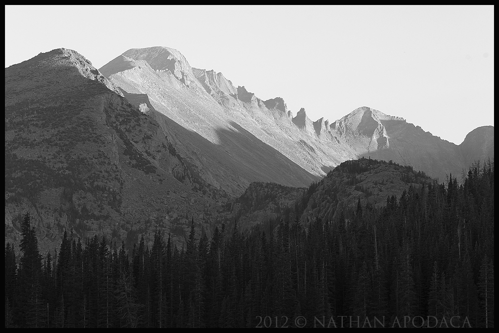
This specific image was taken from Bear Lake (I know, it is a VERY unique image, from a seldom photographed spot

). I loved the detail this one held, and even spent a bit of time looking for hikers on the ridges. The color version wasn't all that interesting, because the sun still had a ways to fall, so I immediately started the B+W conversion. Be honest, and tell me what you think...
Canon 60d 55-250mm @ 70mm
ISO 100 --- f/14 --- 1/10 sec. --- tripod --- no filters
Comments and Critiques WELCOME!

Oh, and VIEW LARGE...

Comments
6 commentsOK, seriously, i have bias since like every other landscape photographer in E CO, ive photographed this scene a zillion times, so trying to look past that i think the conversion needs some work. The sky is washed out (which probabaly is due to the awful smoke here that we can't avoid unfortunately...) but the fg is too gray, there needs to be more contrast with the light/shadow there. The shadows up front need to have more visible detail. Try looking at the color version and seeing what colors stand out and which ones dont--then process to accentuate that effect. Not an easy thing to do, just gotta keep playing with it until you get bored
No really, Stan, thanks for the honest critique. I was having some trouble processing this, so it's good to hear specific points on how to improve it. I'll be busy tomorrow, but perhaps I can work on it and get a re-post up. We'll see... Oh, and BTW, if you do finish that e-book, or whatever it was, on weather and photography, make sure and announce it clearly up here, as it is something I would be incredibly interested in.
I think Stan actually gave a pretty good assessment. I would add that I think this could be improved with some additional or different processing. I think because you had a blank and unforgiving sky, might as well use it to your advantage. I can see a fairly big increase in contrast making three distinct zones if you will. I think certainly more contrast in the mountain range and even more contrast in the trees (without losing the detail) would help. But in addition, if you could drive the sky more towards white, that would boost the overall contrast of the scene. I'm not great myself at b&w work myself, so I'm not going to be much help there.
I do think you have something workable though. I like the opposing lines of the trees and the mountain tops.
Lon