Nature Photographers Network
This is the preserved archive of the original Nature Photographers Network. The community continues at naturephotographers.network.
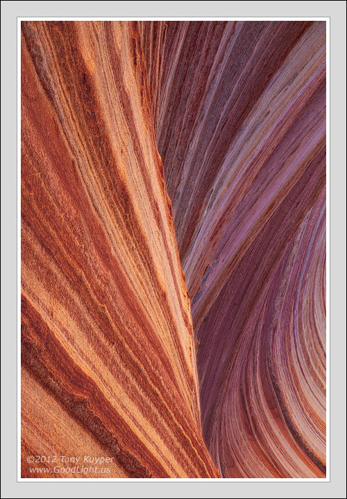
Standing Wave
‹ PreviousLandscape GalleryNext ›

Standing Wave

by Tony Kuyper

Gallery: LandscapePosted September 28, 20124,127 views25 comments
T'is not the pic I planned on taking,
Nor in PS planned on making.
There will be those who think me faking
(the sat and colors over-baking).

The truth be told I'm just partaking
Of focus blends and soft light raking
The sandstone ridges; no camera shaking.
Thirteen frames! My back was aching!

This sat for months, no interest waking;
Worked on a week, almost forsaking,
But with more time and layers caking
Quarter turned it, started quaking.

A pond of hope began there laking
As there seemed to be no mistaking
That the image was at last awaking
To what the light was meant to be.


Now it's your turn to judge the outcome,
And I am sure there will be doubts some.
If this don't please check counterpart;
It's location Photo Art.

Comments

25 comments
Comment posted by Scott Fricke on September 29, 2012 at 12:20 AM
No rhymes, but you created a beautifully flowing composition and wonderfully subtle play of light on the various layers of the image. Very well done, as usual!
Registered on January 19, 2007, 133 Posts, 1448 Comments
Comment posted by Peter Cross on September 29, 2012 at 1:11 AM
Excellent color, detail, and perspective. Nicely composed. Has a strange affinity to the Seaverized Wave. I gotta go to one of these places someday soon.
Registered on April 3, 2010, 271 Posts, 1342 Comments
Comment posted by Ryan Wright on September 29, 2012 at 2:14 AM
The composition is fantastic.
The subtle changes in light, bombastic.
The desert of the south and to the west.
The location of my next quest.
Hopefully I can leave once I finish my tasks,
And thank you for all the help with layer masks.
Registered on January 6, 2012, 14 Posts, 25 Comments
Comment posted by Karsten Wrobel on September 29, 2012 at 7:34 AM
Tony, love the simplicity and clear structure here... I really like your vertical presentation, but the comp when turning the image ccw by 90° works very well too imho
Registered on November 1, 2008, 117 Posts, 851 Comments
Comment posted by John Fan on September 29, 2012 at 8:24 AM
Tony, love the lines and colors. Now I need to learn how to write a poem.
Registered on August 24, 2010, 135 Posts, 489 Comments
Comment posted by Harley Goldman on September 29, 2012 at 8:47 AM
Beautiful mix of lines, color and light and shadow. I like this a lot. You are quite a poet, too. :biggrin:

I definitely prefer this over your electric color work.
Registered on November 19, 2003, 586 Posts, 11271 Comments
Comment posted by Eva McDermott on September 29, 2012 at 9:54 AM
Love the elegant lines of color and light Tony. Beautiful work!
Registered on January 4, 2009, 1015 Posts, 13229 Comments
Comment posted by Paul Breitkreuz on September 29, 2012 at 11:50 AM
Even without the larger version the detail is stunning, Tony. The composition holds a wonderful abstraction look to it, even though it's easily recognizable as well. I really like that play on the scene with the lines and overall twists. Not over-pushed in processing at all IMO. Excellent image. :cool:
Registered on February 25, 2006, 525 Posts, 8448 Comments
Comment posted by Bill Leggett on September 29, 2012 at 12:33 PM
Simple and effective, Tony - nice work.
Registered on July 21, 2004, 706 Posts, 3233 Comments
Comment posted by Lon Overacker on September 29, 2012 at 1:37 PM
A prose this is not,
from a land time forgot.
This image takes you where it wants to be;
an image I clearly see.

Wonderful Tony! I followed your story right down to the "quarter turn" and it all makes sense. You've poetically described the entire image development process. I can just imagine your next tutorial! :wink:

I love the vertical presentation! The only suggestion I have would be a little more separation in contrast/levels between the foreground wave and the bg wave. In other words, I could see the bg wave getting a little more micro contrast - or something along those lines. For example, painting in your own Darks Triple play to bring out the dark textures of the bg. But wait, I'm talking to the master! I bow.

It's a wonderful sandstone image Tony.

Lon
Registered on November 24, 2006, 521 Posts, 19147 Comments
Comment posted by R.Bill Moser on September 29, 2012 at 2:02 PM
Well processed. I love everything about it. Excellent work :toast:
Registered on January 29, 2010, 285 Posts, 4281 Comments
Comment posted by Richard Hartmann on September 29, 2012 at 3:38 PM
Your art is always inspiring
The work must be tiring

Although I’m not confrontational
I’d like it 90 degrees rotational

From you there’s always color in store
But I enjoy this one even more

My work keeps me at home
Where I sit staring all alone

Unable to journey to sights so fair
I must enjoy what you share


Registered on January 15, 2009, 13 Posts, 772 Comments
Comment posted by Mark Metternich on September 29, 2012 at 4:01 PM
Winner! :toast:
Registered on June 19, 2009, 276 Posts, 6240 Comments
Comment posted by Stan Rose on September 29, 2012 at 10:19 PM
I think this is nothin to fear...
all it needs is a little beer...
a nice amber or IPA
that's what this shot needs today... :razz:
Registered on September 15, 2005, 836 Posts, 17099 Comments
Comment posted by Peter Richter on September 30, 2012 at 1:20 PM
Tony, your sensitive composition gives me the feeling of a gentle touch. Great work for me, I especially appreciate your careful treatment of colors.
Peter
Registered on November 10, 2010, 218 Posts, 2723 Comments
Comment posted by David Edwards on September 30, 2012 at 8:20 PM
When I see your work
I always think of food
Like a mix of ingredients
That reflect your distinct mood

Creative expression so very unique
Such lovely textures and colors you take
Intricate layers, folds and swirls
A beautiful print I'm sure this will make
Registered on December 6, 2008, 142 Posts, 2623 Comments
Comment posted by Bill Chambers on October 1, 2012 at 10:47 AM
You missed your calling Tony!! You're NPN's Poet Laureate!

Love the image - quite nice IMO. Not quite as colorful as some of yours, but delightful nonetheless. Love the detail and the curves!
Registered on April 10, 2005, 753 Posts, 21216 Comments
Comment posted by James Fougère on October 1, 2012 at 1:28 PM
:cool: :eek: :cool: :eek:
Well Done!!
Registered on October 25, 2010, 41 Posts, 831 Comments
Comment posted by Floris van Breugel on October 1, 2012 at 2:09 PM
Oversaturated? This is the least saturated of all your images I've seen! I really like the mind bending curves, and the natural colors are plenty colorful for me :smile:
Registered on December 19, 2008, 306 Posts, 4840 Comments
Comment posted by Andrew Morrill on October 2, 2012 at 12:41 AM
Really amazing shot Tony! The color is simply perfect and the comp really conveys movement and meaning. Only nit is the BR corner (and entire right side to a lesser extent) feels like it needs a tad more contrast to feel like it "fits". Awesome job once again. Great job on the rhyme as well - you should make a poem for every image :biggrin:.
Registered on June 10, 2010, 51 Posts, 216 Comments
Comment posted by Anil Rao on October 2, 2012 at 2:53 AM
I love the sense of movement conveyed by this photograph. Given the static nature of the subject, this makes the viewing experience all the more enjoyable.

Color, contrast and the range of tones are spot on, as always.
Registered on November 15, 2003, 234 Posts, 4923 Comments
Comment posted by Zack Clothier on October 2, 2012 at 10:57 AM
This will make a wonderful large print, Tony, fantastic stuff! :toast:
Registered on January 28, 2010, 343 Posts, 2257 Comments
Comment posted by Mark Seaver on October 2, 2012 at 12:59 PM
Man, hard to believe this is the same as the one in PA. Love the swirly falling lines here and the subtle color change between the lit and shaded side. Now you just need to go 3D with some rotation. :wink:
Registered on January 23, 2011, 1103 Posts, 17270 Comments
Comment posted by Nancy Lea Sandy on October 2, 2012 at 4:10 PM
One of your best; tactile, alluring with graceful lines and beautiful movements. Truly a symphony of light and color. Excellent work
Registered on January 24, 2011, 576 Posts, 6942 Comments
Comment posted by Stuart Williams on October 3, 2012 at 2:55 AM
rotate 180 deg, methinks
i like the colours, even pinks
the curves and the lines
and textures leave me feeling fine.
Registered on December 7, 2007, 247 Posts, 4792 Comments