Nature Photographers Network
This is the preserved archive of the original Nature Photographers Network. The community continues at naturephotographers.network.
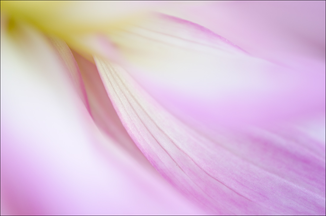
Abstract Dahlia 2
‹ PreviousFlora GalleryNext ›

Abstract Dahlia 2

by Nathan Buck

Gallery: FloraPosted October 4, 2012135 views12 comments
Hi all.

Trying another abstract on for size. Thank you for your thoughts on the last one.

I really want to get better at these - so if you have feedback or criticism in any way, please let me know.

Nathan

Nikon D7000, Sigma 180 macro, tripod, ISO 200, f4ish

Comments

12 comments
Comment posted by Bob&Charly Nelson on October 4, 2012 at 3:04 PM
Another winner in my eyes Nathan, not a nit to be heard from me. :toast:
Bob :wavey:
Registered on October 27, 2005, 289 Posts, 4202 Comments
Comment posted by Reed Bowman on October 4, 2012 at 5:27 PM
Looks like feathers...very nice.
Registered on March 2, 2009, 166 Posts, 1058 Comments
Comment posted by Ramamohan Pai on October 4, 2012 at 7:59 PM
Nathan - Another good one. Love the sweeping edges, flow and the cram kind of effect in the front. The warm yellow wash in the top left also adds to the feel.
Registered on November 1, 2003, 550 Posts, 9037 Comments
Comment posted by scott lanz on October 4, 2012 at 8:32 PM
This is beautiful, Nathan. I find these abstracts difficult to take and difficult to critique because there are no clear "rules" of composition, but If I had a nit, it is that there is a bit too much wash, I think.
Registered on November 14, 2003, 840 Posts, 12902 Comments
Comment posted by Mark Stahlke on October 4, 2012 at 11:20 PM
Beautiful sweeping lines in this image. But, I kind of prefer the composition of "Abstract Dahlia 1". There are a couple of tiny dark spots visible in the larger version that could go away.
Registered on November 1, 2003, 97 Posts, 782 Comments
Comment posted by Eirini Pajak on October 5, 2012 at 6:39 AM
I think you are doing really well at these! This has a good flow to it, zero suggestions.
Registered on December 13, 2011, 216 Posts, 1671 Comments
Comment posted by Ian Wolfenden on October 5, 2012 at 8:05 AM
No suggestions, Nathan - an eminently satisfying image, beautifully composed and coloured !
Registered on May 18, 2007, 1108 Posts, 7647 Comments
Comment posted by Gary Yeoh on October 5, 2012 at 8:10 PM
Nathan:
I do like the flow in this image and the yellow/pink wash. Like Scott, I am finding that the band of wash above left center a little out of place.
Registered on September 1, 2009, 588 Posts, 8184 Comments
Comment posted by Morris McClung on October 6, 2012 at 11:25 AM
Cram-o-Rama! :biggrin:

Another outstanding image, Nathan! :toast:
Registered on May 7, 2007, 670 Posts, 19650 Comments
Comment posted by Albert Darmo on October 6, 2012 at 10:47 PM
Hi Nathan :wavey: the first post was great, but i like this even better :jump: the lines and color are very pleasing :cool: :smile:
Albert Darmo
Registered on November 25, 2008, 1386 Posts, 11978 Comments
Comment posted by Bill Fach on October 8, 2012 at 10:48 PM
Nathan: Love the flow and colors in this one. Well seen.>=))>
Registered on November 1, 2003, 1805 Posts, 26981 Comments
Comment posted by Lucy Aron on October 10, 2012 at 12:25 PM
Interesting unusual. DOF esp super.


lucy
Registered on February 25, 2011, 189 Posts, 1160 Comments