Nature Photographers Network
This is the preserved archive of the original Nature Photographers Network. The community continues at naturephotographers.network.
Butterflies
‹ PreviousFlora GalleryNext ›

Butterflies

by Mark Stahlke

Gallery: FloraPosted October 4, 2012245 views18 comments
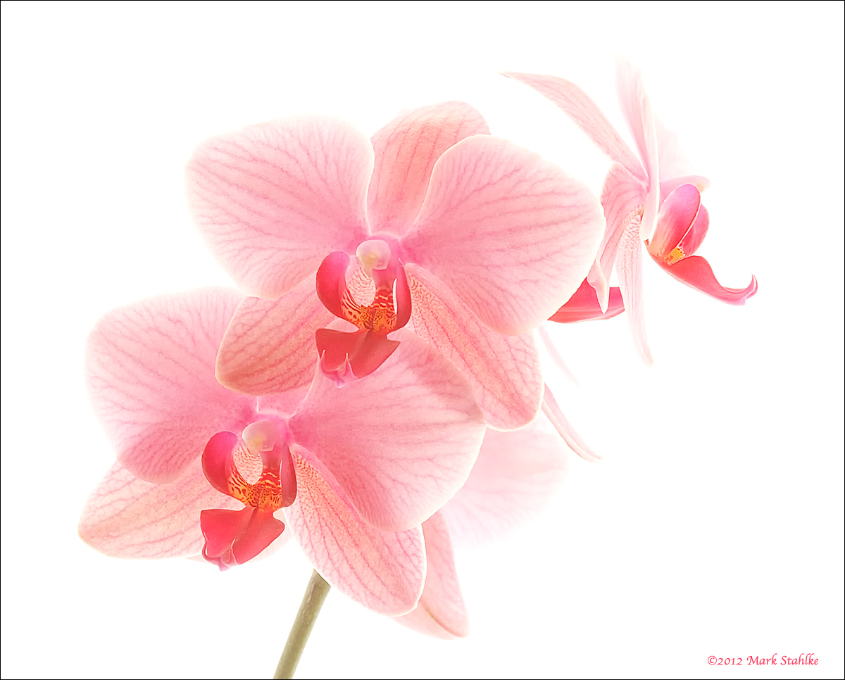
I know Phalaenopsis are commonly called Moth Orchids but they look like butterflies to me.

After a long hiatus, I've returned to a series of high key orchid images I was working on. I posted a different shot of this orchid a couple of years ago. I don't know why I didn't post this one, I like it more than the first image. I have some new orchids and some fun ideas for shooting them. I'm looking forward to posting more.

Cropped to a 4:5 aspect ratio. This makes a lovely 8x10 print on heavy textured fine art paper.

Nikon D300
Micro Nikkor 105/2.8
1/15 sec. @ f/16 @ ISO 200

Comments

18 comments
Comment posted by Patricia Brundage on October 4, 2012 at 11:51 PM
Gorgeous high-key presentation! No suggestions, perfect as is.
Registered on March 23, 2006, 1111 Posts, 6531 Comments
Comment posted by Ken Smith on October 5, 2012 at 1:58 AM
This is terrific! Details and see-through petals with the veins so clear and visible.
Registered on September 5, 2008, 449 Posts, 2444 Comments
Comment posted by Eirini Pajak on October 5, 2012 at 6:32 AM
Wow, nice! No offense to moths but I do think Butterfly Orchid would be more apt! I would be interested in knowing how you did the lighting/background...this turned out lovely!
Registered on December 13, 2011, 216 Posts, 1671 Comments
Comment posted by Bob&Charly Nelson on October 5, 2012 at 7:01 AM
This is just great art Mark. Just wonderful.
Bob :wavey:
Registered on October 27, 2005, 289 Posts, 4202 Comments
Comment posted by Mark Stahlke on October 5, 2012 at 10:10 AM
I would be interested in knowing how you did the lighting/background.
I placed the orchid in a south facing window that's covered by a sheer white curtain. Strong back lighting from the sunlight pouring in the window gives the flower petals a nice translucency except where they overlap. The thin curtains are enough to prevent the back lighting getting too harsh.

Then I overexpose the flowers (about +3 exposure compensation) and the pleats in the curtains vanish and the petals closer to the curtain fade into the background. That gives me a pure white background and just the right separation between the flowers and the background. With the overexposure, I don't use any fill light on the face of the flowers.

Post processing in ACR, I might add a little fill light. I keep the brightness high and the contrast and saturation low. Then it's off to PSCS3 for color balance if necessary and gentle sharpening. I think I ran "Sharpen Edges" once or twice. I also do some selective sharpening of the center of the flowers.

It might sound complicated but it's a pretty simple. And great fun.
Registered on November 1, 2003, 97 Posts, 782 Comments
Comment posted by Reed Bowman on October 5, 2012 at 3:28 PM
very nice high key, the crop works very well too. I think the image is extremely well balanced.
Registered on March 2, 2009, 166 Posts, 1058 Comments
Comment posted by Ramamohan Pai on October 5, 2012 at 3:41 PM
Mark - Just beautiful. Love the slight fading effect on the end of the petals merging into the high key background. No suggestions from me. Works pretty well as presented.
Registered on November 1, 2003, 550 Posts, 9037 Comments
Comment posted by Carol Nichols on October 5, 2012 at 5:50 PM
Absolutely gorgeous Mark. Thanks for explaining your process. :toast:
Registered on November 7, 2007, 161 Posts, 1420 Comments
Comment posted by Nathan Buck on October 5, 2012 at 5:53 PM
Great color, great exposure (I love the high key look) and a great shot overall. The comp works very well for me - especially with the one on the back right being in profile.

Nathan
Registered on November 1, 2003, 1101 Posts, 13589 Comments
Comment posted by scott lanz on October 5, 2012 at 8:06 PM
Expertly accomplished, Mark. Thanks for sharing both the image and your technique for achieving the high key look. :toast:
Registered on November 14, 2003, 840 Posts, 12902 Comments
Comment posted by Gary Yeoh on October 5, 2012 at 8:39 PM
Mark:
Fabulous image. Beautifully crafted and presented. :toast:
Registered on September 1, 2009, 588 Posts, 8184 Comments
Comment posted by Robert Dayton on October 5, 2012 at 11:19 PM
Beautiful, Mark! Your high key rendition works well here. Great detail and color. Thanks for sharing how you set this up, plus
the post-processing information.
Registered on November 11, 2008, 281 Posts, 3958 Comments
Comment posted by Ian Wolfenden on October 6, 2012 at 3:57 AM
Superbly done, Mark ! The composition and the colour balance ( with the fading petal edges ) are perfect for me - a truly first rate image !!
Registered on May 18, 2007, 1108 Posts, 7647 Comments
Comment posted by Bill Fach on October 6, 2012 at 11:26 PM
Mark: 4+ wonderful. Superb portrait in every way. 2 thumbs up! >=))>
Registered on November 1, 2003, 1805 Posts, 26981 Comments
Comment posted by SandyRichardsBrown on October 7, 2012 at 2:19 AM
Beautiful - not the tiniest nit from me.
Exquisite colours and treatment.
Sandy
Registered on November 24, 2003, 3937 Posts, 12909 Comments
Comment posted by SandyRichardsBrown on October 10, 2012 at 4:28 PM
Congrats on the WP!
Sandy
Registered on November 24, 2003, 3937 Posts, 12909 Comments
Comment posted by Yun Gao on October 11, 2012 at 12:28 AM
Congratulations! Thanks for a superb image and the technique information. I used to think that the high key photography required a very complicated lighting equipment and it's for studio.
Registered on September 11, 2012, 267 Posts, 1621 Comments
Comment posted by Giuseppe Guadagno on October 11, 2012 at 9:49 AM
Just beautiful Mark!
Take care
Registered on February 3, 2007, 827 Posts, 5052 Comments