Passion
by Mark Stahlke
Getting up close and personal again.
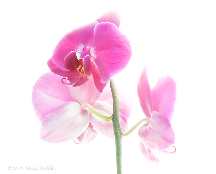
This one was difficult. Inexplicably, all my shots of this orchid had terrible color noise and blotchy color. It took two runs through noise reduction and a couple of applications of "De-speckle" to clean it up. That cost me too much of the fine detail in the petal veins. These high key orchid images don't respond well to heavy handed post processing.
In addition, the top petal looks wrong. The petals have a cup to them that can pop forward or backward. I think this was popped backwards. That might account for the weird look.
I'm mostly satisfied with the lighting, composition (too tight at the top?), and sharpness but I think those two flaws conspire to make this one of the weaker images in the series. The flowers on this orchid are ready to drop so I won't have an opportunity to re-shoot. Oh well. I'm having fun with this series even when I don't get the results I want.

Comments
7 commentsBest,
Carol
Bob
Hi Mark
Albert Darmo
Your self critique is spot one. Not one of your strongest one in the series.