Nature Photographers Network
This is the preserved archive of the original Nature Photographers Network. The community continues at naturephotographers.network.
Plum
‹ PreviousFlora GalleryNext ›

Plum

by Mark Stahlke

Gallery: FloraPosted October 22, 201263 views5 comments
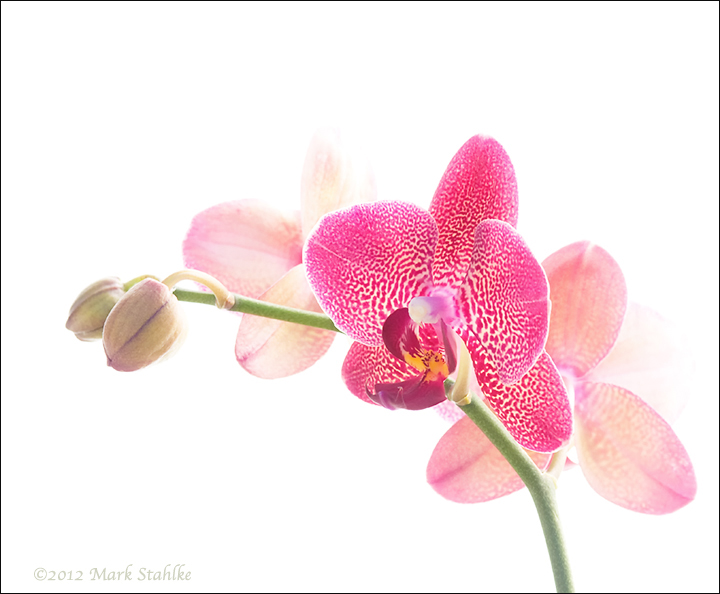
I got tired of waiting for flower buds to open so I'm trying to use them as compositional elements. Are the buds on the left enough weight to balance this composition? Do I have too much white space at the top again? Too tight on the right?

This is another dark colored orchid variety. They don't work as well as the pale colors for high key rendition. It takes so much exposure compensation on the face of the flower that I'm starting to lose other parts. I think this one worked out better than the last dark flower.

I'm trying to give the images in this series single word titles. My imagination seems to have stalled, I'm open to title suggestions. Of course, other comments and critiques are very welcome.

Comments

5 comments
Comment posted by Robert Dayton on October 22, 2012 at 6:54 PM
I enjoy your high key Orchid postings. I too prefer the paler ones, but this is still beautiful.
I think that it might benefit from a little top cropping, but as posted that's not a serious
concern. It's Ok on the right for me.

Please keep posting this kind of work. It' not only pretty but
I learn from such images.
Registered on November 11, 2008, 281 Posts, 3958 Comments
Comment posted by Gary Yeoh on October 22, 2012 at 7:20 PM
Mark
Watermelon came to mind when looking at this image.

Like you, I find the edges are difficult to manage with darker color orchid in hkey. One trick I use is to blend the edge from a less EV image onto the one which is nicely exposed in the darker part.

Yes, I would shave a little of the top. A picture framer told me that it looks better if there is a little more space at the bottom compared to the top.
Registered on September 1, 2009, 588 Posts, 8184 Comments
Comment posted by Mark Stahlke on October 23, 2012 at 10:41 AM
Gary Yeoh wrote:
A picture framer told me that it looks better if there is a little more space at the bottom compared to the top.
Like a bottom weighted mat. Interesting idea, I never thought to incorporate that concept into a composition.
Registered on November 1, 2003, 97 Posts, 782 Comments
Comment posted by Nancy Lea Sandy on October 23, 2012 at 8:55 PM
Love the high key look. Crop looks good, not too tight at all. Nice work
Registered on January 24, 2011, 576 Posts, 6942 Comments
Comment posted by Morris McClung on October 24, 2012 at 1:32 PM
Yes on the crop. But, this is another fantastic offering in your series. Careful, or you may start to be called Mark Orchid! :biggrin:
Registered on May 7, 2007, 670 Posts, 19650 Comments